The right color palette can turn a bedroom from an ordinary place to sleep into a genuine retreat. Color affects mood, perceived room size, and even sleep quality, which makes it one of the most powerful design decisions you can make in this room. Whether you gravitate toward soft neutrals or rich, saturated hues, a thoughtful palette ties every other element together, from your headboard to your rug. Here are the color strategies that designers return to again and again for bedrooms that feel calm, cohesive, and genuinely restful.
Choose a Neutral Base for Longevity
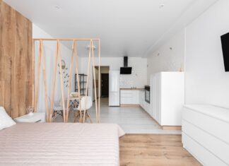
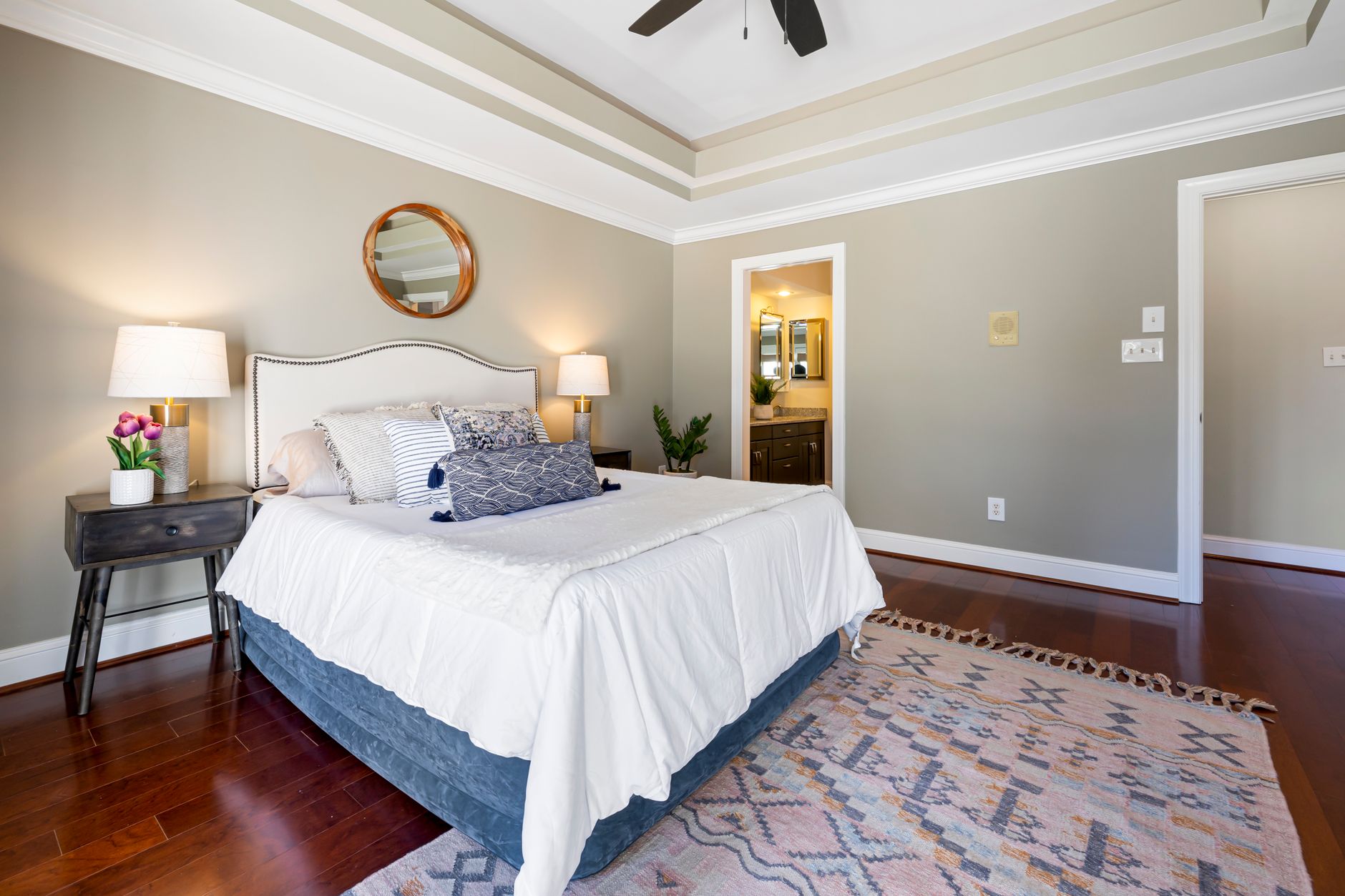
A neutral foundation of soft white, warm greige, or gentle taupe gives you a canvas that won’t feel dated in a few years. Neutrals reflect light well, which keeps smaller rooms feeling open and airy rather than closed in. They also make it easy to update your look seasonally just by swapping out textiles or artwork instead of repainting. Pair a neutral wall color with layered textures, like a chunky knit throw or a linen duvet, so the room doesn’t feel flat or sterile.
Bring In Warm Earthy Tones for Coziness
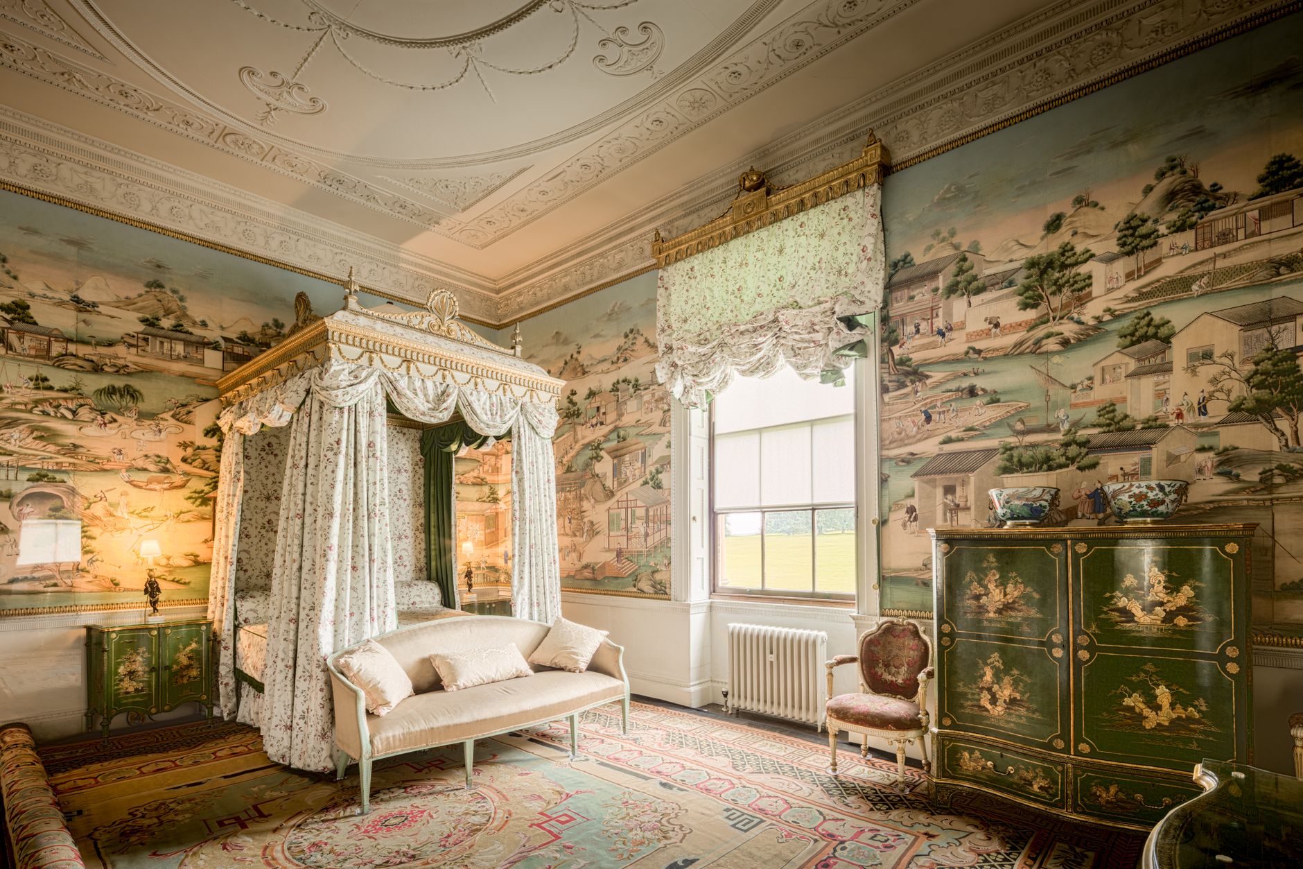
Terracotta, clay, caramel, and soft browns bring an enveloping warmth that makes a bedroom feel like a cocoon at the end of the day. These tones work particularly well on a single accent wall or as the color for bedding and drapery if you’re not ready to commit to a full repaint. Warm earth tones also pair beautifully with natural materials like rattan, wood, and woven window treatments, reinforcing a grounded, organic feel throughout the space.
Layer Cool Blues and Greens for a Serene Feel
Blues and greens are consistently rated among the most calming colors for bedrooms, largely because they echo the natural world. A dusty sage, soft sky blue, or deep forest green can lower visual stimulation and support a more restful state before sleep. To avoid a cold or clinical result, balance these cool tones with warm metallics in your lighting fixtures and warm wood tones in your furniture, which keeps the palette from feeling flat.
Create Depth With a Tonal Palette
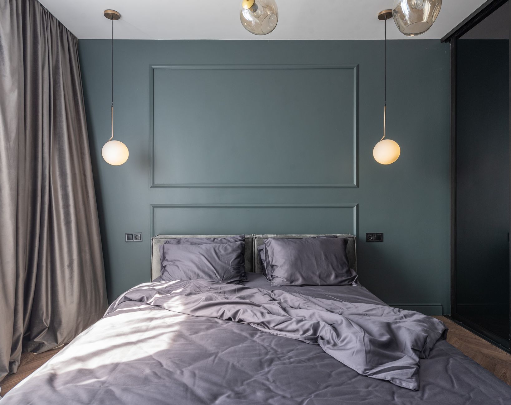
A tonal, or monochromatic, palette uses several shades of a single color family for a sophisticated, cohesive look. Try a range from pale blush to deep rose, or from soft dove gray to charcoal, layering these shades across your walls, bedding, and accessories. This approach rewards attention to layering technique, since varied textures and finishes keep a single-color scheme from feeling flat. Add one contrasting neutral, like crisp white trim, to keep the eye from feeling overwhelmed.
Make a Statement With an Accent Wall
If committing to color across an entire room feels risky, a single accent wall behind the bed lets you experiment with bolder choices, like deep navy, forest green, or moody plum. This approach draws the eye naturally toward the headboard and nightstands, creating a built-in focal point without overwhelming the entire space. Keep the remaining walls neutral so the accent color reads as intentional rather than accidental, and echo the shade in one or two smaller accessories for cohesion.
Let Lighting Guide Your Color Choices
Color never exists in isolation from light, and the same paint chip can look completely different under morning sun versus warm evening lamplight. Before committing to a color, test large swatches on your walls and observe them at different times of day, paying attention to how your lighting fixtures interact with the tone. Warmer bulbs tend to deepen and enrich colors, while cooler LED light can make the same shade feel more muted or gray, so match your bulb temperature to the mood you want the palette to create.
Keep Storage and Function in Mind
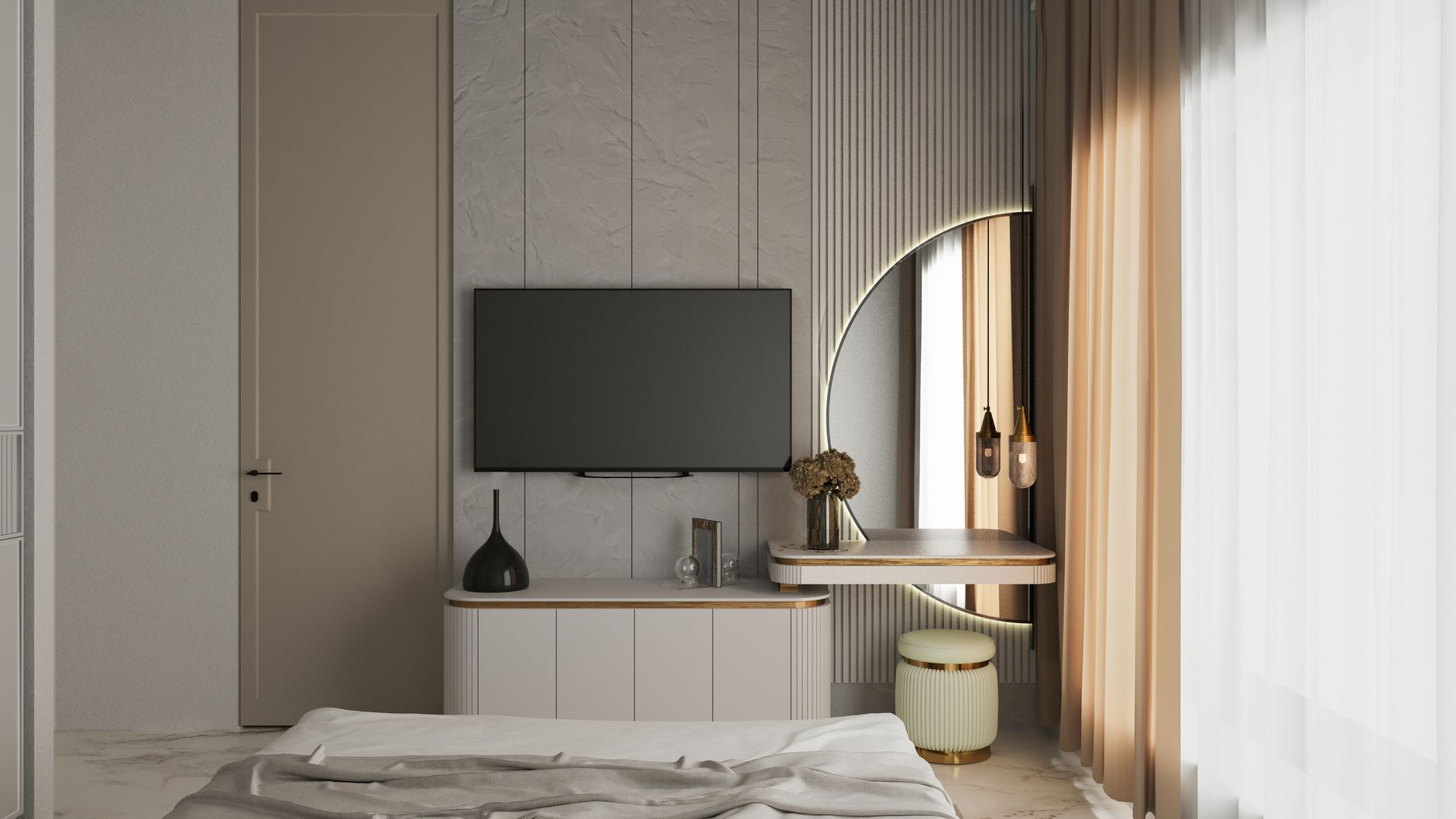
A beautiful palette still needs to work with the practical bones of the room, including how you store everyday items. Choose furniture finishes that either blend into your wall color for a seamless look or contrast intentionally as a design statement, and consider how your storage solutions fit into the overall scheme. Solid, muted tones on dressers and closets tend to age better than trend-driven colors, letting you refresh smaller accessories instead of major furniture pieces as your taste evolves.
Final Thoughts
There’s no single “correct” bedroom color palette, only the one that reflects how you want to feel when you walk into the room. Start with the mood you’re chasing, whether that’s cozy warmth, serene calm, or elevated sophistication, and let that guide your undertones, accent choices, and finishes. Applying sound interior design principles around balance and proportion will help any palette you choose feel intentional rather than accidental. With a thoughtful approach to color, your bedroom can become the calming retreat it’s meant to be.