
For me (and maybe for most of you guys, too), Halloween just feels like one big happy excuse to party. Now, of course, I don’t mean the type of raucous college-era soirees that lasted well into the first of November, but instead a responsibly raucous party filled with goofy adult antics and the excuse to eat treats all night long. At least until, oh…11:30 p.m. anyway.
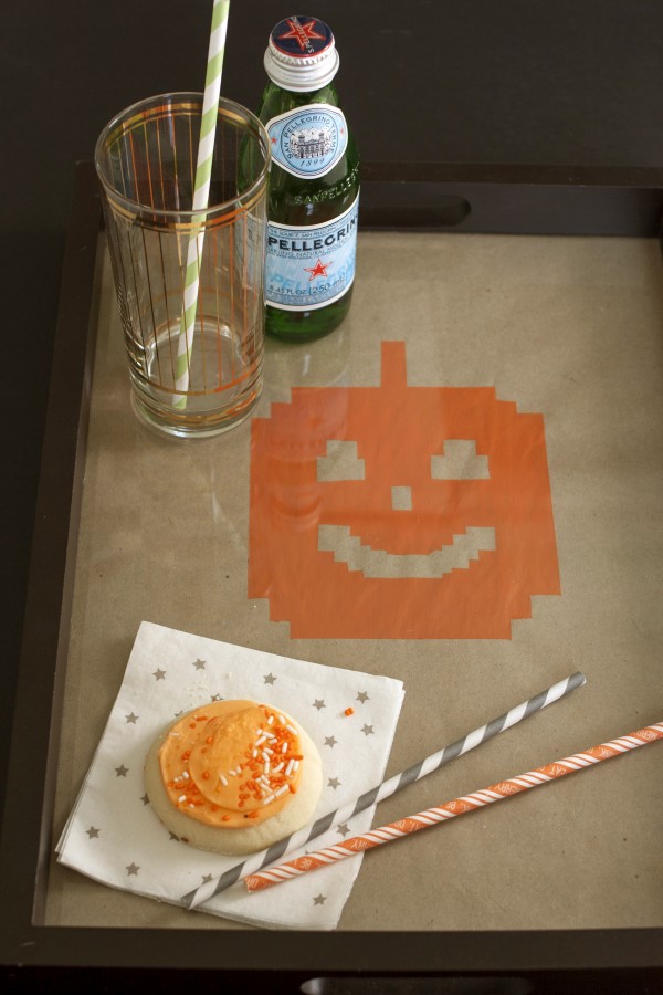
To kick the season off in DIY style, I spent an afternoon in my studio putting together an easy painted tray that now effectively pays homage to Halloween with a modern, digitized version of the holiday’s mascot—that telltale orange gourd, of course!
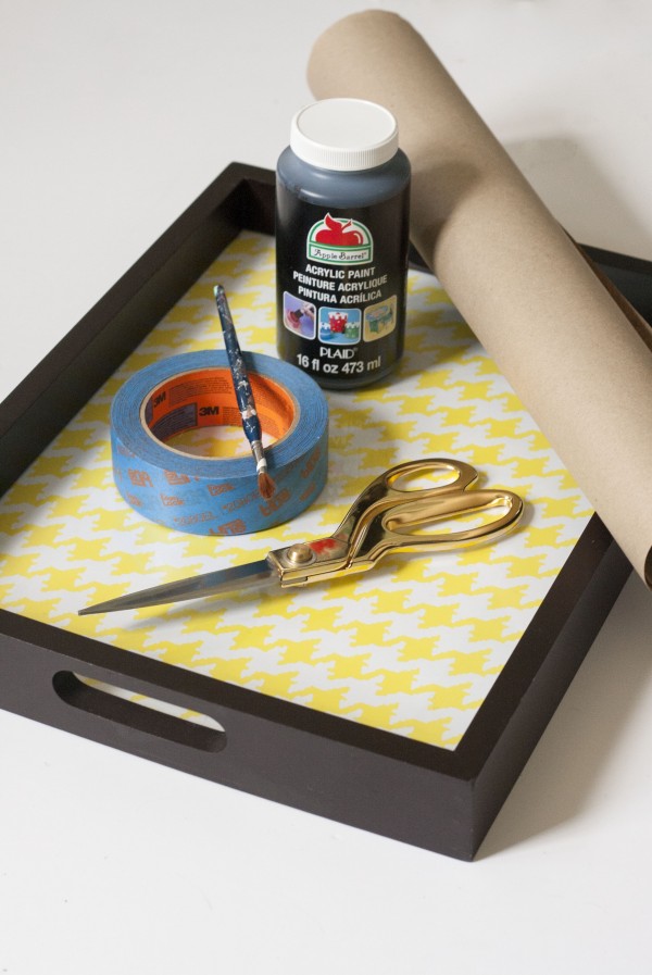

- Scissors
- ScotchBlue™ Painter’s Tape for Delicate Surface with Advanced Edge-Lock™ Paint Line Protector (2080EL)
- Acrylic paint
- Small detail paintbrush
- Plastic painter’s tray
- Decorative serving tray
- Kraft Paper
The serving tray that I used is a bit unique since it has a glass insert protecting the decorative paper or photos put beneath it (think of it like a picture frame with handles), so I also added kraft paper to the mix to act as my canvas. You may not need this extra supply though if you plan on simply painting directly onto the surface of your tray.
NOTE: If you paint directly on your tray using acrylic paint, please do keep in mind that your tray is not suitable for serving food. That said, drinks are a great alternative that will allow you to safely debut your DIY painted tray come party time.
Step 1:
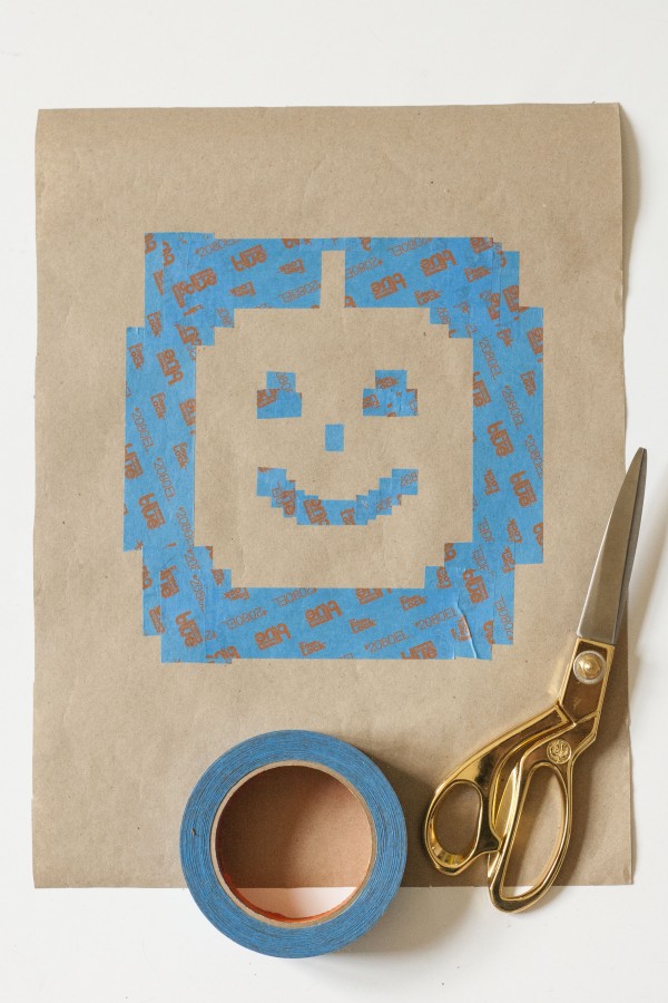
After cutting my kraft paper to fit inside my tray’s glassed in “window,” I then grabbed my ScotchBlue™ Painter’s Tape to start laying out my design. As a quick (and GENUINE) sidenote, since beginning my work with the ScotchBlue™ Painter’s Tape brand, I have become an absolutely loyal user. It delivers a crisp line and it has gotten me out of more than one crafting scrape or two (I tend to skip steps whenever possible, you see). So I had no doubt that my trusted roll would get the job done—and, happily, it did!
Step 2:
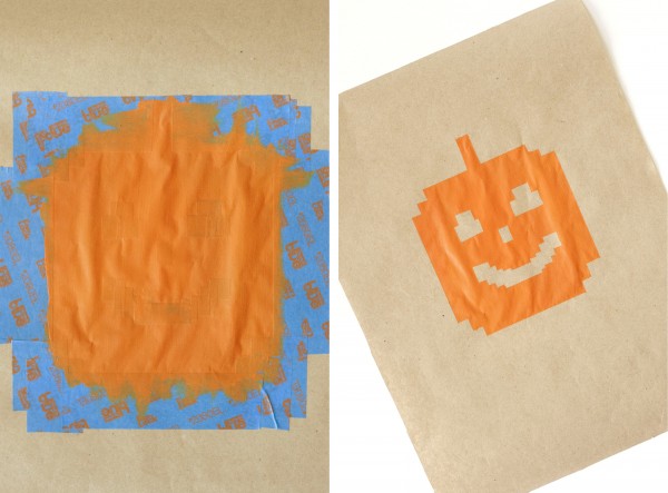
As you can see pictured above, I chose to go a little outside the box with my pumpkin portrait. Rather than the standard round shape, I cut my tape into small squares (just by eye balling them) and then laid each down in a way that suggested a pumpkin shape, but in a fresh way that suits my more modern taste.
Step 3:
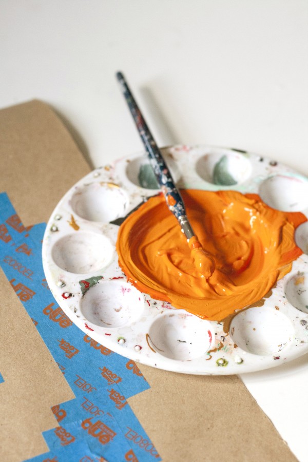
Then came paint. You may have noticed black acrylic paint pictured in the supplies shot towards the beginning of this post, but I ended up making the last-minute (albeit predictable) switch to a bright orange instead. Using my small detail brush, I painted right on top of the face shape, being careful not to paint beyond the outside edges of the tape.
Step 4:
After giving the paint about an hour to dry, I carefully removed the tape to reveal a perfectly digitized, practically glowing gourd face!
Step 5:
To finish this project, I removed the back of my tray, slipped my painted pumpkin portrait inside and sealed it back up. Now, our newly refreshed tray is holiday-ready and it serves as my new favorite go-to for offering drinks and treats to friends—no tricks here!

And now for the fun part…Enter the Home of ScotchBlue™ Painter’s Tape Contest at www.scotchblue.com/homecontest October 1, 2014 through November 15, 2014 and you could win \$5,000 to put towards a home makeover! The first 500 to submit an eligible entry will receive one (1) roll of the new ScotchBlue™ Painter’s Tape with Advanced Edge-Lock™ Paint Line Protector. Check out this project as a featured project example in the contest!
![]()
Contest open to legal residents of the U.S. and D.C. (excluding AZ, MD, NJ, ND, TN and VT), who are 18+ (19+ in AL & NE and 21+ in MS) at the time of entry. Void where prohibited. Enter from October 15, 2014 at 12:00:01 a.m. CT through 11:59:59 p.m. CT on November 15, 2014. All contest communications, entry/judging criteria and details subject to the full Official Rules. To enter and for Official Rules, visit www.scotchblue.com/homecontest. Sponsor: 3M Construction and Home Improvement Markets Division, St. Paul, MN.

Connect With ScotchBlue™
Facebook | Twitter | Pinterest


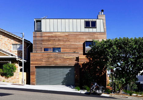

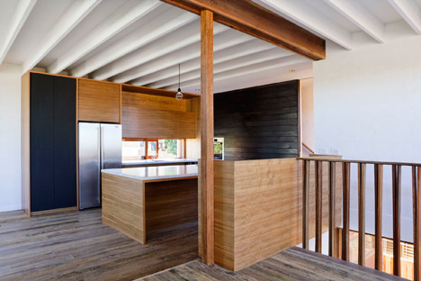
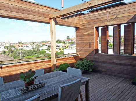 Photograph by Farnan Findlay Architects
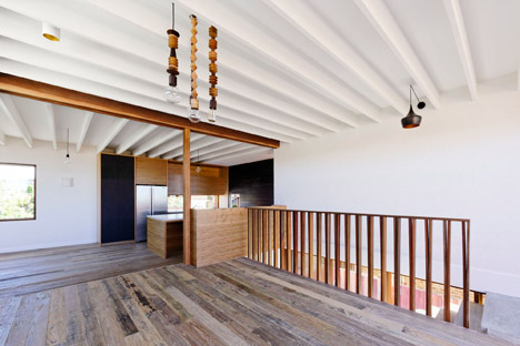
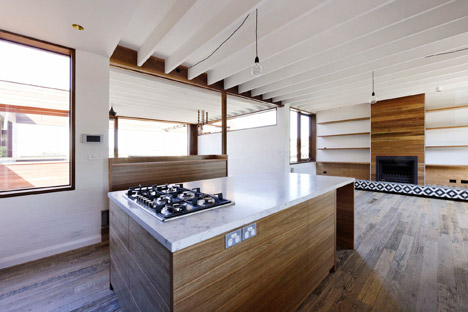
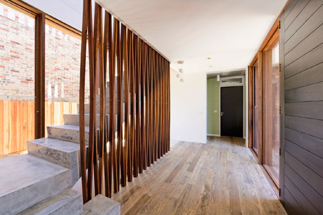
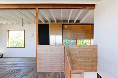
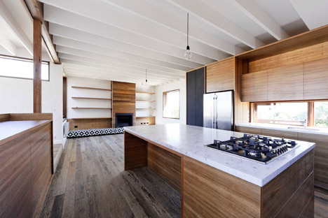
 Photograph by Farnan Findlay Architects
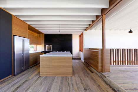
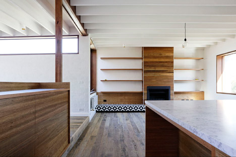
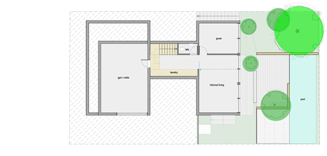 Basement plan
 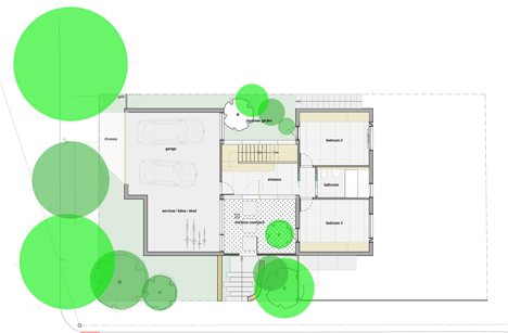 Ground floor plan –
 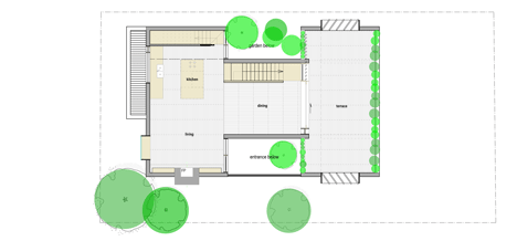 First floor plan
 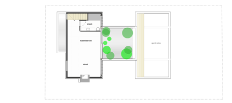 Second floor plan –
 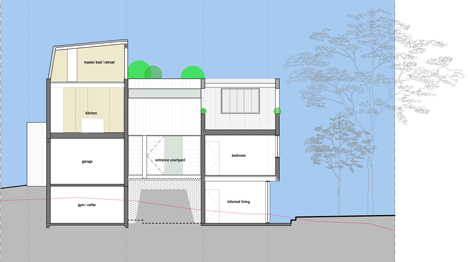 Section


