Hello my friends! Don’t you love this month? It’s one of my favorites for sure – and that has nothing to do with the fact that my birthday is next week. None at all.
I’m reviewing the projects I worked on or shared last month – just in case you missed something! I kicked off the month of September with some of my favorite fall decorating ideas and crafts:

Tons of easy ideas for both inside and out on that post! I haven’t done much fall decorating yet – it’s seemed so early still! But now that things are getting done in the family room I’ll be pulling some stuff out this weekend.
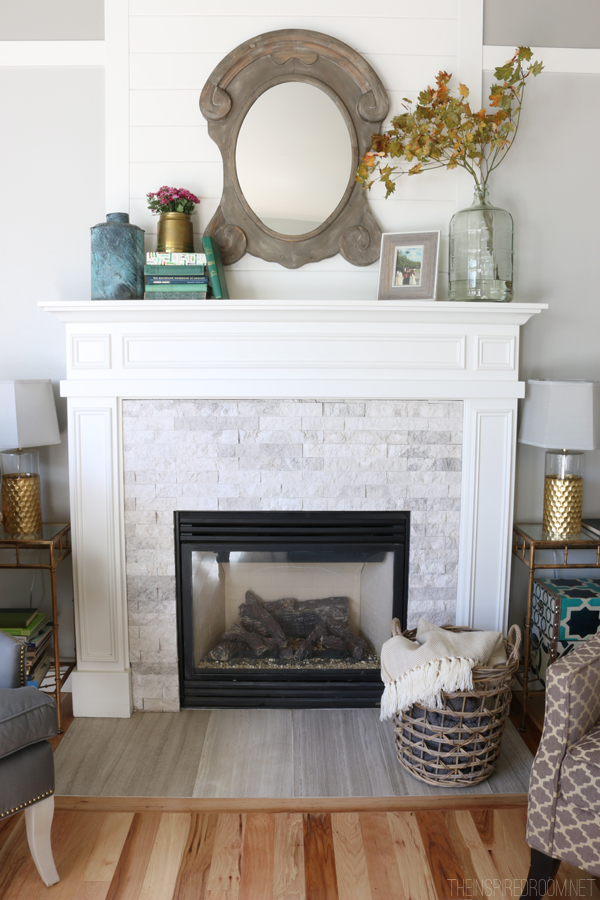
I was determined to finish up the fireplace last month and I did it! It just took me the entire 30 days. 😉 I started by going bold with the paint color – a dark gray:

I added the trim to the sides and front of the built ins and the fireplace as well. It’s just inexpensive lattice wood you can get in the trim aisle at Lowe’s – I use it for all kinds of molding projects. It definitely gives it all a more custom look for sure.
The color was bold and I was a little scared but I LOVE it:

Next up I shared how I removed the center of the cabinet doors and replaced them:

We used standard, unfinished kitchen cabinets and just built them out a bit so they were deep enough to hold the electronics. Problem was I needed to let those electronics breath so they didn’t get overheated. The metal radiator sheeting was the perfect solution:

I love the look – a little modern but also a very traditional feel at the same time. And YES, the remotes work through the metal!
Because my readers are awesome, I shared some of the projects they’ve tackled after seeing some of mine. Tammy’s wall of built ins turned out SO beautifully:

Be sure to check out some of the others!
After I got the paint started on the fireplace and the doors done it was time to attack the biggest project – the tile. There were a few options I was considering:

The herringbone had my heart all along, I was just a little nervous about installing it. At first glance I thought it would take a lot of small cuts.
I soon figured out that wouldn’t be the case at all so I went for it:

I shared the whole process of tiling a fireplace surround here – that post includes some tips if you plan to use a marble tile as well.
We absolutely ADORE the finished product:

SO happy I went for that one!
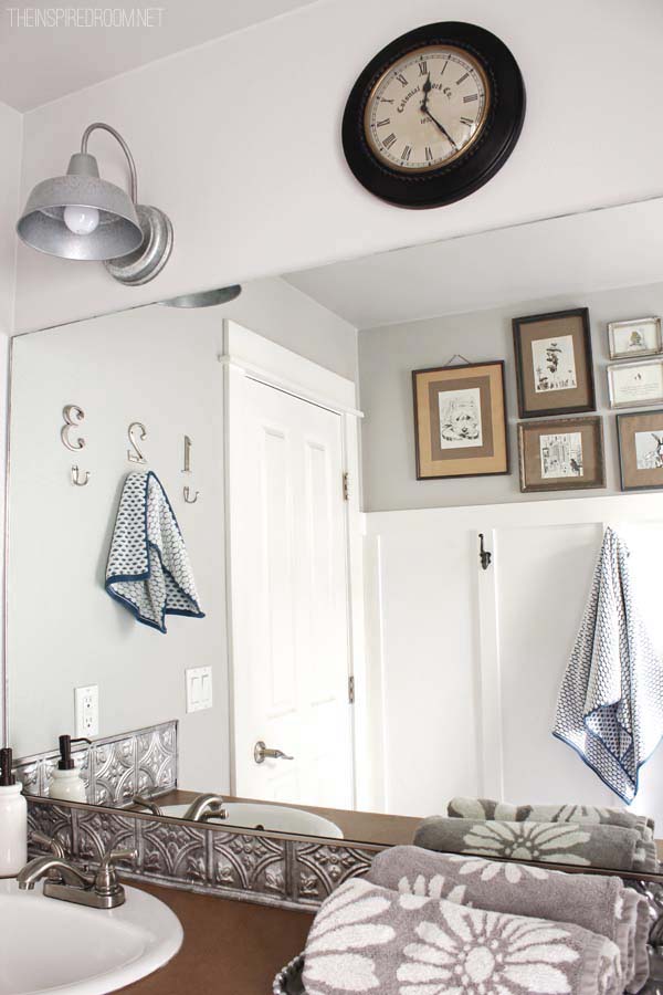
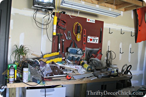
I stepped away from the DIY for a bit to focus on an area that was in desperate need of some decrapification:

Love that my spell check now recognizes that word. 😉 That closet had become my “Monica closet” – a dumping ground for anything that took actual thought to address. 🙂 Go here to see my process for going through all the crap and getting it organized again.
Because the fireplace was looking so good I had to address how filthy it was from all the construction this summer. Did you know you can clean the inside of your gas fireplace glass?:

It’s actually quite easy to do. I like to clean our fireplaces every year at this time before we turn them on for the winter. I also shared how I used high heat paint on the fireplace surround to get it looking good again here.
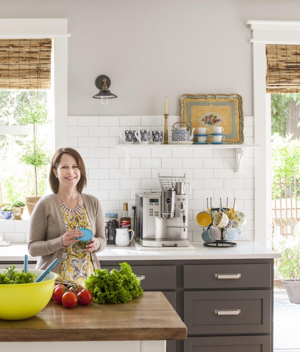
I was thrilled when I realized that taking down the wall in the family room meant our kitchen would get much bigger too. We were able to move our table to a spot that works SO much better with a lot more space, which meant a much bigger table would work. I shared our new one and thoughts on finishing it here:

Goodness I LOVE this table. I’ll show you what I’ve done with it next week. 🙂
Next up I gathered some of the prettiest fall printables you ever did see from around blogland – and all are FREE:

They are such an easy and inexpensive way to decorate for the seasons.
I was needing some warmth in the family room so I switched from our summer neutrals to some color for the fall:

If you’ve never sewn a pillow I also shared some quick tips – it’s not that hard, I swear!
I was fed up with some more of the disaster areas in our house of late so I focused on my problem clutter areas. Take a look at them and this space all cleaned up here:
Yowza. That was bad.
I love finding new fun places to shop that don’t break the bank – I took you on a tour of one of my favorites last week:


Last weekend I finally got the fireplace finished! I love it so dang much! I shared how I planked the wall above the fireplace for \$13 and a bunch of I’m-so-happy-this-is-done after shots here:

A couple of you suggested painting the crown the same color and I think I’m going to try it. I’m not sure it will work but it’s only paint – I can easily take it back to white if I don’t like it. The total cost to finish up the fireplace was less than \$200 – that included the metal sheeting, tile and supplies and the wood for the planked wall. I had the paint leftover from the wall in the bedroom.
Someone commented on the rug earlier this week and yes it does look baby blue in that shot – not sure why. It’s definitely a gray/blue color that works great with that whole wall. (You can see the true color in the pics above.)


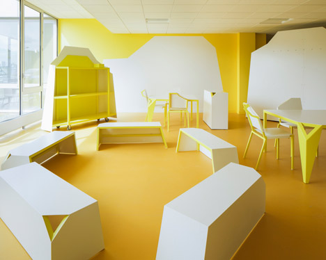
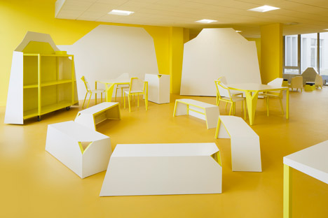
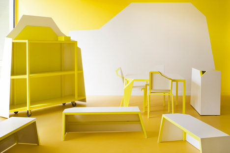
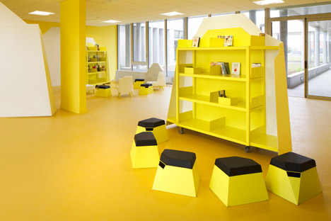
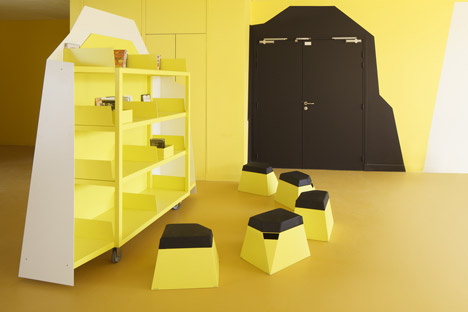
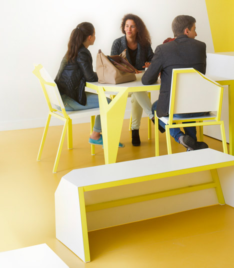
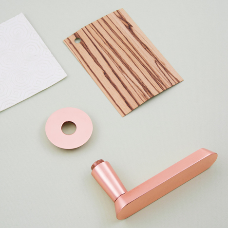 This image: Audrey for Vervloet by Jean-François D’or. Main image: Mate by Bram Boo for Bulo. Both to be displayed at Biennale Interieur 2014
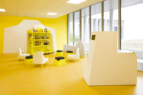
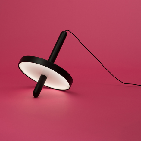 Magnum by Patrycja Domanska and Felix Gieselmann – Interieur Awards 2014 winner, Objects category
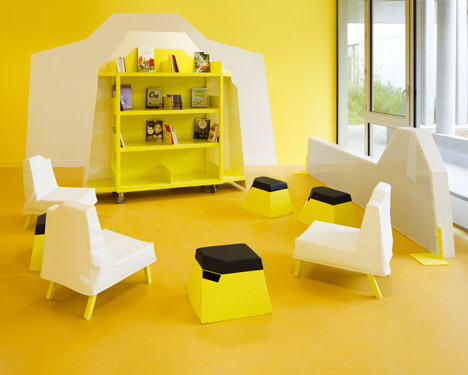
 Kawara Bench by Tsuyoshi Hayashi – Interieur Awards 2014 winner, Objects category
 Map of Kortrijk Xpo
 Map of Buda Island