If you’re a Facebook friend, you might have seen a post of mine from last week featuring a collection of nautical images I created for a new gallery wall at my parent’s beach house.
I found the original images on The Graphics Fairy then modified them slightly to suit my needs. Now, with permission from Karen (The Graphics Fairy) I am offering them as free printables.
This collection includes twelve high resolution images on standard letter-sized paper (for easy at-home or in-store printing) to fit regular 8″ x 10″ photo frames or standard certificate/document frames (of course, you can always use larger frames with mattes or smaller frames if you reduce the image size).
DOWNLOAD HERE
These lovely vintage illustrations are just so versatile. Although the images themselves are all similar in scale and would have real impact in a uniform grid, there’s no reason you couldn’t use randomly sized frames for a more collected look (any larger frames could simply be matted). I think it’s a bit of a misconception that frames and art need to be perfectly scaled and proportioned. There really are no rules, it just depends on the look and feel you’re after.
Here are a few ideas…
I like all these options though really love the simplicity of the single feature idea – using a large frame to give a relatively small print real presence.
And, on top of choosing a hanging configuration, there are also tonnes of framing options (especially if you also use mattes). How about blue frames to co-ordinate with the images, simple white or black frames with blue mattes, gold frames for a more refined look, textured mattes in a natural tone to add some warmth or double mattes to create a border, and on and on.
Of course, if you’re going for an eclectic look, you can simply use a mish-mash of frames which I think always looks great.
To Print For convenience, I simply printed these at home using my best quality print settings onto good matte photo paper. You could also have them printed professionally (in-store or online). If so, look into using a colour document printing service (if available) over actual photo printing. It is usually heaps cheaper and for simple images like these quality is comparable. I just had a quick look at the Officeworks website and saw that 8″ x 10″ photo prints start at \$2.50 whereas colour documents begin at just 88 cents (for twelve prints that’s a saving of around \$20).
Editing Digital Images I get lots of questions about working with free printables so I know it’s not straight-forward for everyone. I also remember just how challenging I personally found it at first. If you’d like to learn more about customising digital graphics refer to my free printables series.
For these images (which were originally found on the Graphics Fairy – as mentioned above) I simply changed the colour (they were initially black) and marginally increased the size. I did this in Photoshop (which is my preferred editing program) though simple modifications like this can be made using lots of programs (such as publishing programs, like Word, or free online editors, like Pixlr).
Of course, you can make further edits to my images if you’d like. You could change the colour, invert the background, introduce a border, add some text or play with overlays for a distressed or grungy look, and so on.
Note: If using a publishing program or free online editor, just be mindful of image quality. One of the reasons I prefer using a purpose editing programs is the control and clarity it offers in terms of resolution. Some editors are not designed to produce print quality images (they merely edit for digital purposes). If you’re confused, you can read more about quality and resolution in my series about free printables. I recommend downloading GIMP if you’re not willing or able to purchase an editing program.
Have fun!
PS I know lots of my regular readers are sick to death of hearing me apologise for my sporadic absences, though I just wanted to let you know that at the mo’ I’m helping my sister finalise deets for her at-home wedding (taking place in two weeks time – eeek!) and hope to be back more frequently once it’s all done and dusted.
You’ve just read the post Free Printable Vintage Coastal Illustrations from The Painted Hive. Click on over to visit the blog and get engaged in the comments section – I’d love to hear your thoughts! Republishing this article in full or in part is a violation of copyright law.
The furniture cam lock that is common to a conventional home is lighting systems, security system, temperature control and ventilation systems, and entertainment systems. In the conventional home each is a stand system. Each separately controlled either by using the keypad, remote control, switch, and more. To get a certain condition is often the occupants should adjust some systems at once, such as adjusting lighting levels, temperature, and security protection during the night. Furniture cam lock is a system used to integrate the various systems that are mostly located in a house. With the integration of various systems is expected to increase: convenience: the level of lighting, temperature, humidity optimum, security:
protection against unauthorized access, alarm systems, and monitoring the situation. Ease: control various systems anywhere and anytime. Efficiency: using the resource which is a major constraint in this integration is how the various systems that are already in the building can communicate with each other.
At this time there has not been a pretty dominant standard furniture cam lock used by electronics vendors as a reference. Based on the medium of communication, integration methods in use today can be divided into: Power Line: electricity using frequency modulation to transmit data. This method is also relatively easy to implement, but is often hampered by the noise on the power supply, relatively slow, and vulnerable to the problem by orders of colliding.
Color choice defines a room. Image Via: Kati Curtis Design
Most of us aren’t interior designers by trade and that’s okay. Whether you think of interior design as an enjoyable hobby or a necessary evil that helps keep your home looking presentable, sometimes it can be tough to understand the industry lingo. After all, how often do you hear about Tertiary Colors, anyway?
At Freshome, we aim for our content to be accessible to everyone – no college degree required. So, today, we’re going back to basics. Gear up for a little Design 101. In this post, we’ll tackle color theory basics that every design enthusiast should know.
After you’ve read, make sure to store this link somewhere readily accessible. It’ll come in handy next time you’re not quite sure whether you’ve chosen the right paint color.
Understanding color theory will make your design projects much easier. Image Via: Caitlin Wilson
1. How To Use The Color Wheel
Like trigonometry, the color wheel is probably one of those things that you learned about as a young child and haven’t thought of since. However, to really understand color, you may have to dust off some of that knowledge.
Simply put, the color wheel provides a visual representation of which colors blend nicely together. It removes all the guesswork, essentially. Most models are comprised of However, in theory, the color wheel could be expanded to include an infinite number of shades.
Don’t worry if you haven’t memorized the color wheel just yet. There are tons of ways to access it digitally. Paletton is a website that will let you create your own color scheme from the comfort of your computer screen and ColorSchemer offers the same capabilities in an app that’s available for iphone.
The color wheel is paramount when understanding color theory. Image Via: University of Makeup
2. What Are The Basic Colors
We bet some of you read the last paragraph and went, “12? How are there 12 colors in the color wheel? There are only 7 colors in the rainbow. “ True. But, trust us, there are, in fact, at least 12 shades on every color wheel. Here’s how things break down:
Primary Colors: Red, blue, and yellow. Cannot be made from mixing other colors.
Secondary Colors: Orange, Purple, and Green. Can be made by mixing the primary colors together.
Tertiary Colors: The six shades that can be made from mixing primary and secondary colors.
If you’re unsure of where to start when it comes to decorating a colorful interior, one of these 12 is often a good jumping off point. Pick one and it will help you narrow down your selections until you settle on the exact shade that you love.
Primary and secondary colors instantly brighten any space. Tammara Stroud Design
3. Changing Colors With Neutrals:
Once you’ve selected a basic color, it’s easy to create many different versions within the same family. All you need to do is combine that color with a neutral in order to make it lighter or darker. In interior design parlance, this is known as tint, shade, and tone.
Tint: The act of lighting a color by adding white to it.
Shade: The act of darkening a color by adding black.
Tone: Slightly darkening a color by adding gray.
Many artists recommend experimenting with color by mixing paints until you have a feel for how drastically neutrals will affect a color. However, if you don’t have access to art supplies, you can easily see an example of tinting and shading by going to your home improvement store and picking up a few of those sample color palettes.
Create tints and shades by adding neutrals to your base color. Image Via: Hughes Design Associates
4. Understanding Color Temperature
You may have heard colors described as having a temperature. A dining room may be decked out in warm tones while your friend may have chosen a cool color to finish off her bedroom. These temperatures also describe where the color falls on the color wheel.
Reds, oranges, and yellows are often described as warm colors. They are typically more vibrant and seem to bring a sense of liveliness and intimacy to a space. In contrast, blues purples, and most greens are the cool colors. They can be used to calm down a room and bring a relaxed feel.
When choosing color temperature for a space, you should also consider the size. Using a warm color in a tight room could make things feel a little claustrophobic. However, using cool colors in a spacious room could leave things feeling stark.
Use warm colors to encourage lively conversation. Image Via: Axis Mundi
5. Complementary Color Scheme
When it comes to color schemes, complimentary is the simplest. It uses two colors that sit opposite each other on the color wheel. Typically one color acts as the dominant shade and the other as an accent. This means combinations like red and green, blue and orange, or yellow and purple.
This color combo is extremely high contrast, which means that it’s best used in small doses and when you want to draw attention to a particular design element. You could use it to make your powder room pop or to bring extra vibrancy to your home office.
If you choose a complimentary color scheme, you really need to embrace neutrals. They will provide a place for your eye to rest and keep you from becoming overwhelmed in the room.
Use neutrals to balance out the high contrast of a complimentary scheme. Image Via: Katie Rosenfeld Design
6. Split-Complementary Color Scheme
If you like the idea of a complimentary color scheme, but are afraid it may be a little too bold for your tastes, split complimentary is a safer choice. To make this color scheme, you would first choose your base shade. Then, instead of choosing the color directly opposite of your base, you chose the two shades on either side of the opposite color.
Those two shades will provide a much needed sense of balance to the room. You’ll still get the visual impact of bold color, but you’ll be able to incorporate more of it instead of relying heavily on neutrals to calm the space.
Split-complimentary works best when you use your base color as the dominant. However, instead of choosing a saturated shade, try to focus o n a color that is more muted. Then, go bold with your other two shades in the room’s accent pieces.
Split-Complimentary color schemes are often calmer versions of their complimentary counterparts. Image Via: McCroskey Interiors
7. Analogous Color Scheme
The analogous color scheme refers to using three colors in a row on the color wheel. Typically, two colors will be either primary colors with the third shade being a mix of the two and a secondary color. For example, you could choose red, orange, and yellow or red, purple, and blue.
The key to using this color scheme successfully is proportion. Again, the 60-30-10 Rule comes into play. You’ll want to choose one color to be the dominant shade, one to support the dominant, and the third, most vibrant color as an accent.
Interestingly, you can also create a similar color scheme using neutrals. It’s typically referred to as a monochromatic color scheme. Simply choose black, white, and gray in lieu of brighter shades.
Stay in one section of the color wheel to create a relaxing look. Image Via: Morosco Construction
8. Triadic Color Scheme
Triadic color schemes, sometimes also referred to as a triad, refers to using three colors with equal space between them on the color wheel. The three primary colors (red, blue, and yellow) are a perfect example, as are the three secondary colors.
This type of color arrangement is often extremely bold. Since the colors are in such high contrast and pure hues are often used, you’ll most often see this scheme in children’s bedrooms or playroom areas.
When using colors that are this lively, it’s always important to consider the spaces that are nearby. You wouldn’t want to put two different triadic color schemes next to each other. That would be too busy. Instead, make sure that the rooms next to your triadic space are calmer and mostly neutral.
The boldness of a triadic scheme makes it the perfect choice for a kid’s room. Image Via: Wen-Di Interiors
9. Tetradic Color Scheme
After the triadic scheme, things get a little more complicated. We’re moving on to balancing four colors in the space. The tetradic scheme, also sometimes referred to as a rectangle scheme because of the shape it makes on the color wheel, focuses on using two distinct pairs of complimentary colors.
In this scheme, color temperature plays a very important role. Try to make sure that you choose two warm colors and two cool colors to fill the space rather than an odd number. Using an even amount of both will help bring balance to the space.
It’s also important to vary how we view the colors. Look for patterns that fall within your color scheme and don’t hesitate to mix them among your solid pieces. If you use all solids, the room will seem overly saturated, but too many patterns will clash, so focus on choosing one or two to help break up the space.
Balancing warm and cool colors is essential in a rectangular color scheme. Image Via: John David Edison Interior Design
10. Square color scheme
The square color scheme is very similar to rectangular in both number and name. It uses four shades, but instead of focusing on opposing pairs, the colors are evenly spaced throughout the color wheel.
No matter which colors you choose, this scheme will be comprised of one primary, one secondary and two tertiary colors. Vary the intensity of the four colors by making two shades more neutral and two a little bolder.
Again, similarly to the tetradic scheme, you’ll want to pay attention to achieving an equal number of warm and cool colors. But, rather than giving equal attention to both color pairs, you should pick one shade to dominate the space and use the other three as accents.
Mix patterns and solids to add visual interest. Image Via: Rachel Reider Interiors
Sometimes interior design lingo can seem like its own language. No one could blame you if talking about furniture, layouts, and décor, makes your head spin. There are so many terms! In an effort to make design accessible to everyone, we’ve revisited some color theory basics. Use this as a guide before starting your next project and you’ll be able to navigate it like a pro.
Did we miss any key color theory topics? Are there any other design fundamentals that you’d like us to explore? Let us know in the comments.
Recommended For You
Way Basics Recycled Furniture – Super easy to assemble and rich in creative possibilities
Cheap Color Changing Faucet
LIT Color-changing LED Tubes to Hide Under Furniture
Decorating White Spaces by Adding a Delicate Touch of Color
Rainbow Bookshelf
DIY : How To Paint Your House
Want more stuff like this?
We’re on a mission to spread inspiring content far and wide. Try our daily email and see for yourself!
By Tara Mastroeni in Best Of
Tags:
color theory
design fundimentals
interior design
0 comments
10 Color Theory Basics Everyone Should Know
10 Things Every Buyer Should Know About Home Inspections
10 Questions To Ask Yourself Before Starting In The Home Buying Process
10 Things You Should Know About Becoming An Interior Designer
The 10 Most Common Causes of Roof Leaks
Why Our Brains Love Symmetry in Design
Minimalist Staircase Design Enriching Century-Old House in Milan
How Architects Take Advantage of The Golden Ratio
10 Things You Should Know Before Painting A Room
Expressive Brazilian Architecture to Inspire Your Next Home Makeover
Shabby Hunting Cabin Turned Into Impressive L-Shaped Contemporary Residence
40 Small Bedrooms Ideas To Make Your Home Look Bigger
30 Small and Functional Bathroom Design Ideas For Cozy Homes
10 Best Free Online Virtual Room Programs and Tools
10 Things You Should Know Before Painting A Room
How To Make Your Home Look Like You Hired An Interior Designer
40 Small Bedrooms Ideas To Make Your Home Look Bigger
30 Small and Functional Bathroom Design Ideas For Cozy Homes
10 Best Free Online Virtual Room Programs and Tools
30 Best Small Apartment Designs Ideas Ever Presented on Freshome
10 Mistakes That (Almost) Everyone Makes in Interior Design
We want to talk today colour scheme of the year on one of the most important fashion trends at the room, Sage Green is in as perhaps never before. You have to thanks to the relaxing and at the same time expressive character of this color.
Blue and yellow mix within this Shading. quite it is suitable also for the establishment of the so-called world designs. Sage Green conveys that this color can a universal and natural mood also still call this high and noble. She can be used main shading, as both a great complementary accents with regard to its broadcast this Sage Green is very capable of conversion.
Depending on the it is surrounded with what other shades, the color can be warm or cold Also consider selecting this color for upholstery, curtains, and other decorative materials into consideration. In any case, if you like this color and wish to gain a harmonious interior design, then you are on the right track!
Interview: neglected techniques represent a new set of opportunities says Sebastian Cox, one of a number of young designers that are championing the revival of traditional crafts in the UK.
Cox is establishing a reputation as an up-and-coming name in the design industry thanks in part to his ongoing collaborating with Benchmark, the wooden furniture manufacturer co-founded Terence Conran.
Related story: Sebastian Cox uses coppiced wood to create Underwood furniture collection
He has also recently produced a number of collections using traditional techniques and coppiced hazel – a byproduct generated from the sustainable management of woodland that has been in use for centuries.
Swill collection by Sebastian Cox and Lorna Singleton
According to the London-based designer, a renewed interest in craft in contemporary manufacturing will help retain skills but also offers designers different ways of working with materials.
“I’m not being sentimental, or nostalgic and sad, about the idea that these skills will be lost if not passed on,” said Cox. “I get excited about the prospect of finding a new – to me, or to contemporary design – set of materials or techniques to learn and draw inspiration from.”
Earlier this week, the UK’s Crafts Council revealed that craft skills contribute £3.4 billion to the British economy – a figure that was significantly larger than expected.
Cox said craft products could appeal to a wide audience of potential consumers.
Suent Chair, from Products of Silviculture collection by Sebastian Cox
“One of the things that unite us is our ability to make,” said Cox. “If we can develop a product that possesses subtle evidence of craft, then I believe it resonates with a customer’s primitive maker urges. As a result the customer will enjoy that thing all the more, and everyone has enjoyed keeping it out of landfill for longer.”
Cox was one of a number of 10 emerging designers commissioned to create wooden pieces for established figures in the architecture and design worlds as part of this year’s London Design Festival. As well as bespoke commissions like this and limited-edition pieces, Cox said that there was potential to translate old methods into more “democratic” mass-produced design.
“I believe in looking both forwards and backwards at once,” said Cox. “We can learn so much from the past that is useful to take forward, especially when thinking about a sustainable future.”
Swill collection by Sebastian Cox and Lorna Singleton
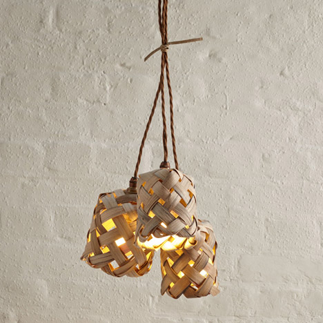
Cox’s latest collection was produced in collaboration with Lorna Singleton, one of the last practitioners of a traditional British woodworking technique known as swilling.
Commissioned by the New Craftsmen, a shop in London dedicated to selling craft products, the furniture is made out of oak that has been boiled and cleft to a thickness of two or three millimetres. These strips, known as swill, are softened by soaking and then woven into a lattice in a method that is unique to Cumbria, an area in the north of England.
“I was asked to mentor Lorna by the National Coppice Federation. I hadn’t heard of swill before, and she came down from Cumbria on the train with a bundle of swill,” explained Cox.
“To see a piece of wood that could be wrapped around your finger, and hold many kilograms of weight at only millimetres thickness, I was in awe.”
Read the edited transcript from our interview with Sebastian Cox:
Ross Bryant: Why do you think consumers are interested in craft?
Sebastian Cox: Simplistically speaking, I think that craft represents engagement with objects and materials. Many of the environmental problems we face come from the fact that people dispose of things sooner than they should. Anything that can engage people with the things they own more, and postpone that disposal is important. Added to which, as Homo sapiens we’re all makers. One of the things that unite us is our ability to make. So if we can develop a product that possesses subtle evidence of craft, then I believe it resonates with a customer’s primitive maker urges. As a result the customer will enjoy that thing all the more, and everyone has enjoyed keeping it out of a landfill for longer.
Chestnut & Ash range by Sebastian Cox for Benchmark
Ross Bryant: How are you trying to change the way we maintain and use the British woodlands?
Sebastian Cox: I want to use good design to give our trees an economic value.
We have 2.8 million acres of unmanaged woodland in the UK, which is a hugely undervalued resource, right on our doorstep. We shouldn’t rely on government subsidies to keep woodlands managed; we should turn that timber into a desirable commodity and make woodland management good business.
In order to for this to happen, we need a small shift in perspective from consumers, which I’m sure is entirely possible. I’m trying to show people how beautiful and exciting our native hardwoods are; they might not be all the same colour and have uniform grain patterns, but that’s part of the charm.
People have started to accept misshapen fruit or vegetables, and started to ask the supermarkets to offer more British-grown produce, and I believe people will gladly begin to do the same with their wooden objects too. I want to make this transition in consumer behaviour as appealing as possible with beautifully designed and made things.
Shake Cabinet in the Chestnut & Ash collection, by Sebastian Cox for Benchmark
Ross Bryant: Is this a sustainable model that could be implemented on a much larger scale?
Sebastian Cox: We harvest hazel from a small, overstood wood in Kent. We do it on a very small scale, but the impact in that wood is already measurable; there’s noticeably more wildlife there.
With my Chestnut and Ash range I developed with Benchmark, we found a business that coppices on a much larger scale for the fencing industry. It’s the most astonishingly efficient company that creates an incredibly healthy and diverse habitat of 900 acres, while making and selling 11 linear km of fencing in a week. Coppicing can be scaled up, and the more you coppice a stool (the stump and root system of a tree), the straighter and more consistent the crop will grow. It’s an ancient process that’s ideal for modern efficient resource procurement.
Hewn Trestle from Sebastian Cox’ Underwood collection at London Design Festival 2014
Ross Bryant: What is the future for craft and makers in the design industry? Can products be mass-produced and affordable for the mass market?
Sebastian Cox: Coppiced products can be made for the mass-market. It’s a self-replenishing material that grows quickly, abundantly, and in every county in the UK. It’s always been really important to me to be imaginative with the manufacturing process to keep the costs down as much as possible. Within my business, and the work we’ve been doing with Benchmark, we’re getting better and I have no doubt that with enough scale we could make more democratic products.
In the UK we have a good amount of timber growing that has little economic value. We import 90 per cent of the timber we use, and much of our forests are un-harvested, or ‘overstood’ meaning they are turning a little wild.
Last year the State Of Nature report told us that since the Second World War woodland cover in the UK has gone up, yet biodiversity has gone down. We need to get used to the idea that the sound of chainsaw in a British wood is mostly a good thing, and we need to see value in those not-so-straight, not-so-perfect trees.
One of the things that I’m trying to overcome is the idea that timber is only useful in wide, straight, uniform boards. Most of our standing timber hasn’t been grown like that, so we need to re-think our manufacturing processes and or re-think our values around timber.
Crown Candelabra from Sebastian Cox’ Underwood collection at London Design Festival 2014
Ross Bryant: Is the craft revival a British phenomenon?
Sebastian Cox: It’s difficult to comment on what’s happening internationally. We have a really deep and rich heritage of rural crafts in the UK, and I’m sure many of them cross-pollinate with other countries. For example, I think that the recent increase in interest in green wood spoon carving has been helped by the affordability of Swedish carving knives and axes. I’m sure spoon carving is just as popular over there and so I would presume that there are pockets of interest in green woodworking springing up in much of Europe and the US.
Ross Bryant: Can you explain what swilling means?
Sebastian Cox: Swill is cleft, boiled oak. Cleaving is the controlled splitting of a piece of wood along its grain and swill is cleft with a knife down to an incredible 2-3mm in thickness. Because the material is cleft it is exceptionally strong for its relative thickness, as opposed to sawn strips of timber, the fibres of the tree follow the entire length of the piece of swill, making it more like rope than wood. Another fantastic property of this amazing material is that it can be bent into tight curves, because the boiling softens it so much.
With the products we developed in the Swill collection I wanted to exploit the properties as much as possible. For example when we weave a bench, the swill is fed through the ash frame and doubled back around the top bar before being folded back on itself again into the sub-frame. We then weave swill tightly in the opposite direction to keep the whole thing under tension. When we finish the benches they are so tight they almost have a drum sound.
Mopstick Ladder from Sebastian Cox’ Underwood collection at London Design Festival 2014
Ross Bryant: Can you tell us the story of how you came to work with Lorna Singleton?
Sebastian Cox: I was asked to mentor Lorna by the National Coppice Federation. I hadn’t heard of swill before, and she came down from Cumbria on the train with a bundle of swill. The material and her skill captivated me.
Essentially, my way of designing involves exploring the properties of a material at the workbench, and then finding an appropriate contemporary application for that material or technique. So to see a piece of wood that could be wrapped around your finger, and hold many kilograms of weight at only 3mm thickness, I was in awe.
Before coming down to London, Lorna asked me if I had anywhere to soak her swill, ‘Ideally a river, although that’s probably not possible’. I said that I was sure we could find somewhere, not revealing just yet that my workshop looks out onto the river Thames at Woolwich, where the river is a little less than half a mile wide. I did wonder if we were the first people to soak swill in the Thames?
Hewn Tea Table from Sebastian Cox’ Underwood collection at London Design Festival 2014
Ross Bryant: Can you briefly talk about the history of the swilling technique?
Sebastian Cox: Original swill baskets were utility baskets, found only in Cumbria. They were used for everything from carrying coal to food, and were strong and versatile. I suppose in some ways it was the vernacular basket of the North West, much like the Sussex Trug in the South East. It’s thought that the word swill comes from when cockle-pickers used the swill baskets to “swill” around the silty water.
The woodland around the Lake District is rocky and harsh, making it ideal growing conditions for oak, which is why that is the timber of choice for the baskets. There’s something very appealing about the way those baskets are made, which links directly to the climate and geological conditions of the area.
Simply, the production of swill baskets declined rapidly following the Second World War because other materials, like plastic, could be produced more quickly and cheaply. So as with many things, the craft was lost. This is the case with so many other rural crafts.
Swill collection by Sebastian Cox and Lorna Singleton
Ross Bryant: Why are you so keen to revive older crafts?
Sebastian Cox: I think we can learn so much from traditional craft techniques and materials. I’m not being sentimental, or nostalgic and sad, about the idea that these skills will be lost if not passed on. I get excited about the prospect of finding a new –to me, or to contemporary design – set of materials or techniques to learn and draw inspiration from. I believe in looking both forwards and backwards at once. We can learn so much from the past that is useful to take forward, especially when thinking about a sustainable future.


 By Tara Mastroeni in Best Of


 Swill collection by Sebastian Cox and Lorna Singleton
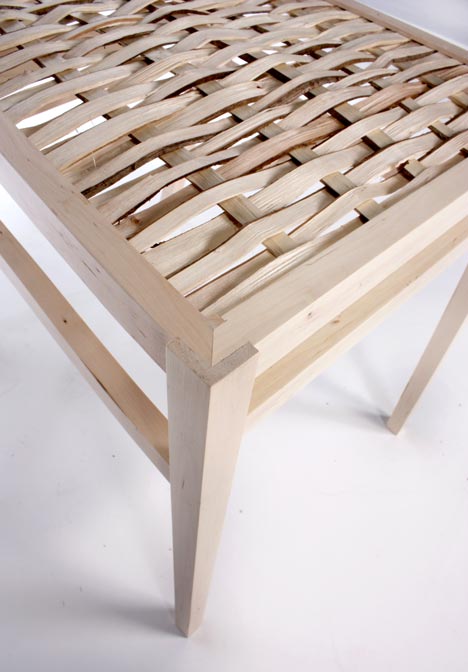 Suent Chair, from Products of Silviculture collection by Sebastian Cox
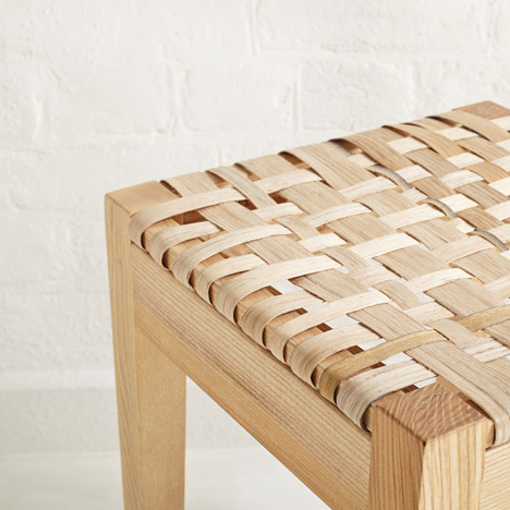 Swill collection by Sebastian Cox and Lorna Singleton
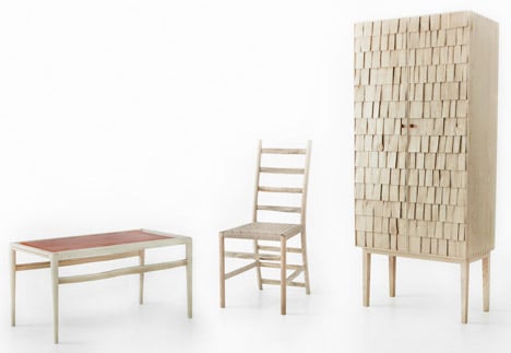 Chestnut & Ash range by Sebastian Cox for Benchmark
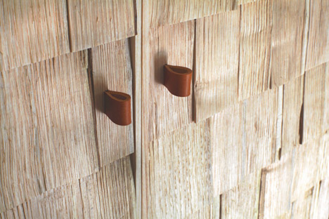 Shake Cabinet in the Chestnut & Ash collection, by Sebastian Cox for Benchmark
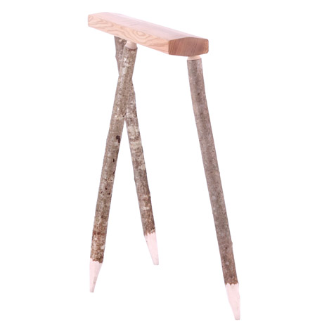 Hewn Trestle from Sebastian Cox’ Underwood collection at London Design Festival 2014
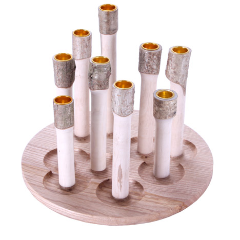 Crown Candelabra from Sebastian Cox’ Underwood collection at London Design Festival 2014
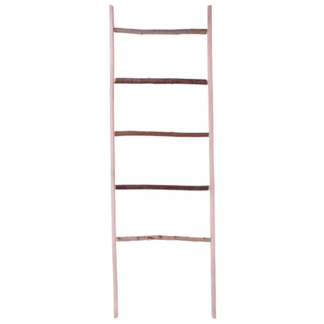 Mopstick Ladder from Sebastian Cox’ Underwood collection at London Design Festival 2014
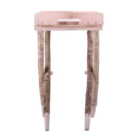 Hewn Tea Table from Sebastian Cox’ Underwood collection at London Design Festival 2014
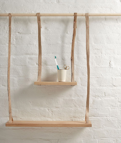 Swill collection by Sebastian Cox and Lorna Singleton


