I love the color peach in interiors. It has such a romantic feel and it’s flattering to most skin tones, without going twee as many pinks can – especially pale tones.

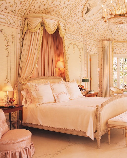
One of my favorite bedrooms was this pale pinky/peach one that I did a few years ago. The wall was painted peach with a pink wash overtop, which added a very pleasing depth (hard to capture in a photo). One of the things I most love about peach is that it works with so many other colors that it’s almost a neutral.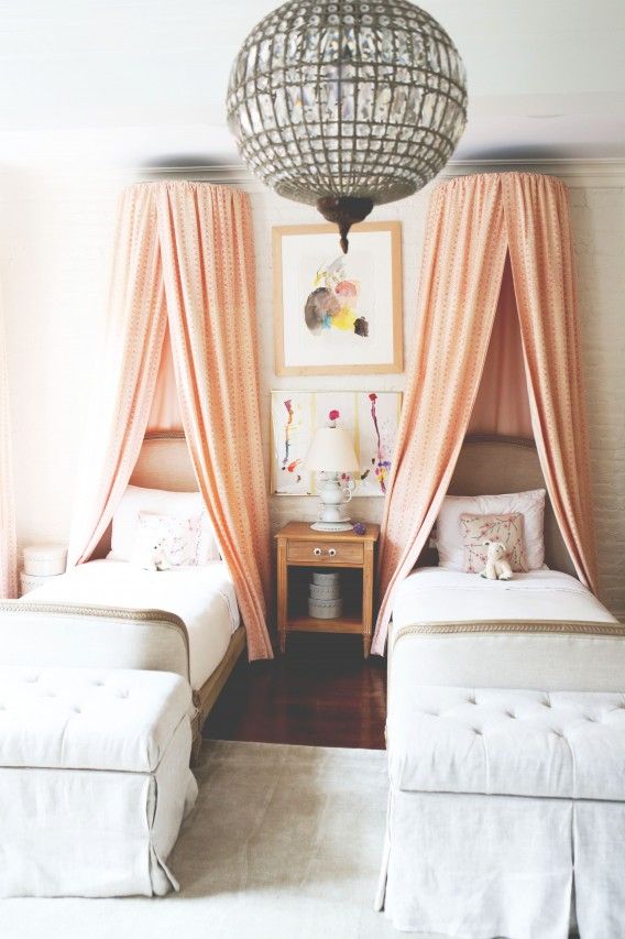
Soft whites and grays mixed with the peach canopy drapes has an easy feel that’s very romantic.
Peach can be filled with life.
It can be kind of casual/bohemian in feel
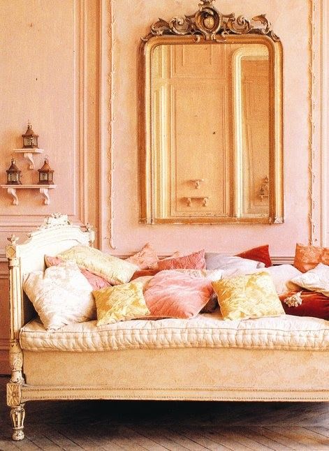
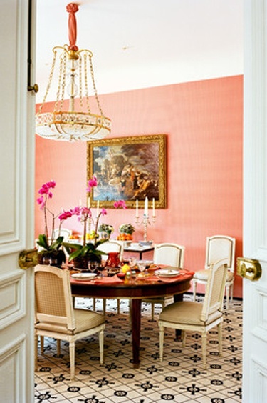
Or super formal.
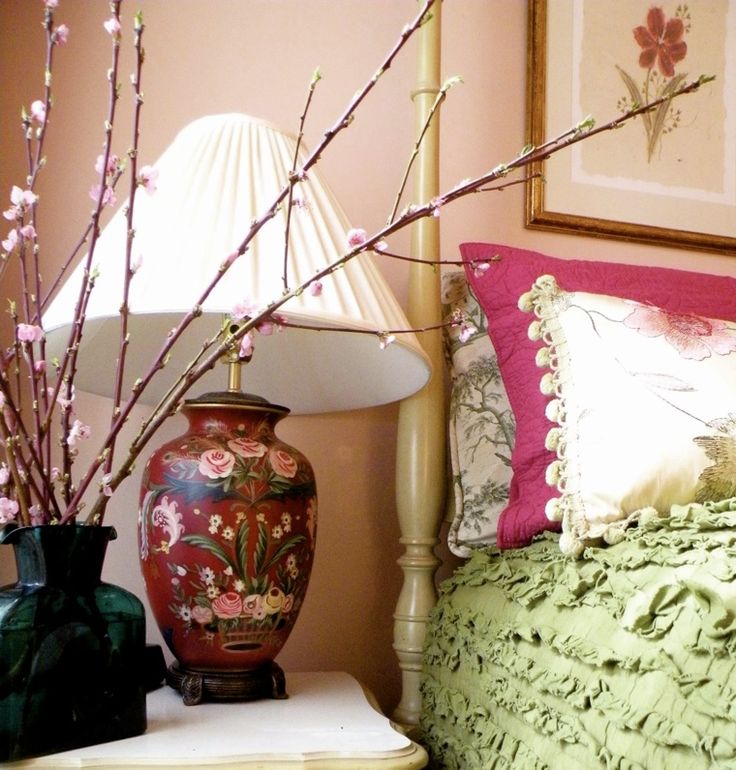
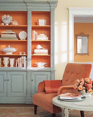
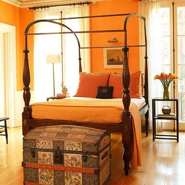
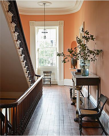 It can add warmth to very traditional architectural elements.
And it pairs well with black accents (above and below)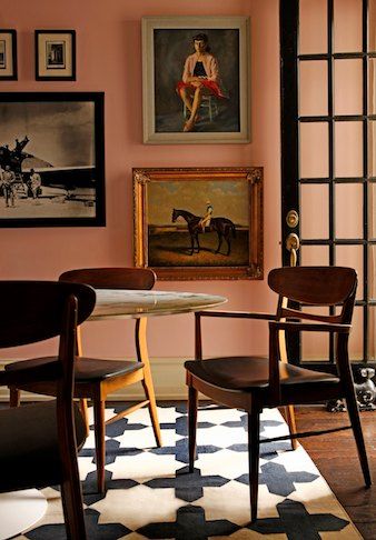
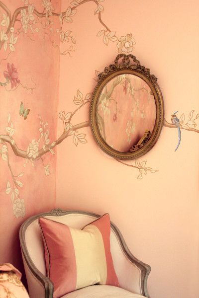
It’s funny though, when we think of peach, we usually think of these paler tones as shown above. (or at least I do).
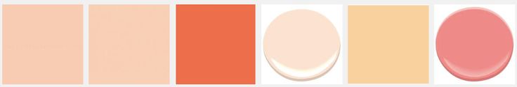
When I google searched on peach paints by Benjamin Moore, these above were the top results. In this grouping, we’re seeing a broader range of hues including pale pinks, yellows and a nearly pumpkin color. When we look at a real peach and really take in the range of colors, the pale peach is less prominent that are the yellows and deeper tones.
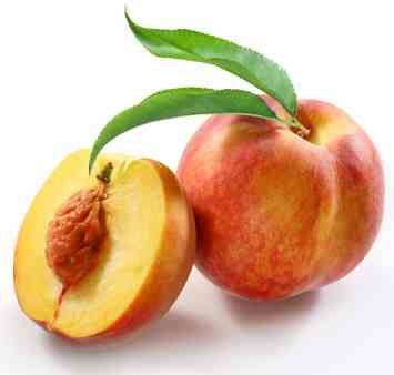
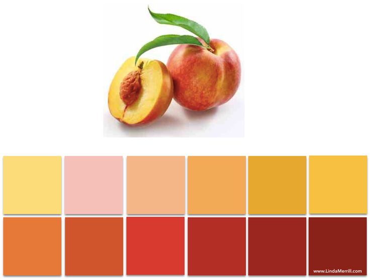
I took the image of the peaches shown above and selected on the color ranges found. It’s a beautiful and wide range of colors, isn’t it? And only one (top row, 3rd from left) is actually a soft peach as found in most “peach” colored rooms.
So, the question I have is, if you see this image:
Do you call it peach, or is it orange?
Or coral. Or terra-cotta?

If you’re looking to create the home of your dreams, contact me to discuss the possibilities! ![]()
::Surroundings::

")


