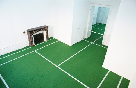
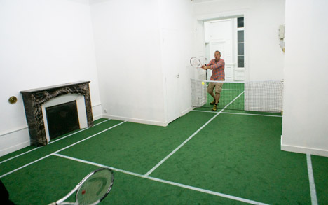
French artist Benedetto Bufalino has created a tennis court over two rooms of a gallery in Dijon, complete with fake grass, white lines and a net across the doorway .
Benedetto Bufalino’s installation at the Interface Gallery, intended to “rethink indoor tennis”, encourages visitors to the gallery to participate in an unconventional game.
Related story: Two-handled tennis racket spotted at the U.S. Open
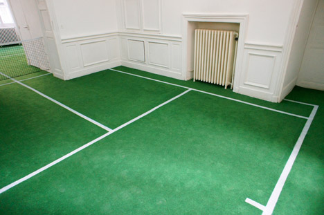
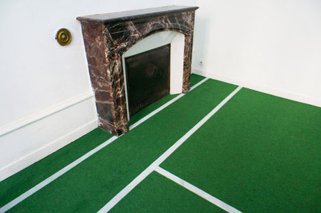
Interface is housed in a former apartment in the French city of Dijon. It retains the original layout of small rooms and features including fireplaces, cornicing and mouldings.
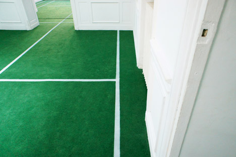
Within this setting, Bufalino has carpeted two adjoining spaces with artificial grass and strung a net between the white-painted walls either side of the doorway that connects the two spaces.
White fault lines and service boxes are marked out on the floor, creating an oddly shaped court for two people to play a restricted game of tennis on.
“Visitors are invited to pick up a racket and strike up a match with an opponent occupying space on the other end of a door frame,” said Bufalino.
Walls protruding into the space, domestic fittings and architectural features all provide extra obstacles on top of the restricted net width.
“Players must find a way to carefully manipulate themselves and the tennis ball throughout the space, paying special attention to domestic objects strewn about, like radiators and windows,” said the Lyon-based artist, who has previously turned a Seat Ibiza car into a Jacuzzi and a British K6 telephone box into a fish tank.
The installation is open until 31 October at the Interface Gallery, which was set up in 1995 on Dijon’s Rue Chancelier de l’Hôpital as an experimental arts space.
Suivons Pierre B, en mode reporter pour BED du côté de Courtrai pour un évènement maintenant incontournable…
Après 1h30 de transports depuis Paris, me voilà arrivé à l’espace expo de la Biennale Intérieur de Courtrai près à découvrir de nouveaux produits et à explorer les différents lieux de cet événement.
J’avais pu assister aux précédentes éditions et il est plaisant de voir que le salon grandit et évolue, tant dans sa communication, que par la qualité des produits et scénographies présentées.
Stand DH PH – Biennale interieur Croutrai 2014 (voir détails plus bas)
Une fois mon pass en main, il m’a fallu quelques mètres pour avoir mon premier coup de cœur avec les suspensions acoustiques d’Acoshape dessinées par BASHIR. Des suspensions aux textures et aux couleurs affirmées qui font d’un élément technique servant à canaliser l’écho d’une pièce, un véritable objet de décoration.
Le salon est vaste et dense, 6 halls, remplis de stands de près de 300 maisons d’éditions, des éditeurs prestigieux, mais aussi des designers émergents, ce qui permet d’accéder à plein de découvertes, et de produits nouveaux, un vrai plaisir à voir. Les traditionnelles maisons d’éditions y sont présentes, mais de nouveaux noms apparaissent, et détonnent dans le paysage actuel. On y trouve ce qui se fait de mieux actuellement sur la scène du design belge et à l’international.
Sur l’expo, j’ai surtout apprécié l’espace dédié à la créatrice bruxelloise Marina Bautier, élue designer de l’année en Belgique, le concept des espaces de restauration réfléchis comme de véritables scénographies, ainsi que l’exposition des lauréats des huit dernières années du prix du Designer de l’année, une très belle rétrospective. J’ai aussi eu quelques coups de cœurs (A voir ci-dessous dans l’article).
Marina Bautier :
Concept des espaces de restauration :
Rétrospective :
Après avoir visité le salon je me suis rendu avec l’aide des nombreuses navettes mises à dispositions vers le centre de Courtrai afin de voir les nombreux lieux d’expositions situés dans le quartier de Buda Island. Les travaux d’étudiants, de designers résidents ou de designers émergents sont présentés dans la Buda Factory.
J’y ai particulièrement apprécié les pièces du Fusions Bar dessinées par Lukas Wegwerth and Wendelin Kammermeier, des designers berlinois ainsi que les pièces d’Aurel Studio, un designer du Nord de la france.
La Buda Gallery présente le travail de designers comme Jeamichel Tarallo dont nous avons présentés le travail sur le blog. Enfin, j’ai aimé la présentation In situ des produits de l’exposition Mad about Living, à lécole de Broel.
Comme évoqué plus haut, voici Mes 10 coups de cœurs sur l’ensemble de l’évènement:
La totalité du stand DH PH pour la finesse dans la recherche des matériaux, la qualité de la présentation et l’impact produit par les objets présentés.
Le système d’assemblage de mobilier Handbend, un système de découpe laser qui permet de plier des profilés métalliques, des pièces de bois ou de verre. L’objet est livré au client à plat, il devra ensuite plier lui-même les pièces et effectuer l’assemblage. Une solution astucieuse, et une très bonne utilisation de la découpe laser.
La lampe Svampe et le geridon Nested d’Alice Viallet, assurément une designer à suivre de près.
Le travail et les illustrations de Julie Richoz, présentés dans le cadre de l’exposition Rise and Shine des diplômés de l’Ecal
Les différents produits présentés par Lucie Koldova notamment la lampe Bella, les contenants Double bowl, et le fauteuil Corques
Les œuvres en céramique de Jeanne Opgenhaffen et Ann Van Hoeypour la Puls Gallery
Le lustre en chaine de vélo de Lolo Palazzo
Les mobiliers de Muller Van Severen pour la galerie Valerie Traan
Les assises Offshore la marque Sixinch pour la simplicité du dessin, le minimalisme des formes et la gamme des couleurs choisies.
La Biennale Intérieur mêle habilement travaux d’étudiants, petites maisons d’éditions, maison d’éditions reconnues, scénographies, designers émergents ou reconnus, dans un ensemble très cohérent avec une sélection pointue et plaisante. De ce salon, je retiendrais l’accueil (facilité d’accès, gentillesse et accessibilité du personnel et convivialité), la qualité des scénographies, ainsi que la sélection des différents exposants.
En résumé, la Biennale Intérieur est un très beau salon à 2 pas de Paris qui présente un mobilier innovant et des créations avant-gardiste qui s’inscrit de plus en plus comme un évènement à ne pas manquer.
Plus d’informations sur l’évènement : Biennale Intérieur
By Blog Esprit Design
The post Retour sur la Biennale Intérieur de Courtrai 2014
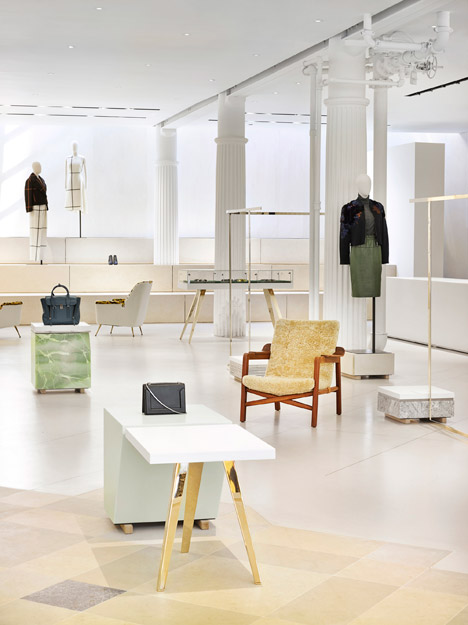
An assortment of mint-toned marble display plinths and golden garment rails are scattered across a poured-concrete floor in fashion designer Phillip Lim’s New York store, by Campaign.
Campaign designed the 3.1 Phillip Lim flagship store on Great Jones Street in Manhattan’s NoHo district. It is the fourth interior the British design studio has created for the clothing brand.
Related story: 3.1 Phillip Lim Seoul Flagship by Leong Leong
The Hackney-based studio collaborated with Lim to produce the store design, which combines high-end materials with more modest mainstays of construction – MDF, plywood and plasterboard.
“The design of the flagship boutique brings together contradictory materials, mixing the luxurious with the humble in unexpected ways,” said the design team, who has also created an experimental perfumery for Selfridges.
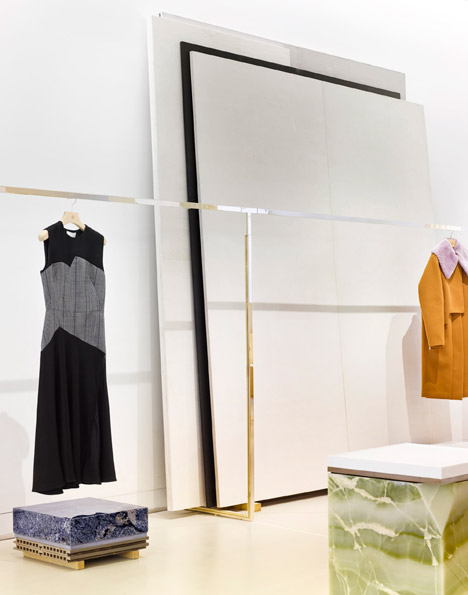
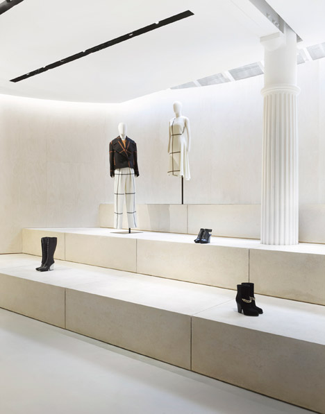
Plinths and tables, dotted across the 325-square-metre poured-concrete floor, display the brand’s menswear, womenswear and accessory lines. The plinth bases are finished in marble and onyx with white Corian or tiled tops, while tables have champagne-gold legs.
“Plinths to display accessories make playful use of utilitarian materials with ordinary floor tiles stacked high, and interspersed with pieces of glass giving a glint of blue,” said the Campaign design team.
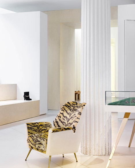
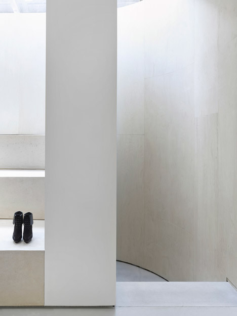
Single items of clothing are hung from gold-coloured garment rails positioned between white fluted columns that run in a line through the centre of the shop. Industrial pipework around one of the pillars has been whitewashed, incorporating it into the design.
“Collections are displayed on bespoke designed fittings echoing the casual elegance of the brand,” said the designers.
Further hanging rails line either side of the shop-floor, with stacks of large pastel-toned canvases lent against the walls behind them.
Armchairs and foot stools with brightly-patterned and heavily textured seat covers are balanced by refined wooden frames or white exteriors.
Three oversized stone steps along the back wall of the store create a display area for shoes and accessories. The steps run into a white curved plywood wall that sweeps around the rear of the store.
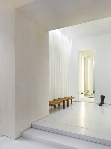
To the right of the steps, a bay with changing rooms is housed in a “minimalist architectural block” with white drapes, wooden furniture and concrete floors.
Towards the entrance of the store, the poured-concrete floor transitions to a chequered design of grey limestone and blue marble tiles.
“Inlaid brass strips mark out the pattern and add a note of classical refinement,” said the designers.
Other Phillip Lim store interiors have been designed by Japanese studio Schemata Architects, who added dizzying mirrored surfaces, and New York office Leong Leong, who created a spiky interior.
Photography is by Scottie Cameron.
Project credits:
Design team: Philip Handford, Steve Wynne, Dan Wilson Project architect: OLA Main contractor: Fulton Landing Inc Services engineer: Grant Engineering Lighting consultant: ZeroLUX
There are a lot of reasons to use neutrals in your interior design. image Source: James Thomas
Do you think neutral colors are boring? We are going to debunk the myth that bold is better. Of course, there is always room for pops of color in your life, but there are a lot of good reasons to stick with a neutral color scheme for your interior design.
Neutral colors don’t have to be boring! In fact, a calm, neutral backdrop allows you to bring out some pretty bold elements into your design that may otherwise look garish. So, put down that can of red paint, at least for a moment, and read this first…
Here are the top reasons to stick with a simpler, more neutral tone-on-tone color scheme for your home interior:
You will never grow tired of neutral colors, and you can liven it up with textiles such as the zebra club chairs in this photo. Image Source: Thompson Custom Homes
Neutral Colors Show Off Furnishings and Textures
The textural elements of a room often get over looked. Interior designers are schooled and excel at this textural design secret— a neutral backdrop creates a welcoming interior when mixed with warm textures such as rough hewn wooden elements, shiny tiles, nubby linens, and brushed velvets.
If walls are painted in a bright orange, for example, then the bold color takes center-stage, making any textural elements disappear into the backdrop. This is not necessarily a bad thing, when done properly, but it can make a room feel unwelcoming by omitting a layered, textural design.
Simply put, layering textiles is the key to creating a warm, well-designed space, and neutral colors allow you to create this space more easily. Scandinavians have had this design style down-pat for centuries.
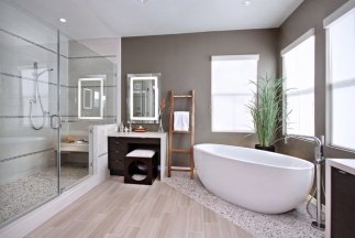
Look to the bathroom in the image below— the neutral color scheme allows the modern tub, shiny tiles, rustic wooden ladder, and modern dark wood vanity to come to the forefront and tell the story of the room design.
With a neutral backdrop, this bathroom shows off its modern tub, textural tiles and wood flooring. Image Source: I Custom Designs
Never Grow Tired Of Neutral
Have you ever painted a room in a bold, bodacious color? If you did, how long did it take for you to pick up the paint brush again, covering the once-loved color with something more calm? Another example of bold-gone-wrong— the bright red couch that you thought you just had to have. Fast-forward three years later—yeah, you are pretty sick of it now aren’t you?
This is the best feature of neutral colors—you will never grow tired of them. Neutral will always be a classic. If the mood strikes and you decide you need some vibrant hues in your life, then you simply add a few inexpensive pillows in a bold color, or buy a beautiful bouquet of bright flowers.
Think of a neutral color scheme as an investment, allowing you to avoid buyers remorse and ensuring an interior design that will never grow old.
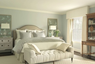
The bedroom in the image below is a perfect example of neutral done right. Imagine this bedroom with bold walls…it certainly wouldn’t be the same calming bedroom retreat that it is now.
Neutral colors are very calming and are perfect for a bedroom retreat. Image Source: Amy Studebaker
Neutral Colors Offer Colorful Opportunities
We hear you. You want a unique interior that speaks to your vibrant personality, so you think a neutral home wouldn’t work for you, right? Wrong!
This is all the more reason that you should choose a neutral backdrop for your interior. With a neutral background, your personal tastes can come to the forefront, allowing you to show-off all your cool design choices and personal style.
There is a reason designers commonly choose neutral walls, especially in modern interiors, it allows the lines of high-quality furniture and the architecture of a room to come alive and be noticed. Look at the bold black-and-white chevron cushions in the image below— they work because the backdrop is neutral and they certainly show-off a bold personal style.
Also, the architectural elements in this photo come alive thanks to a calmer color scheme. The wooden wall and vaulted ceiling would have been lost within a bolder backdrop.
A neutral backdrop and neutral couch allow the bold chevron to take center stage. Image Source: Johnson Mcleod
Neutral Works For Any Style
We have already touched upon why neutral is best for modern interiors, but here is the great thing about neutral colors—they literally work with any style! Whether you are modern, traditional, eclectic, or love rustic country charm— a neutral backdrop is ideal for you.
Home stager, Barb Schwarz, notes that white and grey neutral walls (which are very popular right now) allow a room to seem larger, more airy, clean and welcoming.
She adds that these neutral colors work with any style or range of taste, allowing prospective home buyers to envision their own furnishings in the space.
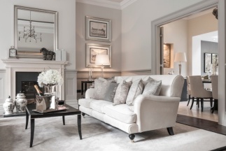
The living room in the image below certainly attests to that statement. The grey-on-grey color scheme is anything but cold. The room appears very clean, welcoming, well-designed and warm!
Regardless of style, neutral works with everything. Image Source: AJI
So there you have it, neutral color schemes are the ideal choice for any interior style statement. Use neutral colors in your home to ensure that you never grow tired of your design choices, thereby creating a classic home that never gets old.
Neutral colors are also great options for modern interiors, allowing the architectural elements of your design to take center-stage. Plus, if you get bored of your neutral backdrop, then you simply add a few inexpensive, brightly-colored cushions. Proving, that neutral is anything but boring, rather it is for the savvy home designer that loves keeping their options open.
What is your favorite neutral color scheme and why do you love it?
Recommended For You
10 Ways to Achieve a Gender Neutral Kid’s Room
How to Add Depth to your Interiors with Accent Color
How to Choose a Complementing Color Palette for your Home
How to Design your Room Decor around your Bold Area Rug
10 Ways to Change your Space with Tone on Tone Color
4 Ways the Color Greige Will Make you Rethink Neutrals
Hi everyone! Today I’m excited to share another project I’m working on in my local community. Long time readers know over the years we’ve donated our time and raised money for our local charity of choice, the Committee on the Shelterless (COTS) and we’re at it again this fall. Years ago we dubbed our efforts the “Alma Project” after the first house we adopted and the name stuck.
COTS has helped thousands get back under a roof of their own and provides almost 350 beds every night. The kitchen serves over 124,000 meals a year and delivers over 750,000 pounds of food annually, and the award-winning program has helped thousands to rebuild their lives.
The latest project is one for a community Work Clothes Closet/Store to help complete the Work Ready training program. Once the clients in the program are trained in a trade, skill, or service, the new COTS Work Clothes Closet will provide them with clothing to reenter the workforce.
The project received some local press a few weeks ago…
It’s hard to read so here are the important points…
Training and attire are the biggest self confidence boosters for people reentering the workforce but purchasing clothing is beyond the income level of COTS clients. The Work Clothes Closet is the latest space transformation I’m working on with a team, it will provide not just professional attire for men and women, but trade clothing too (chefs, construction, etc.).
A local commercial property owner generously donated downtown space to serve as the Work Clothes Closet and house the attire for the program. No money will change hands, this store is run on donations, and by the COTS volunteers, and the good will of the people !
Here’s a peek at one corner of the space when we started a few weeks ago, it’s 2,200 square feet so there is much to do including building two dressing rooms, painting the ceiling, walls, and floors, and constructing garment racks, shelves, and display cases.
A local volunteer contractor has already prepped the sheet rocked walls with topping compound so we’re ready for the next step which is primer and paint on the walls (pale gray) and a porch and floor paint for the cement floors (navy blue).
We’re going with an industrial style for the space, working with the exposed pipes and incorporating garment racks and rustic shelves in that style, like these.
Thus far, Lowe’s has donated building supplies for garment racks and shelves. Thank you Lowes ! Glidden is donating paint for the walls, ceilings, and cement floors. Thank you Glidden!
World Market is donating gift cards to purchase light fixtures, scarves, and jewelry, we’re excited to pull this space together!
If you’re a brand or store, large or small, that would like to contribute email me at centsationalgirl[at]gmail.com. This Work Clothes Closet project is an unfundedCOTS project that relies on donations and volunteers so if you’d like to help out we’d appreciate it!
What we need is LABOR, so if you’re local, you can come on by this Saturday between 11 and 4 to help paint that would be wonderful but note you need to fill out a quick application first (screening required) and email me to let me know you’re coming at centsationalgirl[at]gmail.com so I can share the downtown Petaluma address.
If you’re handy with power tools, we will be building garment racks and shelving these two weekends: Nov 15th and Dec 6th so we could use help with those projects too.
We have no need for clothing right now, we have garment donations, and we’re relying on some local vendors for trade clothing and boots. We do need to raise money to build the partitions to create two dressing rooms so if you’re inclined, donate an amount to the Alma Project via the PayPal button below, or you can or send a check via snailmail to my PO Box made out to “The Alma Project”.
We’re planning on a December Open House so I’ll take pictures of all the projects and share the big reveal then ! ..


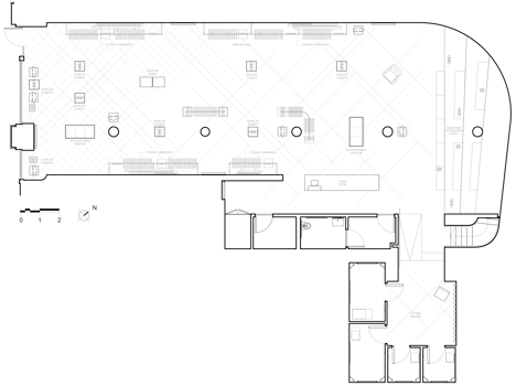 Floor plan –


 10 Ways to Achieve a Gender Neutral Kid’s Room
 How to Add Depth to your Interiors with Accent Color
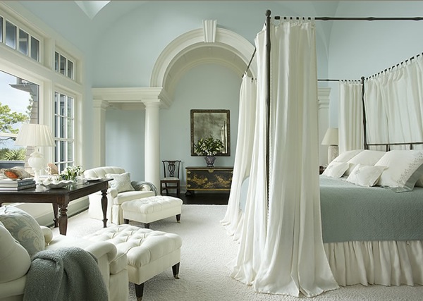 How to Choose a Complementing Color Palette for your Home
 How to Design your Room Decor around your Bold Area Rug
 10 Ways to Change your Space with Tone on Tone Color
 4 Ways the Color Greige Will Make you Rethink Neutrals


