En écho à la présentation de La chaise à whisky, le designer anglais Gareth Neal revient sur BED afin de nous présenter sa création baptisée Hamylin Chair, reposant une nouvelle fois sur l’association cuir x bois et savoir-faire traditionnel anglais.
«I wanted to design a piece that could capture the raw beauty of leather in its natural state and build on from the language of the Brodgar Chair.«
Chêne et cuir fumé, l’assise de bois et dossier de cuir demandent de nombreux mois de délicates et soigneuses étapes de conception.
«The lengthy & environmentally friendly process is key to the quality of the leather, and has been brought to life in the photographs of Joss McKinley who visited the tannery in 2013. His pictures below capture the 12 month journey of the leather which comes in as raw hide, is stripped of its hair, then submerged in numerous tanning pits for three months before being lain flat in deeper pits for a further 9 months to complete the gentle and irreversible process.«
Il explique le véritable «voyage» du cuir, travaillé pendant plus de 12 mois avant de pouvoir être utilisé !
Réalisée en collaboration avec Bill Amberg Studios, fabricant de meuble et peut-être la dernière tannerie traditionnelle de la famille Baker en Angleterre.
Pièce disponible à la vente : thenewcraftsmen
Plus d’informations sur le designer : Gareth Neal (Retrouver ses articles)
By Blog Esprit Design
The post Hamylin Chair la chaise de cuir par Gareth Neal
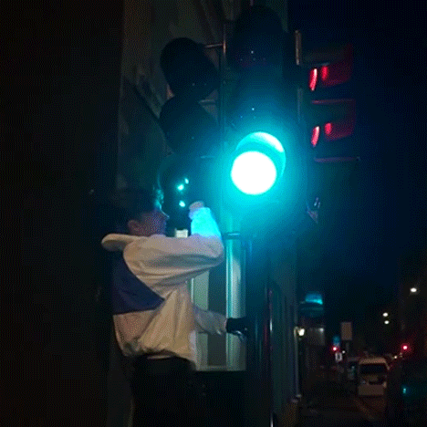
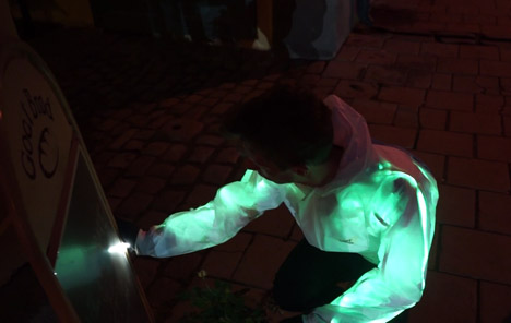
This jacket by Oslo studio Drap og Design illuminates to imitate the colours of whatever the wearer is touching (+ movie).
The Interacket was created to mimic a chameleon’s colour-changing ability by four Norwegian designers who set up their studio Drap og Design after graduating from the Oslo School of Architecture and Design.
Related story: “Technology is going to turn the entire fashion industry inside out”
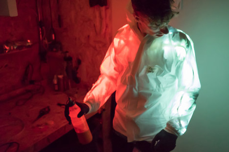
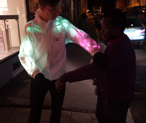
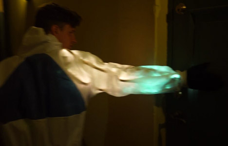
LEDs embedded into the jacket light up when the wearer places their hand on an object and display a similar colour to that of the object or surface being touched.
“Interacket started off as an exploration in how a range of animals interact with their surroundings, as well as how they are seen by it,” said Drap og Design co-founder Jan Anders Ekroll. “In the beginning we looked at animals as different as bats, squid and platypus, and researched how to mimic their unique qualities using electronics and wearables.”
Finally settling on the chameleon, the studio designed the garment to replicate its surroundings in a similar way to the colour-changing reptile.
“We studied the patterns of change as well as natural movement in order to find the right speed and direction of the colour adaptation,” said Ekroll. “With this in place we began working with the layers of material we needed to achieve the diffuse appearance needed in order to make the LED strips work.”
The lights are embedded between a bottom layer of reflective heat foil, commonly used for emergency blankets, and a translucent protective painter’s overall on top.
Colour sensors held in each hand are wired to Arduinos – computer microcontrollers that can be programmed to perform specific functions – which control the colours of the LED strips using open-source code available from digital library Adafruit.
“Since we are designers rather than coders, we rely on the open-source community to get started in the direction we want to,” Ekroll said.
Two Arduinos were used because the designers “simply couldn’t figure out how to make do with one in the time-frame”, and together they allow the opposite sides of the jacket to show different colours at the same time.
Drap og Design has made the designs for the garment available online, so anyone can build their own.
Le studio italien Dossofiorito, composé de Livia Rossi et Gianluca Giabardo nous présentent Lightscape, véritable suspension modulable !
«The act of seeing, as a creative action and as an interpretation of perceived reality, is the conceptual foundation from where this project is born.
The Lightscape lamp is a physical interpretation of our experience of recall. Three colours as a material synthesis of a precise moment that is light, space, and time. A moment to look back on, as it is stamped in our mind, by way of a lamp that offers again the visual perception of our lived experiences.«
Tel une interprétation de paysage par la couleur, le duo de designers vous proposent par trois demi-cylindres de verres colorés imbriqués de dessiner la lumière de votre choix, chaque éléments pouvant coulisser l’un dans l’autre.
«A minimal landscape of light, given by the sum of three glass cylinders in colours of choice, is allowing us to see and experience again the brightness of a specific situation. A landscape is recreated in light, memory is fixed in colour for the time to come: thanks to a wide available choice of tones the lamp transforms the landscape in a personal interpretation.«
Plus d’informations sur le studio : Dossofiorito
By Blog Esprit Design
The post Suspension Lightscape par le studio Dossofiorito
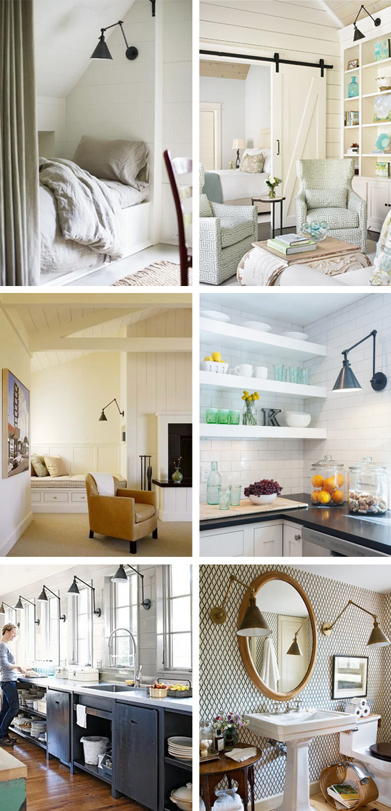
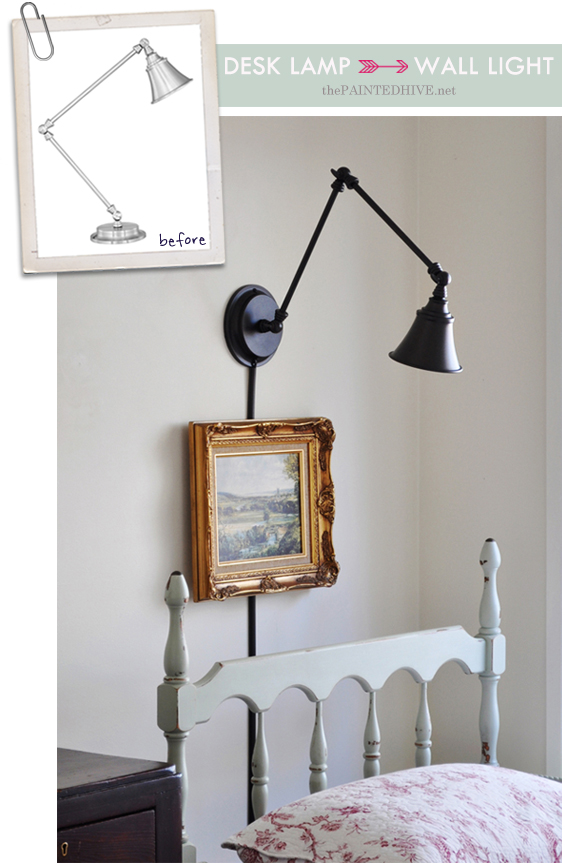
I’ve coveted adjustable arm wall lights from the first moment I saw one.
1 | 2 | 3 | 4 | 5 | 6
To me there’s just something so desirable about their sculptural form and subtle industrial edge. That said, I never really envisioned actually using one in my own home.
You see, despite the oft crazy price tag (and down-right unavailability – especially here in Australia, anyways) I’m just a bit too fickle to commit to the permanence of hard-wired wall lights – I simply like the flexibility of everything in a space being easily repositioned (I guess that’s the reason I’m also a fan of free-standing ‘built-ins’, like the one in our home office). I know, I know, it’s not too difficult to reposition sconce lights if required, though with the cost and work involved with installation, I’d simply rather not go to the trouble. Yep, I’m stingy and lazy like that.
So, when it came time to implement my lighting plan for Charlotte’s room I needed to think a bit outside the box.
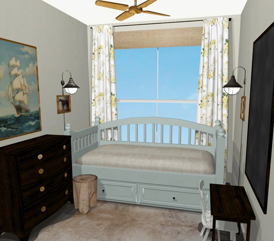
Remember my inspiration rendering from ages ago…
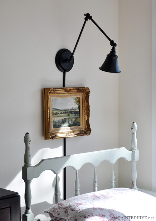
Given the tininess of Charlotte’s room and the position of her bed, I really liked the idea of using sconces in place of a table lamp. My initial plan was to use two. I do still like the symmetry of this though for now have decided to opt for one over the bed head only. As already mentioned however I didn’t want to have to hard-wire it in.
So, I decided there were three main options…
1 Use a plug-in wall lamp. Simple, right? Well, not exactly. I discovered that aside from the IKEA options there are almost NO plug-in wall lamps available here in Australia and certainly none of the adjustable arm variety. Trust me. I looked, and looked and looked, and annoyed people with seemingly perplexing emails and phone calls, and looked and looked, and looked some more. There was the option of having one shipped from overseas though with the cost of postage plonked on top of the cost of the actual lamp it wasn’t gonna be cheap, not to mention the hassle of incompatible electrics.
2 Convert a hard-wired wall light into a plug-in option. Definitely do-able (or so my husband tells me) though I was kinda set on using an adjustable arm wall light and the minimum cost for one of those is around \$250!
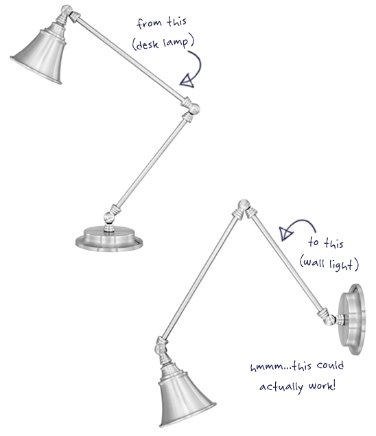
3 Get my décor crazy on and stick a desk lamp to the wall. Sure, why not, hey?
If you follow me on Facebook you might remember a post (from about a year ago now) where I shared some adjustable arm desk lamps which, at the time, were on sale from Wayfair for just \$35 each (it seems they are no longer available through Wayfair though you can buy them from other retailers – here, here, here. You can, of course, also find similar ones).
I know desk lamps like this aren’t anything new though for some reason I immediately associated these particular ones with the swing arm wall lights I’d been crushing on. Sure enough, my head was soon tilted at a right angle (looking at the lamp pic on my screen) and my noggin cogs were turning! Before committing to buy however, rather than trust my imagination alone, I had a bit of a play around with the product pic in Photoshop, manipulating the lamp into something that might actually work on a wall.
You see, although I was planning on simply sticking a desk lamp to the wall, I didn’t really want it to look like I’d just stuck a desk lamp to the wall. I wanted it to look as legit as possible. Luckily, my rough Photoshop renderings convinced me it could work (in fact, I thought it looked just like the real ones!) so I went ahead and made the purchase.
Once the lamp arrived, I played around with the arms in person. I noticed that the beehive style “hinges” restricted the amount of angle I could achieve because they hit each other. Fortunately, this didn’t effect my desired configuration. I also felt the leading arm was a little too long though figured this was just me being overly fussy.
Anyhoo, here’s how the whole (easy and affordable) project went down…
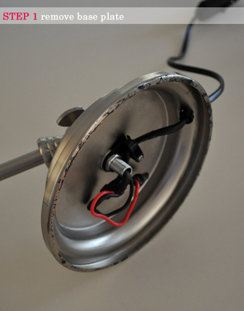
STEP 1 Remove base plate.
Adjustable arm desk lamps come with pretty hefty bases to balance the weight of the angled arms though for my purpose it was just making the whole lamp way too heavy. To remove the base plate, it was simply a matter of pulling off the glued-on cover, undoing a few bolts and nuts then releasing the heavy resin disk.
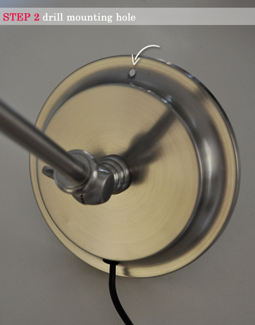
STEP 2 Drill mounting hole.
With the base plate gone the lamp was surprisingly light (like, lighter than a picture frame light) though I still needed to come up with an effective means of attaching it to the wall. After brain-storming a few different ideas I concluded that one long central screw was the simplest and safest method. Sure, this meant there would be a visible screw head though with the slight industrial style of the lamp I decided this wouldn’t bother me. To accommodate the screw I drilled a neat hole in the top of the base opposite the cord. For obvious reasons I did this prior to painting.
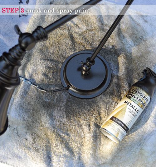
STEP 3 Mask and spray paint.
Ideally, I would have loved an antique brass lamp though they just weren’t available in my stingy price-frame. I contemplated creating a brass finish myself, though decided instead to go with something very neutral and chose Rust-Oleum Oil Rubbed Bronze. I simply taped-off the bulb socket and cord (in hind-sight I didn’t need to tape the cord though) then gave the lamp around three light coats, adjusting the arms as needed to achieve all-over coverage. I thought about doing the whole ‘colour pop’ thing on the inside of the shade (which I do love) though decided to keep things simple. Maybe I’ll hand paint it a sunny yellow or something in the future, maybe.
Of course, the original brushed chrome finish was totally fine, just not in-keeping with the scheme for Charlotte’s room.
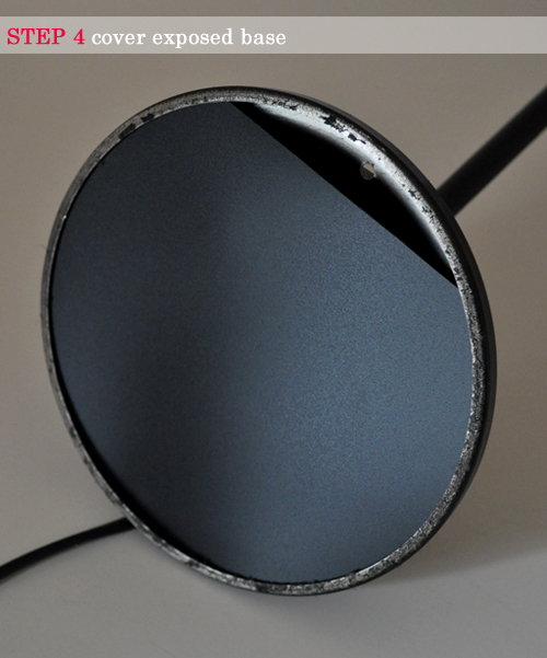
STEP 4 Cover exposed base.
Just to keep things neat and conceal the wires I cut a disk from the front of an old display folder (you know, those flexible plastic ones) and inserted it behind the rim. I also made sure to cut a slot for the impending screw.
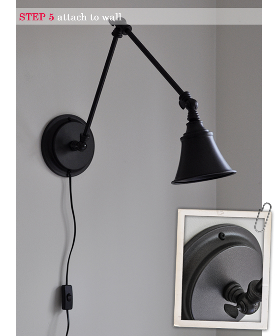
STEP 5 Attach to wall.
As mentioned in Step 2, I decided that once long central screw was the best way to mount the lamp. I was lucky to have an appropriately located wall stud so my lamp is actually anchored in solid timber though given the lightness of the lamp I think a heavy duty plaster plug would also do the trick. To ensure my screw head nestled neatly into the lamp groove, I drilled into the wall on a slight downward angle and used a dome-head screw. My screw was originally black so already matched my lamp though of course you can paint the head any colour to co-ordinate.
STEP 6 Conceal cord and switch.
I knew from the beginning that the visible cord and switch were going to bug me. That said, I think that in the right space the casual nature of the exposed cord can work. I just wanted something a little more ‘finished’. If it doesn’t bother you then you just saved yourself an extra process!
I decided to hide the cord in a narrow concealer made to appear like part of the light itself. I actually quite like this look. I found an adhesive cord cover (D-Line Micro – \$10 from Bunnings), cut it into two portions (one for above the switch, and one for below) then spray painted it to match the lamp. Of course, you could instead choose to paint the cord cover to blend in with the wall, though I think this is a look better suited to dark coloured walls. I wanted the cord cover to abut the light so it looked like part of it. This created a slight lean away from the wall where it meets the lamp due to the cord needing some clearance space. Thankfully this is only discernible upon super close inspection and the dark colour of the lamp, cord and cover really does help disguise everything.
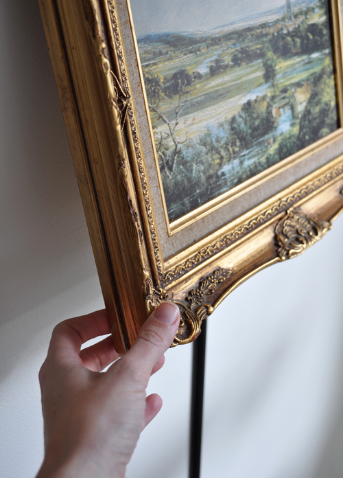
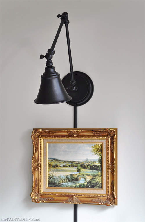
To deal with the exposed switch I decided to hang a pretty picture over it.
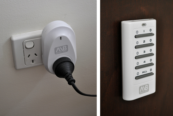
I know, I know, you’re probably thinking how ridiculously impractical that sounds – “A picture over the switch, how the heck do you actually use the dang thing then? Duh”. I thought this too which is why I installed a remote power switch (click the link if you’re not sure what a remote power switch is – sorry, I couldn’t find a link to my actual brand). I love this thing. Essentially, the lamp is always ‘on’ though power to it is controlled via remote. The remote is simply attached to the side of Charlotte’s chest of drawers with a 3M Picture Hanging Strip so it’s nicely hidden, completely removable and super accessible.
The remote is capable of operating multiple power points which is why it has so many buttons. Of course, we only need to press the top (“1″) button to operate our lamp and Charlotte has this down to a fine art.
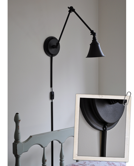
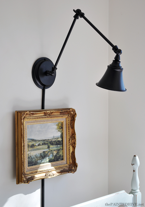
I thought about using some kind of hinge system to hang the picture though decided that was overly complicated (and extra difficult given the fact the switch means the picture can’t sit flush on the wall). Instead I simply opted for basic picture string and two long nails hammered in on a steep downward angle. It’s easy to lever the picture without the string slipping off the nails so the switch can be accessed (if needed).
The length of the nails, which sit just proud of the switch plate, also mean that although the picture doesn’t sit flush against the wall it does rest neatly parallel to it. An unintended bonus is how having a piece of art below the sconce gives it the impression of being a picture light, which I like.
I went with a 15 watt pilot bulb which, although very soft, throws ample reading light. I was initially concerned that the position of the light might be somewhat blinding though have laid beside Charlotte on numerous occasions to read bedtime stories and have never once found it to be a problem – on the contrary, it’s actually quite nice to have a warm back light for a change (and, of course, the tilt of the shade can always be altered to redirect the cast, if need be).
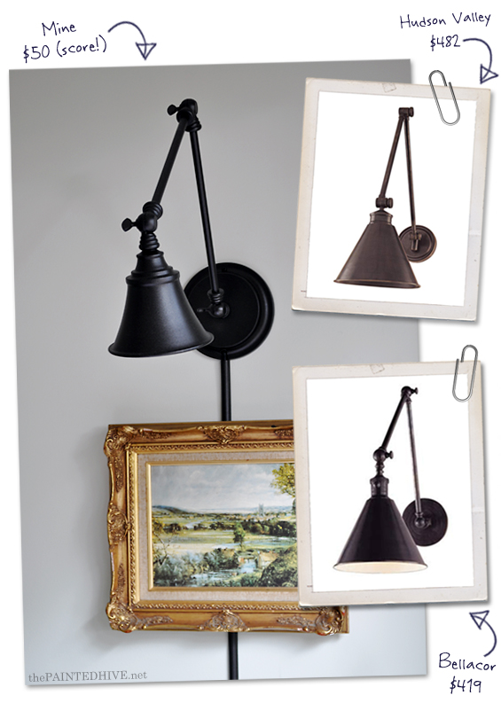
Although I wasn’t ever attempting a specific “knock-off”, before publishing this post I did a quick Google search and found these similar lamps…
Bellacor | Hudson Valley
The \$50 for mine includes the lamp, cable cover and paint. I know those proper wall lights are pretty gorgeous, though I do prefer my price tag!
This whole project was a total experiment and I’m really happy with how it turned out though the fact the concept is kinda weird hasn’t escaped me. So, tell me…successful or stupid?
You’ve just read the post A Desk Lamp Becomes a Wall Light from The Painted Hive. Click on over to visit the blog and get engaged in the comments section – I’d love to hear your thoughts! Republishing this article in full or in part is a violation of copyright law.
Comments update: two design heavyweights, Marc Newson and Frank Gehry, dominated the debate on Dezeen this week for very different reasons.
Swear-y Gehry: Frank Gehry’s response to a journalist’s question about his architectural style – raising his middle finger and saying the “98 per cent of what gets built today is shit” – became the biggest architecture story of the week with plenty of readers wading in to give their view.
“I think it’s fair to say that some of his own buildings belong to the 98 per cent he’s talking about,” wrote Mies.
“If he were a bit less blinded by his past, he could see that the debate has long moved on,” added Gerland Lindner. “Today heroes are those who help build towards a fairer and more sustainable world.”
But Aaron was among the Gehry defenders. “I like his reaction. You don’t go through projects of the magnitude that Gehry designs ‘just for show’,” he wrote. “That is insulting.”
James was one of the few that agreed with Gehry and offered a reason for the problem. “It is sh*t because the planners don’t let us build anything with a bit of vision,” he wrote. Read the comments on this story »
Gun debate: news that Marc Newson – who recently joined Apple as a special projects designer – was preparing to unveil a new shotgun for Italian gun brand Beretta triggered a heated debate in the comments.
“Something that kills will never be beautiful,” wrote Christian Ocampo. “I’ve seen many antique samurai swords that I’d consider beautiful,” countered another reader calling himself Odysseus.
“Regardless of the final design, the discussion over whether firearms are utilitarian or objects deserving of beauty, is a good one,” added regular commenter The Liberty Disciple.
But Colonel Pancake was baffled by the response: “I’m continually amazed at Dezeen’s ability to manufacture outrage at anything that isn’t a dinky cabin in the Swedish countryside.” Read the comments on this story »
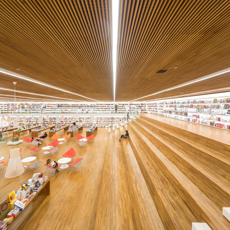
Bookish: the expansive interior design for this bookshop in Sao Paulo, Brazil, proved popular on Dezeen, but locals chimed in to explain it might not be as inclusive as the open plan space might suggest.
“A beautiful project in my hometown, but unfortunately only a privileged group of people has access to this bookshop, as it sits within a luxury mall in one of poshest regions of the city,” wrote HeloRighetto. Read the comments on this story »
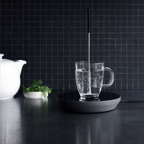
Tea time: one of the products we featured from Dutch Design Week was the Miito, a device for heating water in a cup using an induction plate. Its creator, Eindhoven graduate Nils Chudy, said it would help save energy by only heating what people need rather than boiling a whole kettle full of water.
“How does it compare to a microwave? Will it heat multiple cups more efficiently than a kettle?” asked mb4design.
Chudy jumped into the comments section on Dezeen to answer these questions and more. “It is quite hard to estimate the time you need until one cup has been heated in the microwave,” he wrote. “That is why I believe Miito might be a better option to heat your cup of tea.”
A number of readers said that the idea of using an induction plate wasn’t new, but most were taken by the design anyway.
“Not much different from putting a small stainless steel pot or kettle on an induction plate,” wrote spadestick. “But I think I will part with some cash for this brilliant concept.” Read the comments on this story »
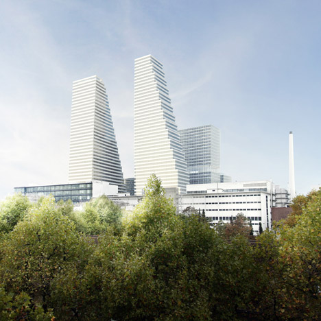
Skyscraper vs minarets: Herzog & de Meuron unveiled plans to overhaul the Basel campus of pharmaceuticals company Roche, including new skyscrapers that prompted a discussion of Switzerland’s seemingly contradictory rules about religious structures.
“I really do not understand the logic behind approving not one, but two towers of this scale in a city like Basel, and on the other hand ‘banning’ the construction of Minarets with the main argument of distorting the city landscape,” wrote one reader under the name Confused Basler.
“The argument that led to the minaret ban in Switzerland may be minimised by the building permit for these huge towers, but minarets are all about architecture and politics,” responded ionandrei. Read the comments on this story »