
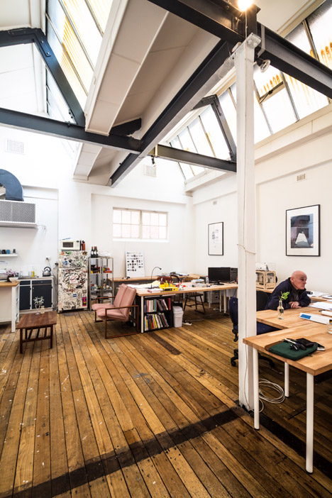
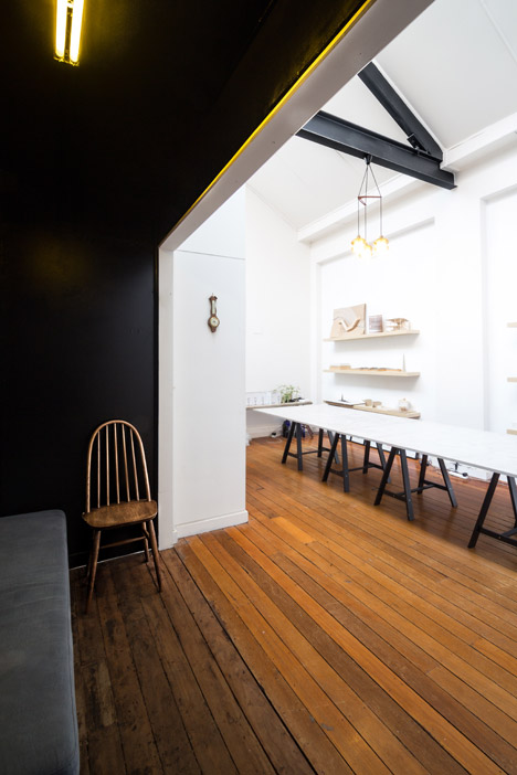
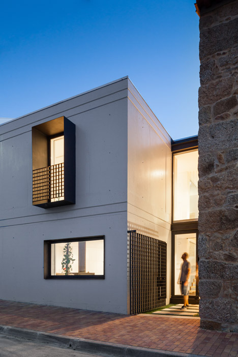
Workspaces are differentiated from circulation space by sections of contrasting monochrome paintwork in this Perth studio designed and occupied by Australian firm Post- .
Post- carried out the refurbishment of a two-storey building on King Street, west Perth, for a project called Make the Space Look Nice.
Related story: Particular Architects build themselves a reconfigurable studio
The Australian firm renovated the space to host its own studio, a gallery for Australian artist Jordy Hewitt and Spacemarket – a not-for-profit organisation run by the studio that pairs “disused spaces with useful people.”
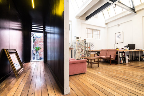
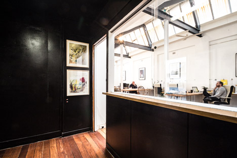
“We kept it simple. Workspaces are white, passages are black. Slow space is tall, soft and bright while fast space is dark and compressed,” studio founder Nic Brunsdon told Dezeen.
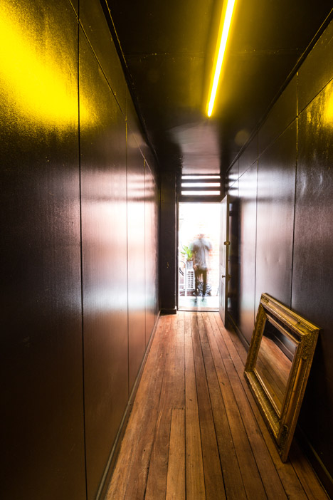
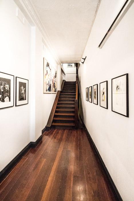
Hallways with low ceilings, connecting the front door to the studio space and the rear of the property to a meeting room, are painted a glossy black that contrasts with the bright, white-washed primary spaces.
The light from fluorescent tubes mounted on the black walls reflects off the shiny paintwork and illuminates the corridors.
“There’s a really nice spine that runs through the space,” said Brunsdon. “The hallways are the confined moments. You pop out from them into the high, white spaces. It creates a really lovely spatial experience and legibility.”
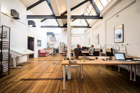
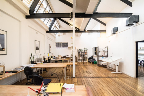
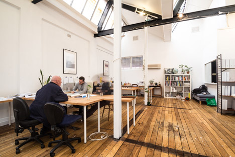
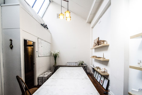
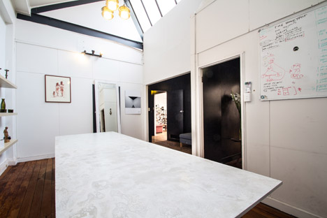
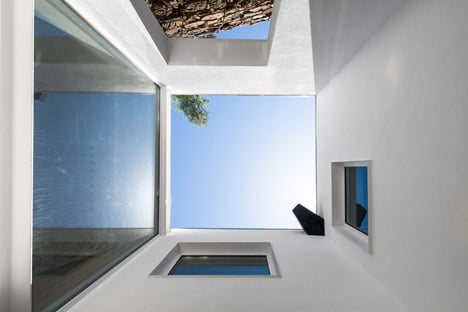
Rows of angled skylights in the pitched ceilings over the double-height studio and adjoining meeting room provide an abundance of natural light for the workspaces.
The steel framework that supports the roof is painted black to contrast the light-filled space, while white-washed vertical columns blend in with the walls.
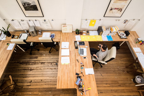
The architect removed the carpet across the ground floor to reveal black outlines on the floorboards, left behind by the partition walls and structures of businesses that once used the space.
“We love that. They are the old wall bottom plates. It used to be a photographer’s studio and before that a sewing floor. We are in what was, and in some ways still is, a bit of a rag-trade precinct,” he said.
Wooden tables are arranged in a conference-style layout to form a communal work area in the studio. The table-tops are made from strips of timber that run in opposite directions to the floorboards.
“We’ve tried to keep the materials honest to what exists,” said the architect. “The age and history of the space is celebrated. It’s a beautiful place to work.”
Vintage wooden-framed sofas clustered around one end of the studio create a seating area and give the space a lived-in feel.
“The furniture is just a collection of stuff that I like and have picked up through the years,” said Brunsdon.
Towards the back of the studio, a waist-level wall with a sliding glass partition creates an intermediary space between the architecture studio and a meeting room.
This area, coupled with the “dead space that comes off the street and up the stairs” is used as a gallery by artist Jordy Hewitt.
In the meeting room, two lengths of fibre-cement rest on black trestle legs to form a table.
Photography is by Vanity Projects.


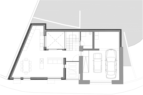 Ground floor plan –
 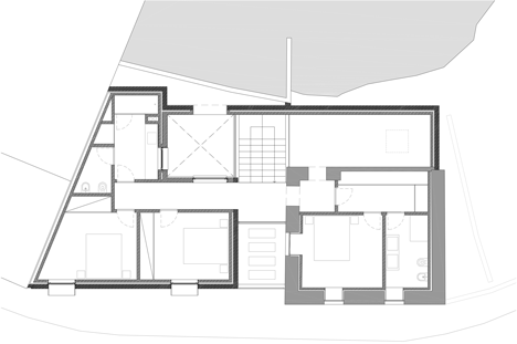 First floor plan
 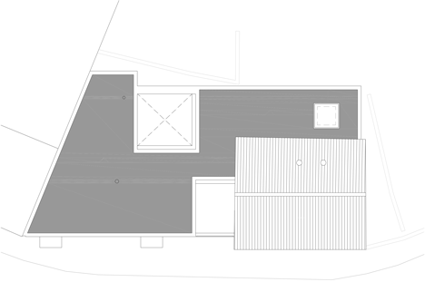 Roof plan
 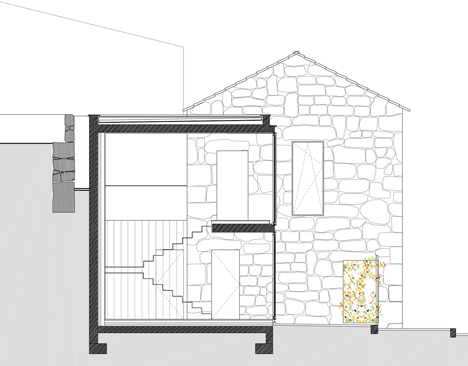 Section


