When it comes to the topic of home decoration, curtains are one of the most important aspect of consideration. The perfect selection of the curtain will not only serve you with high utility, but, it will significantly raise the beauty and the aesthetic of the place. For instance, the aesthetic Paris curtains or the black and white curtains, if perfectly used, will give a complete new makeover to the place. Here is your guide to making the perfect selection.
The fabric of the curtain is the primary point of consideration
No matter you are opting for the fashionable paris curtains or curtains of any other style and design, it is the fabric that deserves the primary consideration. The fabric should be chosen in a style that it is durable, easy to maintain as well as matches with the home design. The seasonal feature is another important point to consider in this regard. For instance, you should pick the heavier fabrics during the winter months, while the lighter fabrics will be comfortable for the hotter months in the year.
The color of the curtain should match with the room design
You should pick the color of the curtain in a style that it suits and complements the room design. To be specific, the shade of the curtains has to match the color used on the walls and the color of the upholstery. If you have already choose the beige wallpaper with Eiffel Tower pattern, the curtain with beige or light color will be better for the whole Paris themed room. Also, the bronze ornaments placed on the table or the shelves add the vintage environment to the room.
Assume, you have decided to go for the black and white curtains; in those instances, you should use such colors for the walls and the upholstery that will match the shade used for the curtains. The use of black & white combination for the curtains will give you the highest alternatives for colors. This style of curtain usually involves 2 layers of clothing for the curtain, the top layer in white and the bottom in black. This actually forms two separate layers and you can use one at a go. For instance, if it is your bedroom and you don’t want the light of the rising sun to get into the rooms, you can drag both the layers at a go that will check the entry of light.
Another important point is to ensure that the curtain should not affect the lighting conditions inside the room. Highendcurtain selected, considering these points will be the perfect choice for the room and it will make the place all the more livable and make it to appear beautiful.
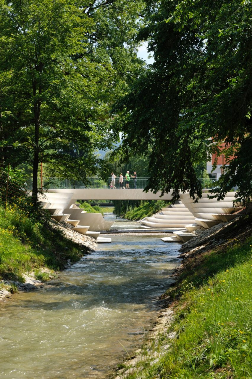
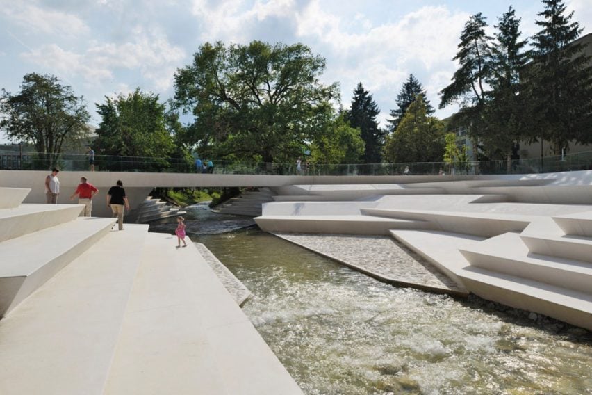
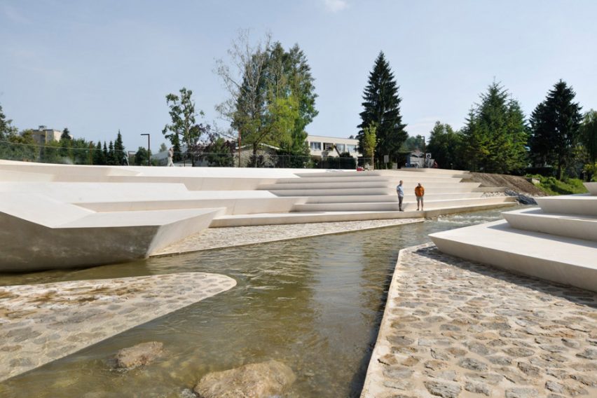
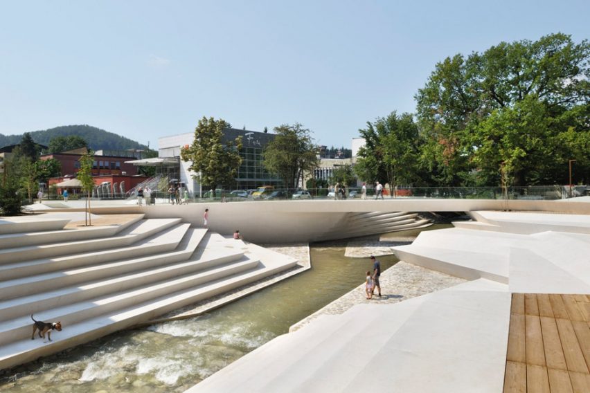
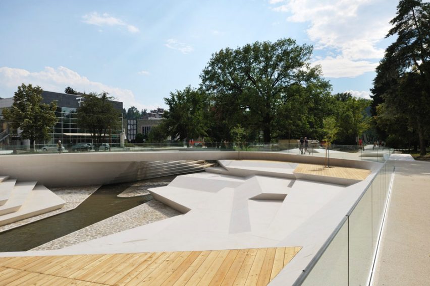
A+Awards: angular steps and terraces line the banks of a shallow waterway to form a promenade at the heart of Velenje, Slovenia – a project that earned Ljubljana firm ENOTA a 2016 Architizer A+Award.
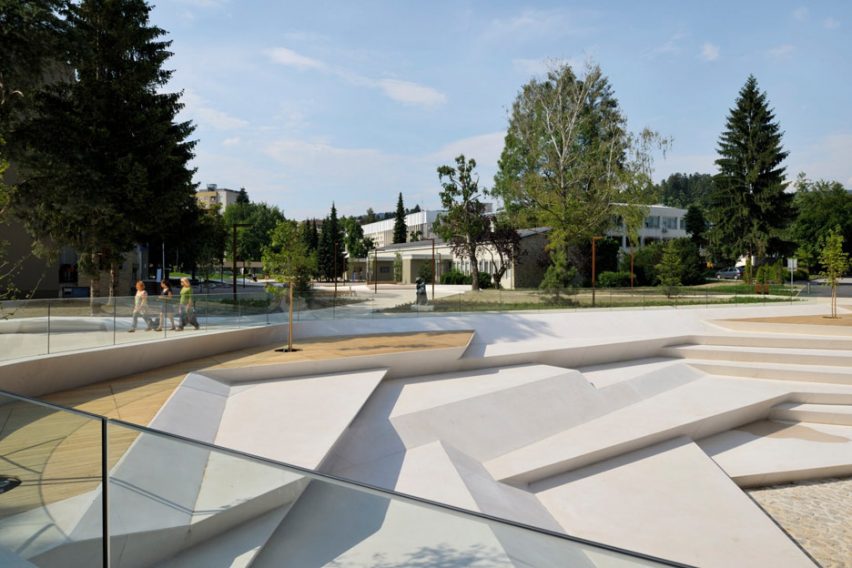
The Promenada in Velenje’s centre forms a public space and thoroughfare for the young town, designed in the 1950s in the modernist tradition of the garden city.
It is the only one of its kind in Slovenia, and has grown to become the country’s fifth largest urban area.
ENOTA renovated the civic space to kick off a wider revitalisation of the city centre.
“Its tasks are to supply the city with the missing programmes and to help it reclaim its original character of a town-in-a-park,” said the firm.
Aiming to add both greenery and events spaces to the area, either side of the River Paka. The landscaping was planned to open up its banks and draw more attention to the fast-flowing stream.
“The River Paka is a torrential river, which means that its watercourse swells up significantly a few times a year, but remains relatively shallow at all other times,” said ENOTA.
“As a consequence, the riverbed is very deep and until now, the river – which is an attractive element of any city – flowed out of sight somewhere down below.”
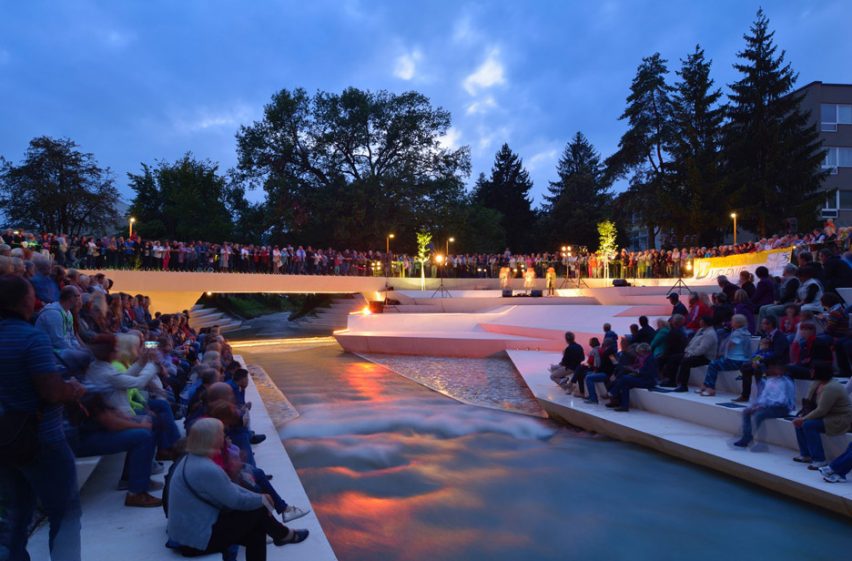
Angular stone terraces that vary in height and depth create pathways beside the water. Smaller steps form an amphitheatre for public performances, or relaxing in the sun.
The existing bridge connecting the two river banks was replaced by a narrower structure that sits off-perpendicular to the waterway.
Paths emanate from the centre to connect the surrounding buildings and streets. In between are grassy areas with exaggerated mounds, and plazas dotted with trees and sculptural benches.
“The river may once again claim an important spot in the townspeople’s consciousness,” the architects said.
The Promenada Velenje completed in 2014 and won in the Public Park category at the 2016 A+Awards.
Organised by Architizer, the awards promote and celebrate the year’s best projects and products.
Their stated mission is to nurture the appreciation of meaningful architecture in the world and champion its potential for a positive impact on everyday life. Find out more about the A+Awards ›
Photography is by Mirana Kambiča.
Four competing designs unveiled for Pershing Square in downtown Los Angeles
Today I’m joining in a Spring Tour of Cozy homes hosted by Rachel from Shades of Blue Interiors and Country Living. Besides the fact that I love the women who host tours like this and it’s fun to join in, the biggest perk of these tours is that they force me to get my house into somewhat presentable shape!
My goal for our home’s style is for it to be cozy enough to be comfy while using the least amount of stuff possible to get the quirky, casual cottage style I love.
I call myself a Cozy Minimalist…
Meet our little table. This guy is our breakfast table, dining table, catch-all table, laundry holder, puzzle central and sometimes he turns into my work space. This corner of our home is the hardest working little area and I made a few logistical changes to it right in time for spring.
I took this photo within hours of the first photo above, and you know what, I think it’s just as pretty. This is the truth about what it looks like when our surfaces serve us well. But I recently added that thin console table turned desk back there on the left side to both look pretty and solve some issues.
Here’s what I had there before. I love this little half-moon table, and I loved the white plate display, but I wanted something that could double as a desk so I could move stuff off the table for dinner and have a place to put my computer and still be able to pull up a chair. The head planters went out on the porch (but now that I see them, I miss them in the house.)
Here’s that same corner from a little different angle now. The desk, mirror, pillow and blue urn are from HomeGoods, the white vase is from The Depot at Gibson Mill and I’ve had the chair for years along with the cat.
I broke off a few cherry blossom branches from our yard because #SPRING! My favorite way to add life to our home is by bringing in something from outside. When you are hunting for leafy or flowery branches, try to cut or break them off about twice as long as you think you want, see how those branches above fill in the empty space and look riskier and fancier? They have more presence because they are tall and quirky.
Below you can see the different personality that you get when you use lots of short branches, more sophisti-mi-cated. As they say.
The half-moon table makes so much more sense here on the other side of the window. Since there’s main thoroughfare/foot traffic highway right next to the table, having those rounded edges tapering to the wall give us more space than the old sideboard I used to have there, bonus: no more permanent bruise on my hip from hitting a corner daily! I realized this is such a great use of a rounded table–at the end of a wall!
Chippy Windows: The Depot at Gibson Mill
Table: Joss & Main (forever ago)
Ginger Jar and planter: HomeGoods
Blue & White Urn: Local Consignment Place That I Forgot The Name Of
Relax: Lindsay Letters
Pillows & planter: Home Goods // Peacock Chair: local thrift store
I’ll be sharing more on instagram today, you can see more cozy home inspiration there with the hashtag #cozyhometour
I wish there were another tour going on next week that could ensure that my house stay somewhat presentable. For now, special thanks to HomeGoods for partnering with the Cozy Spring Home Tour, be sure to check out the other Cozy Homes below:
A sponsored post created in partnership with Ace Hardware & the brand of chalk paint I’ve been using for years anyway: Amy Howard at Home® One Step Paint™
You know those TV shows where they count down the best inventions of all time?
Well, if I were in charge of that show, chalk paint would be in the top ten. I remember the dark, olden days before I knew such a thing as chalk paint existed. In those hard times, we didn’t have much choice but to use glossy enamel paint because it cured to a hard finish–sadly, that curing took a month.
Listen, I’m not talking about chalkBOARD paint, no, this is chalk paint–a one coat paint that requires no sanding or stripping– I’m pretty sure I’ve even painted right over dust and spiders. Chalk paint is a DIYer’s BFF.
And Amy Howard should win the award for the prettiest paint labels and branding.
I decided to repaint this hutch that I’ve had for years and years. I wanted him to be a warm, light pink but I wasn’t exactly sure the shade I was looking for. I use the top part of the hutch in another part of the barn where it sits on a big old table and I love where it is. The top and bottom half of the hutch have been divorced since we moved out here, so it was time for the bottom half to move on and go his own color with an afternoon makeover.
Chalk paint loves being mixed together to get the right color. Also, mixing paint colors is SO FUN! So I decided to grab a few colors and experiment until the color felt right.
I started with using mostly the colors Palmer Pink and Shaw Red with a little Linen. But the color was waaaay to strawberry and bright for what I wanted. So I kept adding in more Linen and Palmer Pink to lighten and even a little dash of Holy Moley (yellow) for warmth up to the perfect shade of light pink.
If you don’t want to mix your own colors and can’t find the color you love out of the 52 Amy Howard suggestions, just make sure you get the tintable base, and the Ace Hardware folks can mix it to any color you want.
You can see the darker color on the top of the hutch, then I added more Linen painted that on the drawer on the right then again, more Linen, painted that on the middle drawer, and it’s hard to tell in the photo, but the drawer on the left if even a lighter color.
I thought I had the color right until I painted the entire piece. Nope, still too strawberry and intense. It is One Step Paint, so if I would have loved this color, I could have been done in one coat!
No worries, I just added in more Linen colored paint to my batch and waited about an hour for everything to dry and quickly painted over the hutch again. Seriously, I do paint really fast like a possessed woman, but even a slow painter should be able to paint a piece like this in less than an hour. This paint goes on so easy.
The best thing about chalk paint is how forgiving it is. I could “practice” my colors all over the piece, and once it was dry I did one last coat in my final color and all traces of the first coat were gone.
Ta-Da! This might be the most productive and rewarding two hours I’ve had all week!
Never painted furniture before?
Here’s my best advice for painting with chalk paint:
Be sure to have the paint people at Ace shake your paint in the machine, even if it’s premixed
Give yourself an afternoon (seriously, don’t put it off because you think a paint project will take all weekend, this entire project took about 2 hours including time for the first coat to dry!) Chalk paint looks better when it’s imperfect, you aren’t painting the Sistine Chapel, most people paint too slow, that’s fine except when you let that hold you back from starting a project. Consider the choice to paint quicker but less perfect and have a finished piece instead of a piece you have to take a vacation to complete to perfection and therefore it’s never started. AMEN.
Don’t start with a bookshelf as your first ever painted piece. Think about all the surfaces and corners and back of the shelf and the underside of every shelf. I’d rather paint two dressers than one bookshelf.
If you are painting something with a main surface that gets used (pretty much everything) be sure to use wax to seal it. Amy Howard has her own line of waxes, I’ll probably end up adding clear wax to this piece in a few days–it won’t really change the color much, but it will protect it.
If you’ve never painted furniture, practice on something small first. Don’t have something small? Take $ 5 to a thrift store and buy a practice piece.
Don’t be afraid to mix colors together. It’s so fun!
Don’t start painting on the top first, start on the back or the bottom of one of the sides, that way you can get your rhythm and brushstrokes going confidently on a “private” part of the piece.
Use a brush, not a roller–chalk paint likes brushes.
Don’t like the color? No problem! You don’t have to wait for the paint to cure for weeks, go ahead and paint another color on top once it’s dry!
Amy Howard at Home® One Step Paint™ paint is available at select neighborhood Ace Hardware Store.
PS. Now through March 20th, buy two get one free on all gallons of Royal®, Clark+Kensington®, Valspar® Aspire and Valspar® Optimus paint at The Paint Studio at Ace. (the white paint I used on the walls and ceiling of our house is: Clark + Kensington’s Designer White)
AIM Studio was challenged to design a creative apartment in a former office building in Milan, Italy. Even though Brazilian Taste exudes a harmonious design throughout, its functional spaces — the kitchen, dining area, living room and study — are well defined.
“The owner asked us to think about an elegant, fresh, flexible space that would communicate with numerous plants, their major passion,” the architects said. The layout was redesigned according to the contemporary living needs of the clients.
Collect this idea
The project was developed around a white concrete box, a living room that’s framed in and closed on three sides. Inside, the white resin finish bounces light off the walls, helping the plants grow. A variety of eclectic furnishings make the room homey and inviting.
The rest of the 2,153-square-foot apartment features several textures, including concrete walls, dark wood flooring, a sleek, modern kitchen and bath, and — adding a touch of the tropics — plenty of plants. What do you think of this creative apartment? [Photography by Nicolò Parsenziani]