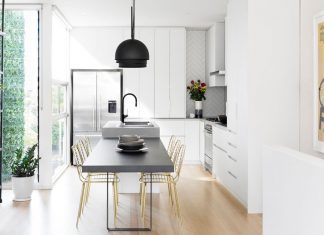
When it comes to redesigning a room, the first decision is usually, “which color?”.
And sometimes, that can be the hardest choice of all. I can’t be the only person who has excitedly walked into a paint store, then left a short time later, overwhelmed with a thousand similar-but-different options. Who knew there could be so many shades of white? And where do I even begin with furniture?
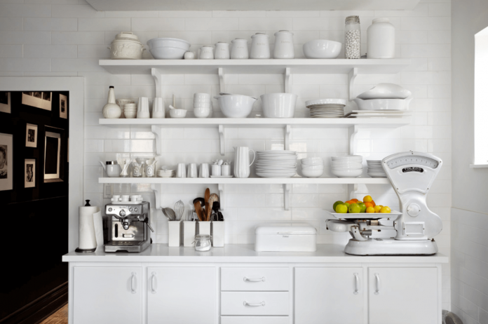
Here’s one way we bypass having to coordinate colors: designing a room with a monochromatic color palette. It’s an incredibly simple way to bring elegance to your interiors without hiring a designer. And it’s becoming increasingly popular in interior design.
In this article, we’ll outline why using a single color palette is an excellent choice for any interior, and show you how to recreate the look on your own. We think you’ll be eager to embrace monochrome in no time.
All you have to do is decide which color!
Why go for monochrome?
Monochrome easily creates harmony — because it’s really all one base color.
By choosing a monochromatic color palette, you have your unifying element from the start. ‘Monochromatic’ simply means is that you take one basic color and apply color theory to create a range of hues by playing with the various tones, shades, and tints that can be created from the original.
For those of us who are starting to experiment with interior design, the prospect of putting an entire room together can be daunting. After all, there are so many different components to take into account: furniture, floor coverings — don’t even get me started on art and decor. Going monochrome will guide your decisions, and pull everything together seamlessly.
But shouldn’t design have lots of different colors?
Yes and no. By now, we’re all familiar with the colors that we use to fill our spaces impact us psychologically. While bright colors like orange can provide a much-needed burst of energy, and earth tones make us feel more grounded — sticking to one color palette helps create a soothing and restful environment.
Research by The University of Texas found that websites with a monochromatic background palette were easiest for others to read. They attribute these findings to the fact that the brain has less to process and therefore is able to better concentrate on the website’s content. You can take this same principle and use a single color palette to showcase your space’s best features.
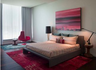
Since monochromatic designs have such a relaxing effect, it’s often utilized in spaces that need an extra calming boost. Bedrooms are, of course, an excellent option, as are those too-often-stressful home offices. But you shouldn’t be afraid to branch out a little — experiment with monochrome in your bathroom to create a spa-like feel, or use it in your children’s playroom to help keep all that energy at bay.
How to rock monochrome in your home:
The words “monochromatic design” might still feel a little worrisome. Maybe you’re picturing a room where the sofas blend into the walls and every element of the room is the exact same shade. I’m going to let you in on a secret: Monochromatic interior design offers plenty more than just a single shade.
Since the shades in your interior will tend to blend together, texture and pattern are the easiest, and often one of the cheapest, ways to add visual interest. In fact, while too many patterns are usually a design no-no, monochrome is an occasion in which you can let your mixing-and-matching skills run wild.
As you pick out the design elements that fit your room, be careful to ensure that the undertones, or the yellow, green, pink or blue hues that stand out in a color when it’s hit by when hit by the light, match. Two design elements with separate undertones will not look right when placed side-by-side, but similar undertones can “match”, even when their patterns or textures vary greatly.
It’s also best to think of the unifying color palette as the base of the room rather than the whole picture. Think of it as a pie; the color you choose to follow isn’t the entire pie – just the filling. But no pie is complete without the crust. In this case, the “crust” is the neutrals and complimentary accents. Focus on complimenting your main color with a variety of neutrals; Pops of white and black give the eye a place to rest from the intensity of the main shade.
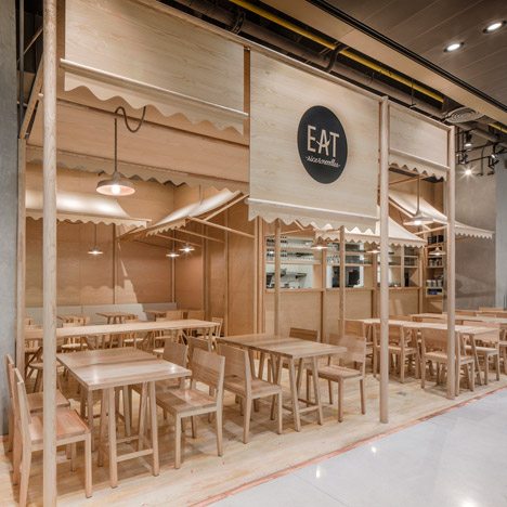
If you’re uninspired by neutrals, natural materials can work in much the same fashion. Use wooden furniture to break up your bedroom or a set of ultra-modern metal chairs to making your dining space really stand out.
Whichever group you choose, just be sure to provide plenty of coordinating pops throughout the room. Not only will they provide that always-essential visual interest, but they will pull the room together to give it a professionally-designed feel.
Single color spaces are often the subject of heated debates. Some think they’re too simple to be worthwhile. But, when done correctly, we can attest that they are the epitome of easy elegance.
How do you feel about monochromatic colors? Have you used them in your home? If so, what are your best tips? Share them with us in the comment section below, or reach out to us on social media.
Image: The New Design Project

