
If you want a living room that’s worthy of showing up in a home décor magazine, you need to start with a good color scheme. It’s not all about the color you choose for the wall. You want a look that’s well-balanced throughout the space, paying careful attention to how colors in the furniture, floors, walls, and artwork all complement each other.
It’s all too common to err on the side of caution, sticking with a neutral color scheme that just comes off as boring. On the other hand, you don’t necessarily want to make decisions that are so bold that they make others cringe.
We’ve put together a short list of some of the best color schemes for your living room. As you look through the images, you’ll quickly see how incorporating a few key colors can set the tone you want. Whether you’re looking for a tranquil space for relaxing or something happy and energizing, you’re sure to find a few ideas that will work for you.
1. Pretty with Pink
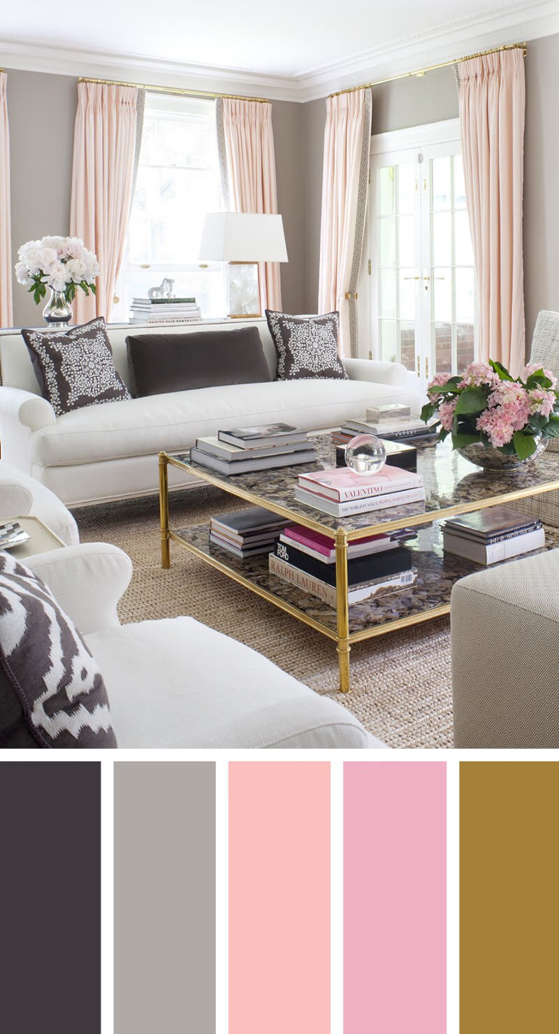
When you have too much pastel pink in your home, it can start to feel like the home of a little old lady. Using the light pinks alongside the cool grays that you see here gives the room a more sophisticated feel. The darker gray seen in the pillows offers a nice visual contrast, ensuring that the other colors in the space don’t get washed out.
2. A Calming Sea of Blues
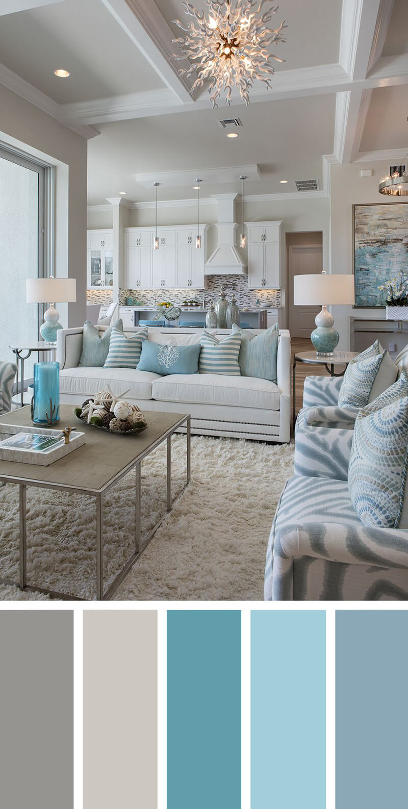
If you want a nice, relaxing space, stick with light colors like these. While everything is pastel, painting the trim on the ceiling a slightly different shade helps the eye stay interested. The blues are subtle, found throughout the space in little details, like the lamp, the coffee table centerpiece, and the pillows. Using these colors against a neutral background is perfect because it makes it easy to change the look when you want to. Rather than re-painting everything, you simply need to change the accent pieces.
3. Bold Colors from Art
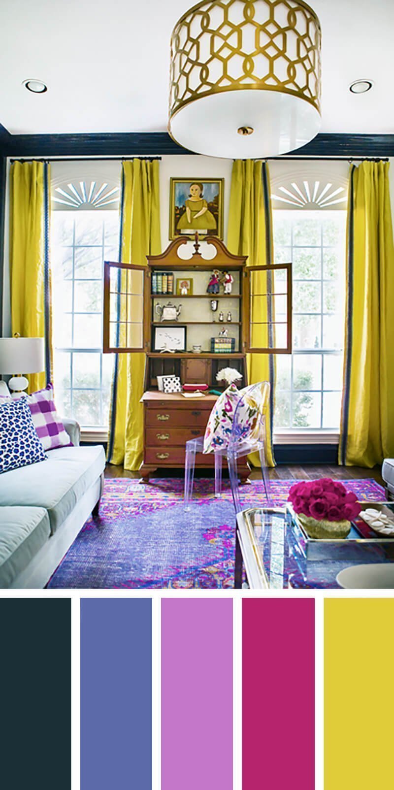
One of the best ways to find a color scheme that works for you is to start with a favorite piece of art. Here, the bright color of the girl’s dress might seem like an unusual choice, but it really works nicely when paired with the other colors. The magenta is on the opposite side of the color wheel, so it offers a sharp contrast to the bright greenish-gold color in the curtains. The dark blue-gray around the windows might seem too dark in other spaces but mellows out the bright colors in this room.2017
4. Defining Space with the Accent Wall
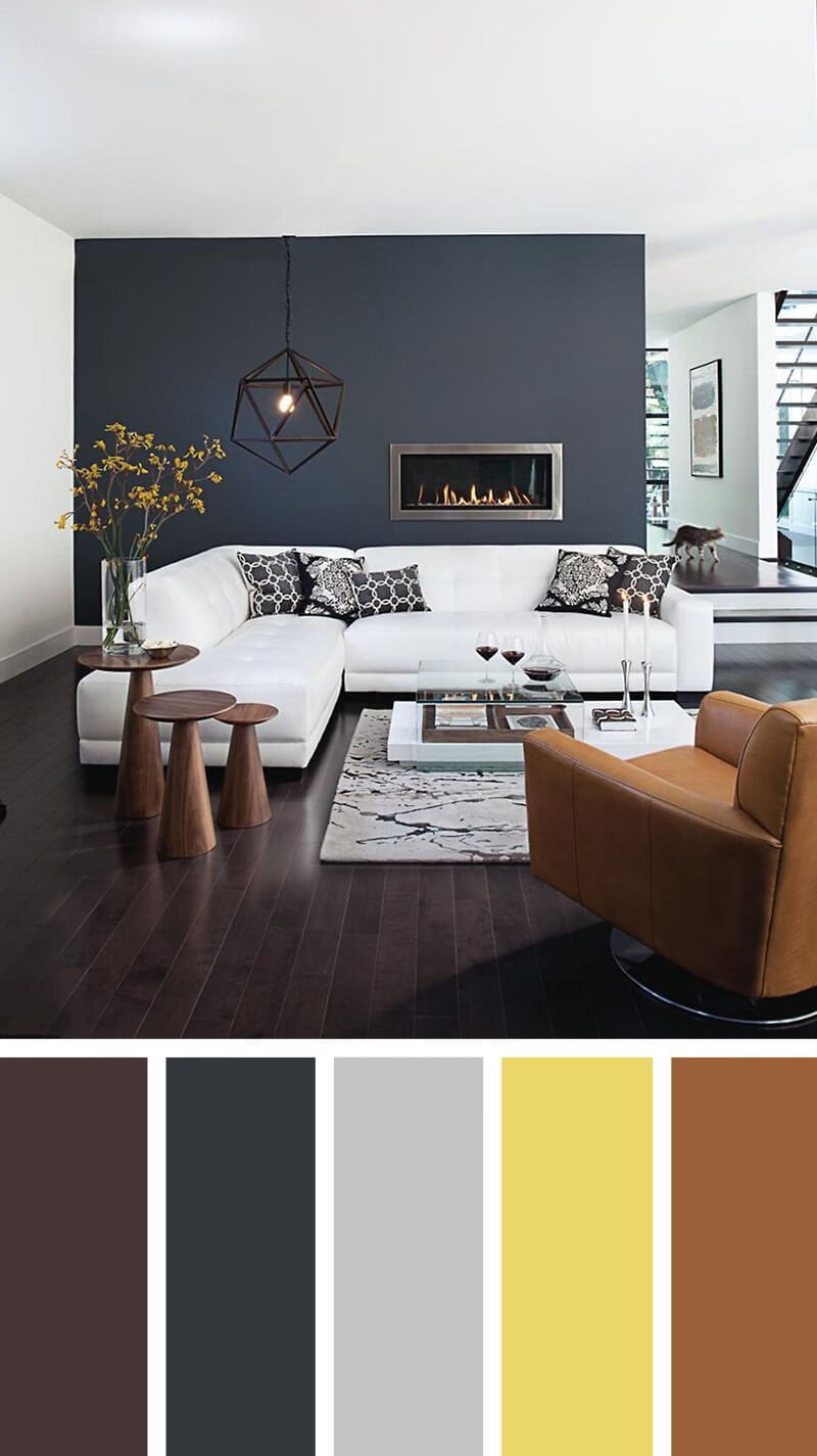
In an open concept living area like this one, it can be difficult to define the space. You’ll see that it isn’t a problem when you choose to paint the accent wall in a nice, dark color. The hardwood floors in this home really stand out, so the owner has incorporated that color into the overall plan for the color scheme. Since the floor and the accent wall are dark, they need to be balanced out with a large, light-colored sofa and throw rug to complete the look.
5. The Pop of Color
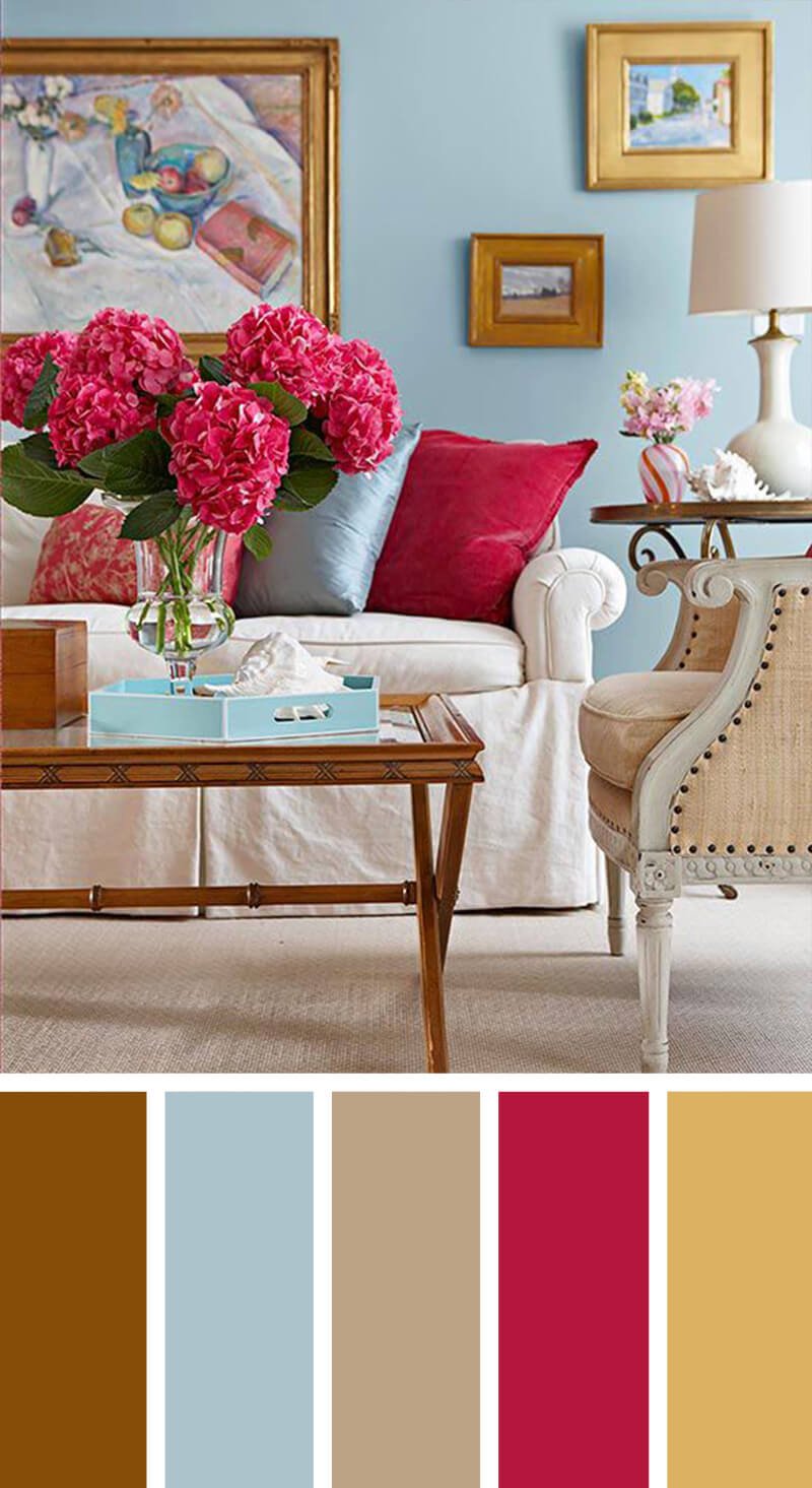
Liking a bold color such as deep magenta doesn’t necessarily mean that you need to stick with bright colors throughout the space. In this color scheme, there’s a background of cool blue that allows the bright color to pop out at you. An especially nice touch here is the conscious color choice for the picture frames and table legs. The gold looks different than the usual black or brown frames you might see, and really stands out against the light blue walls.
6. Neutral Isn’t Boring
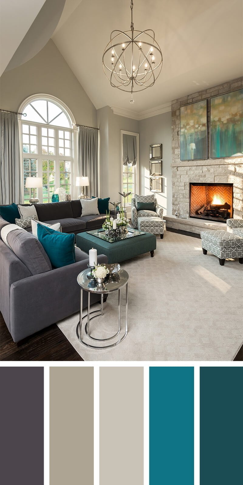
Grays and blues are generally thought of as neutral colors, but you can see here that they don’t have to be boring. A large rug covers the dark-colored hardwood floors, giving the space an airy feel. With a light background on the walls, you need the slightly darker color of the sofa for balance. Turquoise accents have the same calming effects of other blues but are a bit unusual. Though it’s hard to know whether this was an intentional choice or not, it’s interesting to note that the roaring orange of the fire burning in the fireplace is on the opposite side of the color wheel from the turquoise. It looks nice together.
7. Colorful Balance
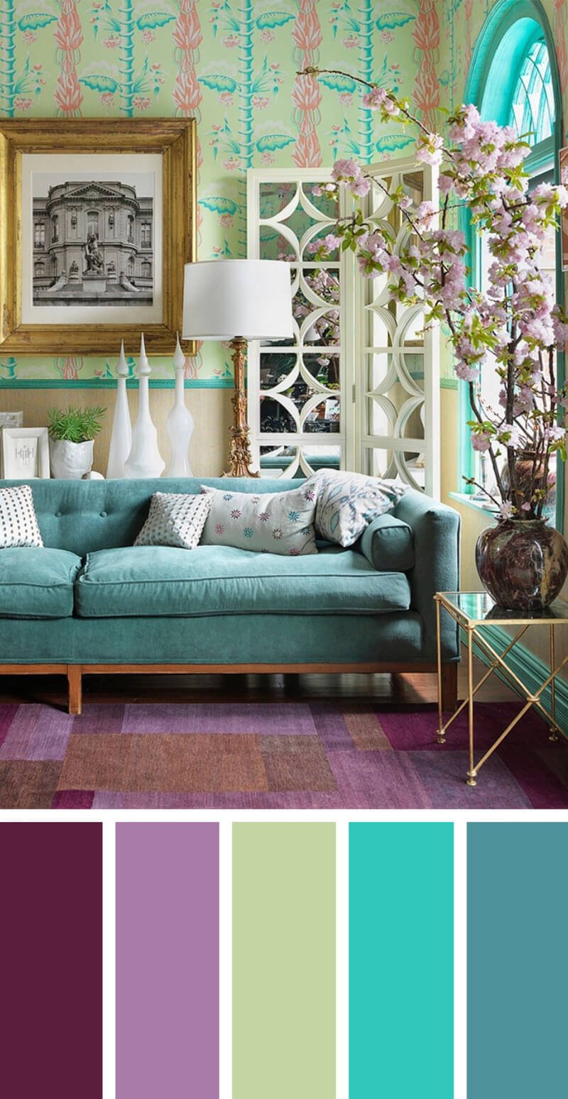
Those who like color in their rooms will love this look. It nicely incorporates different shades of purples and blues for a look that feels complete. Here, a colorful wallpaper adds a lot of visual interest to the space. What really makes this work, though, is the blue trim around the windows. It matches the blue of the wallpaper so that everything feels like it belongs together. Note that when you use a lot of color on the walls and floors, you need to balance that out with accents that are more neutral, like the white pillows and lampshade in this room.


