Welcome to NOVEMBER! What? I can’t even believe it. I gotta tell you – I’m SO excited about Christmas and I’m one of those who loves seeing the stuff out in the stores already. But I’m already feeling behind! My Instagram feed is full of holiday projects and decor already. It doesn’t help that everything I’m seeing is beautiful and cute and I want to make every single thing. 🙂
It’s time for another before and after link up! Before you check out the new links, I like to share a few that caught my eye from last month. Tami knocked it out of the park with this one – her knock off card catalog:
You won’t even believe how this one started out! (Hint: it wasn’t a card catalog.)
Here’s another brilliant project – Karen took a raised garden planter and turned it into a functional coffee table:
You guys are so smart!! That would look beautiful in a dark stain as well – and you can create storage inside. Awesome.
Joan DIY’d a countertop for her laundry room and it turned out so well:
Love that stain in combination with the black cabinets!
You know how much I love my black interior doors! I have always loved the look of a gray door too – Sarah shows just how good they can look:
It’s a beautifully neutral twist and still adds some dimension to the space.
There were some bigger projects shared last month as well – Hayley shared some GREAT tips on how to paint your cabinets:
And Jaime shared some as well – love her two toned look:
Laura’s bathroom renovation turned out beautifully:
That tub!! Love the smart hidden storage they added when the lost a linen closet in the space, be sure to check that out.
Karah’s new rustic bathroom is a beauty too:
I’ve always been drawn to an open shelving vanity like this. If you are a DIYer this is something you could definitely make yourself to fit your space perfectly. I’m considering something similar for when we redo our master bathroom…years from now. 😉
There you go – more fabulous projects! If you are linking up and would like to be considered for a highlight next month, go ahead and include a link to TDC or this code in your post:
<div align="center"><a href="http://www.thriftydecorchick.blogspot.com/" title="TDC Before and After" target="_blank"><img src="http://www.homestoriesatoz.com/wp-content/uploads/2012/03/beforeAndAfterButton_thumb1.gif" alt="TDC Before and After" style="border:none;" /></a></div>
And now let’s see what you’ve been up to lately! Link up your projects here:
The world of corporate office design is rapidly changing. Image Via: Geremia Design
Running a business is no easy task. At any given moment, there are a thousand different decisions to be made. As the boss, not only is it your responsibility to make those decisions, but the answers that you give could potentially make or break your commercial success. When you live under all that pressure day in and day out, it’s only understandable why office design would be the furthest thing from your mind. After all, it doesn’t really matter what a space looks like as long as the work gets done, right?
Wrong. It turns out the way in which a corporate space is designed has a profound impact on the business itself. Design choices have an effect on everything from task performance, to error rate, and employee satisfaction.
Take a look at the article below for further explanation of the science behind these effects. We’ll share the research with you and then show you how to help your workspace design achieve optimal results. It may just be time for a remodel.
Companies that stick to a traditional layout may be unintentionally harming their bottom line. Image Via: New Office Design 2015
Color Choice Affects Task Performance
At first thought, it may seem like choosing colors for your workspace will be your easiest office design decision. Of course, you’ll choose the colors that you’ve chosen for your brand, right? Not so fast.
Research by the National Institute of Health has found that the colors that surround us have a profound effect on how well we are able to complete tasks. Exposure to blue and green shades was found to enhance performance on tasks that required participants to generate new ideas. Red, on the other hand, seemed to aid tasks that required specific attention to detail.
It’s no coincidence that a red, blue, and green color combo sounds familiar to us. Many big name companies like Google, Ebay, and Microsoft have incorporated these shades into their branding and office design. Keep an eye out the next time you come across an advertisement. Odds are you’ll often come in contact with these three shades.
Green shades are often used in corporate design because they’ve been shown to improve task performance. Image Via: Decorbizz
Rounded Shapes Inspire Collaboration:
When it comes time to buy furniture, there are undoubtedly a few characteristics that any employer will be taking into consideration: price point, style, and even color. But, for whatever reason, shape is often overlooked – and it shouldn’t be. Using round furniture in your workspace design could help employees think more creatively.
A 2013 study by the Proceedings of the Notational Academy of Sciences found that participants were more likely to engage in collective thinking when they were seated in a curved formation. Conversely, they were more likely to have in self-based thoughts when in a rectangular arrangement. Interestingly, the study also found that subjects were more apt to rate shapely spaces as beautiful compared to linear environments.
So, what does this mean for you? Maybe it’s time to put the stark look aside for the more relaxed feel of rounded furniture. Plus, when it comes to putting together spaces for your creative teams, a large round table may be a better investment than several segregated cubicles.
Choose curved furniture for the areas in which you need creativity most. Image Via: Capital Painting, Inc.
Decor Items Attract Higher Quality Workers:
In the past, office space design was all about sleekness, clean lines, and functionality over form. Neutral shades were preferred over pops of color and clean desks were praised over ones filled with clutter. However, it appears that this movement toward minimalism has gone too far. A lack of personality in office design is leading to employee dissatisfaction and higher turnover rates.
Gensler, an architectural practice, surveyed the opinions of 200 managers from law, media, publishing and financial firms. Their survey found that individuals who worked in an office space with a lean design strategy were far more likely to feel undervalued and ignored by their employers than those who worked in a decorated environment. Employees with positive personality attributes – self-motivation, self-confidence, task dedication – were also more likely to report plans to move on to a new company in the near future.
The key to successful décor lies in moderation. Too little will appear stark and unwelcoming while too much will seem cluttered and unorganized. Stick to wall art that feels interesting-yet-professional and try to coordinate it with your paint colors to maintain cohesiveness.
Offices that pay attention to decor report happier workers. Image Via: Imtex
The Right Temperature Decreases Errors:
In any office, regardless of occupation, temperature always seems to be a battleground. There’s always one group that complains about sweating in the middle of winter and another group that always requires a cardigan, even in the middle of summer. While it may seem impossible to make everyone happy, there may be a way to help your employees work smarter.
Conventional wisdom by the Occupational Health and Safety Administration (OSHA) states that offices should be kept between 68 and 76 degrees Fahrenheit – the perfect middle ground between warm and cold. But, new research out of Cornell University argues that raising the temperature from a brisk 68 to a warmer 77 degrees decreased typing errors by a shocking 44%. Employees’ work output also drastically increased. Consider incorporating a programmable thermostat into your workspace design to help keep temps consistent.
Of course, you can’t forget about your employees who prefer cooler weather entirely. Instead of turning the thermostat down, offer them individualized methods to help keep themselves cool. Access to portable desk fans or even ice cold beverages can go a long way to assuring your staff that their newly error-proof work is very much appreciated.
Keeping employees warm at their desks could reduce errors. Image Via: HGTV
With the amount of decision-making that goes into running a business, it’s no surprise that most entrepreneurs may not give their workspace design the attention it deserves. But, what if we told you that the design choices you make could be hurting your bottom line. Research shows that environment has a profound impact on how employees feel about their jobs and how well they perform tasks. Take our suggestions on how to reju venate your décor to achieve positive results on both those fronts. It may just be the smartest business decision you’ve ever made.
Does the look of your office affect how you feel about your company? Will you incorporate these tips into your corporate design strategy? Let us know in the comments.
Recommended For You
Modern Hardwood Desk to Ease Your Workflow by Artifox
Shaping The Office Of The Future: Workspace Design Trends [Infographic]
Original Workspace Allowing Privacy Without Losing Contact with the Environment
Not Your Regular Workspace: Dreamhost Office in Brea, California
Modern Concrete Home & Workspace in Argentina: Sobrino House
Loosecubes, Finding or Renting a Shared Workspace at a Push of a Button
Want more stuff like this?
We’re on a mission to spread inspiring content far and wide. Try our daily email and see for yourself!
By Tara Mastroeni in Best Of
Tags:
commercial design
Corporate Spaces
interior design
Office
workspace design
0 comments
10 Color Theory Basics Everyone Should Know
10 Things Every Buyer Should Know About Home Inspections
10 Questions To Ask Yourself Before Starting In The Home Buying Process
10 Things You Should Know About Becoming An Interior Designer
The 10 Most Common Causes of Roof Leaks
Why Our Brains Love Symmetry in Design
Playful Approach to Modern Living in Taiwan: The Family Playground by House Design
40 Small Bedrooms Ideas To Make Your Home Look Bigger
30 Small and Functional Bathroom Design Ideas For Cozy Homes
Modern Home Aiming at Converting Traditionalists by David Small Design
10 Best Free Online Virtual Room Programs and Tools
40 Small Bedrooms Ideas To Make Your Home Look Bigger
10 Things You Should Know Before Painting A Room
30 Small and Functional Bathroom Design Ideas For Cozy Homes
Luxurious Modern Interior Scheme Uncovered by The Appealathon House in Australia
10 Best Free Online Virtual Room Programs and Tools
40 Small Bedrooms Ideas To Make Your Home Look Bigger
30 Small and Functional Bathroom Design Ideas For Cozy Homes
10 Best Free Online Virtual Room Programs and Tools
10 Mistakes That (Almost) Everyone Makes in Interior Design
30 Best Small Apartment Designs Ideas Ever Presented on Freshome
It seems just as Halloween passes, we all rush to get ready for Christmas and forget that fall is still very much a season to be savored. Right now the wineries in our area are so crowded with tourists so instead of gathering there we invited a group of friends over for Harvest Party to celebrate the flavors of autumn and share some of our wine with friends.
Every two months, I have the opportunity to work with a few Better Homes and Gardens products so a backyard harvest party seemed the perfect occasion. I snapped a few photos of the table layout before our guests arrived.
I gathered up some old favorites along with the new, including amber vases filled with leaf clippings, white platters, and my favorite wood salad bowl. Our potting bench again served as a casual bar.
Friends brought sweets and appetizers too, Elise’s “Italian Flag” platter of pesto, cream cheese, sundried tomatoes, and roasted pine nuts was a favorite, I served a version of Michael’s tasty antipasto kabobs.
I brought our upper patio furniture down below to the courtyard to create a gathering space in front of the outdoor fireplace, the hearth decorated with some simple mums in pots and pumpkins real and faux.
I failed to take the classic BHG “people enjoying themselves at the party” picture because I was too busy laughing it up and having a good time, I blame the wine 🙂
It was a perfect fall evening and a chance to relax in our backyard with friends before the busyness of the holidays is upon us. Thanks again to Better Homes and Gardens for the opportunity to entertain with your products!
pictured: harvest plaid tablecloth / melamine plates / lace medallion tablecloth / fall scented jar candles
*This post sponsored by Better Homes and Gardens products at Walmart. All opinions are my own. Catch up with the BHG Live Better on Facebook, Pinterest,Twitter and Instagram.
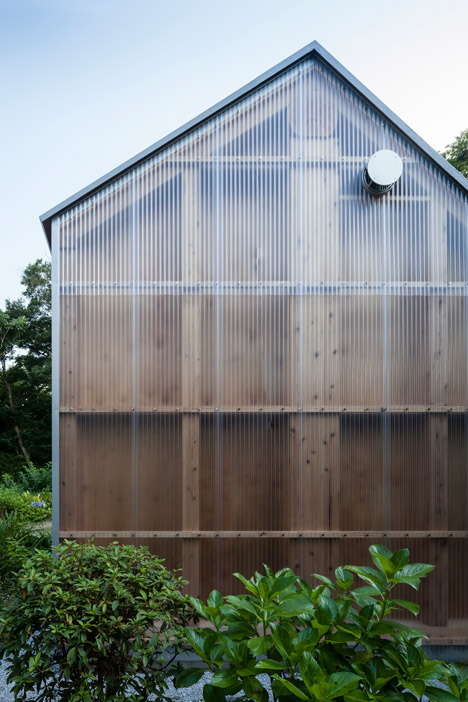
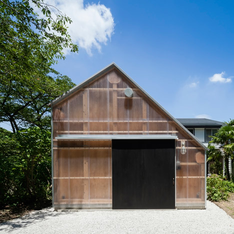
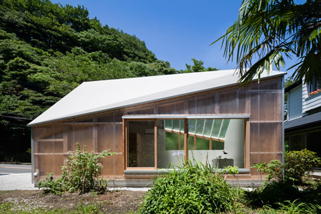
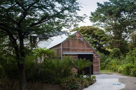
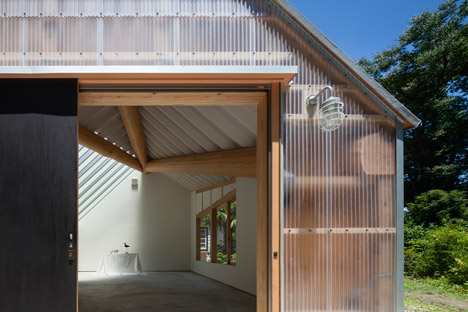
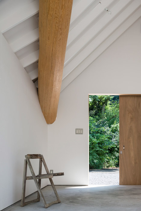
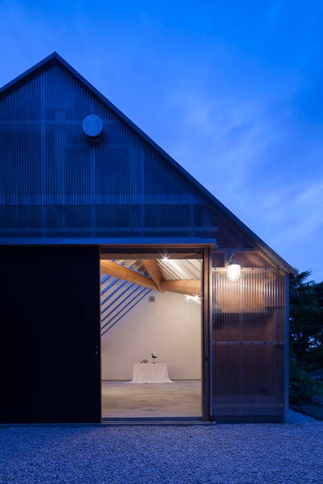
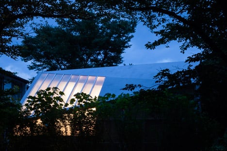
Sheets of translucent corrugated plastic reveal the timber framework of this photography studio in Japan by FT Architects, which also features an angular white roof .
FT Architects designed the 33-square-metre studio, named Light Shed, for the back garden of a photographer’s house in Kanagawa, in the southern Kantō region of Japan.
Related story: Archery Hall and Boxing Club by FT Architects
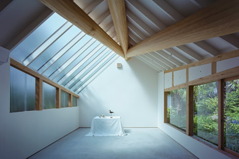
The interior space measures 4.5 by 7 metres and comprises an open-plan studio with a toilet built into one corner – a space “solely composed of essential functions required for a photographic studio”.
The Tokyo-based studio used a timber frame construction and a multi-faceted gable roof to create the largest possible volume on a tight budget.
The unusually shaped roof was designed to reduce the impact of the horizontal supporting struts typical in gable roof construction.
These low-level elements would otherwise have significantly reduced the height of the space and compromised the photographer’s ability to take a clear shot.
“Following simple geometric rules, the roof was distorted into a multi-faceted, asymmetric form,” said the architects, whose previous projects include a timber-framed boxing and archery arena for a university in Tokyo.
“Three ridge beams at the folding lines support the roof structure, negating the need for any horizontal members that may compromise the height of the room,” they said.
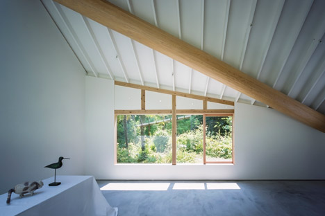
The roughly-hewn joists radiate down from the gable closest to the photographer’s house, giving the roof its asymmetric shape.
The large logs that create the ridge beams on the interior of the roof contrast with the slim sections of timber used for the rest of the building’s framework.
“While the log beams were employed as pragmatic means to fulfil the brief, they also bring along symbolic associations of being one of the oldest building materials,” said the team.
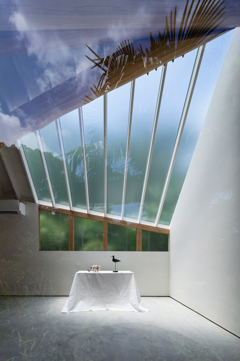
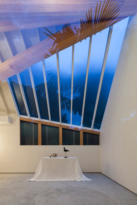
Panels of corrugated polycarbonate were tacked onto the horizontal batons on the exterior, creating a rain screen that leaves the shed’s wooden structure largely visible.
The plastic cladding covers a window on the west side of the building, while a large skylight is glazed with frosted glass. This ensures that the majority of the natural light is diffused before entering.
“Direct sunlight creates overly strong contrasts that would result in unnatural portraits,” said the architects.
On the opposite side of the space, a wide timber-framed window on the east side of the shed faces onto the garden to provide one direct source of sunlight.
“Together with the wide windows on the side facing onto the lush garden, the interior, although enclosed, is always as bright as the external environment,” added the team.
A large black door has been positioned off-centre on the east wall. It slides open to provide an entrance point to the studio.
Inside, the door’s natural wooden surface is revealed. The walls and ceiling are painted bright white, while the pale grey concrete floor tones in with the light grey gravel the shed sits on.
Photography is by Shigeo Ogawa.
Site plan Floor plan – Long section Cross sections Elevations Dezeen
When looking for inspiration that would upgrade your ideas of the perfect living environment, apartments, villas or concept homes like the one you are about to see hold details you need. Located in Munich, Germany, the concept house known as Poing House was designed by German studio Luxhaus. Spreading over 1,184 square feet, the showcase home points out to important features a modern home should incorporate. This fine piece of contemporary architecture marries quality of living and advanced technologies for the home. The Poing House’s design gives us an idea of what functionality and contemporary elegance look put together.
Luxurious and inviting, this plus-energy house expresses Bauhaus influences, extending over two floors within a volumetric frame. Sheltered under a flat roof, the social and private living areas provoke senses with an eye-catching mix of colors, materials and decorations. Offering an ingeniously functional floor-plan, the concept home creates a harmonious collection of spaces reduced to its essence.
Built-in furniture optimizes the spaces while harmony rules over this piece of land. Do you see yourself living in a place like this?
Recommended For You
Sleek and Functional Two Bedroom Apartment Showcasing Family Scandinavian Design
Impacting Through Bright Colors: Blue Penthouse in Shanghai
Fun and Functional Nig ht Light Table for Soothing Bedrooms
Contemporary Malibu Home With Soothing Ocean Views
Bright Family Home Defined By A Held Back Color Palette
Highly Modern American Home Showcasing A Dynamic Architectural Composition


 You guys are so smart!! That would look beautiful in a dark stain as well – and you can create storage inside. Awesome.
 Love that stain in combination with the black cabinets!
 It’s a beautifully neutral twist and still adds some dimension to the space.
 And Jaime shared some as well – love her two toned look:
 Laura’s bathroom renovation turned out beautifully:
 I’ve always been drawn to an open shelving vanity like this. If you are a DIYer this is something you could definitely make yourself to fit your space perfectly. I’m considering something similar for when we redo our master bathroom…years from now. 😉


![Shaping The Office Of The Future: Workspace Design Trends [Infographic]](https://cdn.freshome.com/wp-content/uploads/2014/08/the-changing-workspace-323x216.jpg)


 By Tara Mastroeni in Best Of


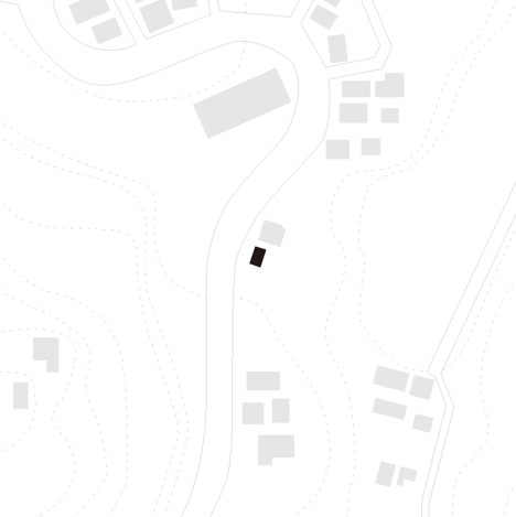 Site plan
 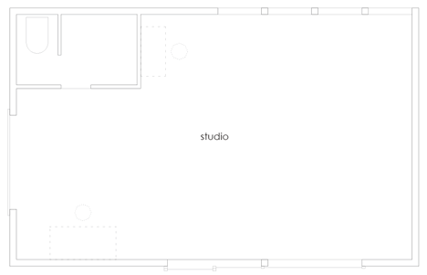 Floor plan –
 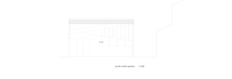 Long section
 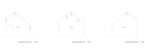 Cross sections
 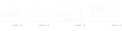 Elevations


