What images does the phrase “Scandinavian style” conjure up in your mind? We can’t say for sure, but whatever interior you imagined, we can tell you at the 99% level that it had a perfectly neutral, apparently white background. And for sure this interior was quite laconic and minimalistic. Minimalism, in turn, implies the presence of solely essential furnishing and décor. In Home Amore project by RIS Interior Design (Taiwan) the walls are also light and for the most part white and the furnishing component is represented only by must-haves. But unlike pure Scandinavian interiors, its austere furniture and décor is touched by the spirit of French style. Speaking metaphorically, in this apartment Scandinavian style created kind of a canvas for elegant and unostentatious French motifs. And we suggest that you have a closer look at each of the rooms…
Living room
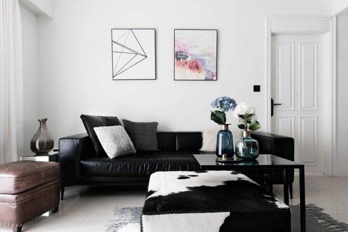
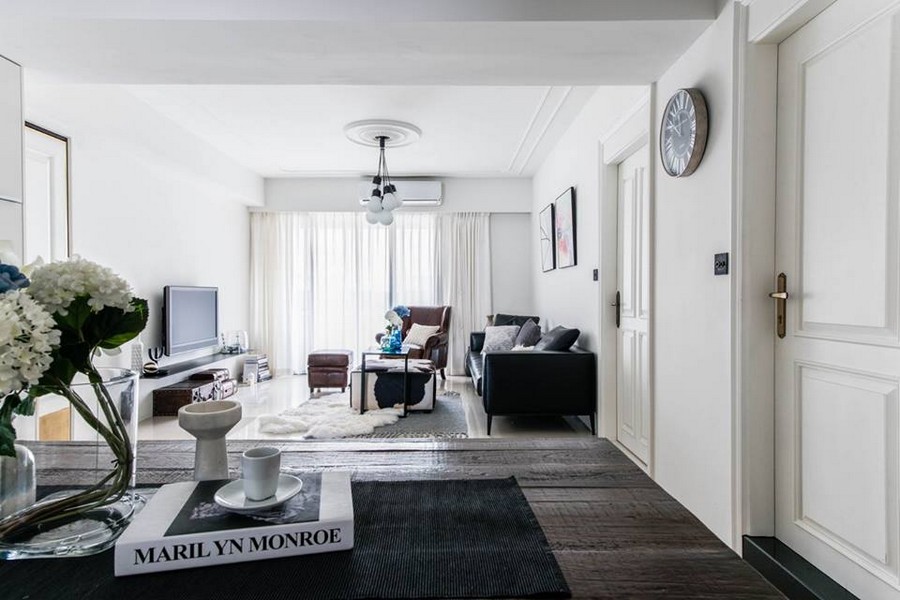
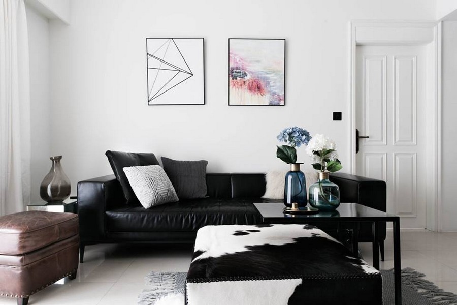
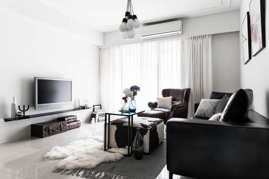
On the surface the living room interior is very contemporary and designed according to the latest trends of European style: a fashionable black-and-white color scheme, a dark black leather sofa, a light wall-mounted rack under the TV set instead of a customary console, a group of coffee tables and etc. But on looking closer the eye catches plenty of details that are so French: a ceiling medallion, a few naturalistic hues that perfectly refresh the monotonous black-and-white scheme, vintage suitcases arising the sense of nostalgia, shaggy throw pillows and a rug on the floor that bring the sense of ultimate coziness and hominess… All of these details are fit into the Nordic background so skillfully that you can hardly notice the eclecticism of the composition.
Dining room
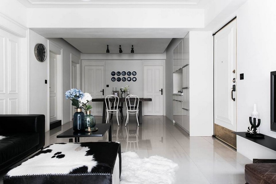
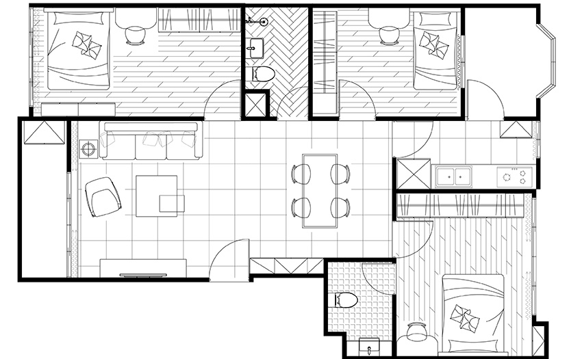
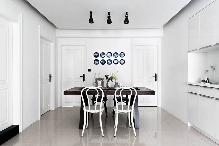
Initially the dining room and kitchen were isolated from the living room by a partition, and hence badly lacked daylight. Given that this space is windowless (it’s a hall with exits to the bathroom and bedrooms), the most logical solution was to demolish the wall and make the kitchen open to the lounge. Thanks to white walls perfectly reflecting natural light and the open concept of the layout, now the family got a full-fledged public space ideal for interaction and traffic and with plenty of sunlight coming inside.
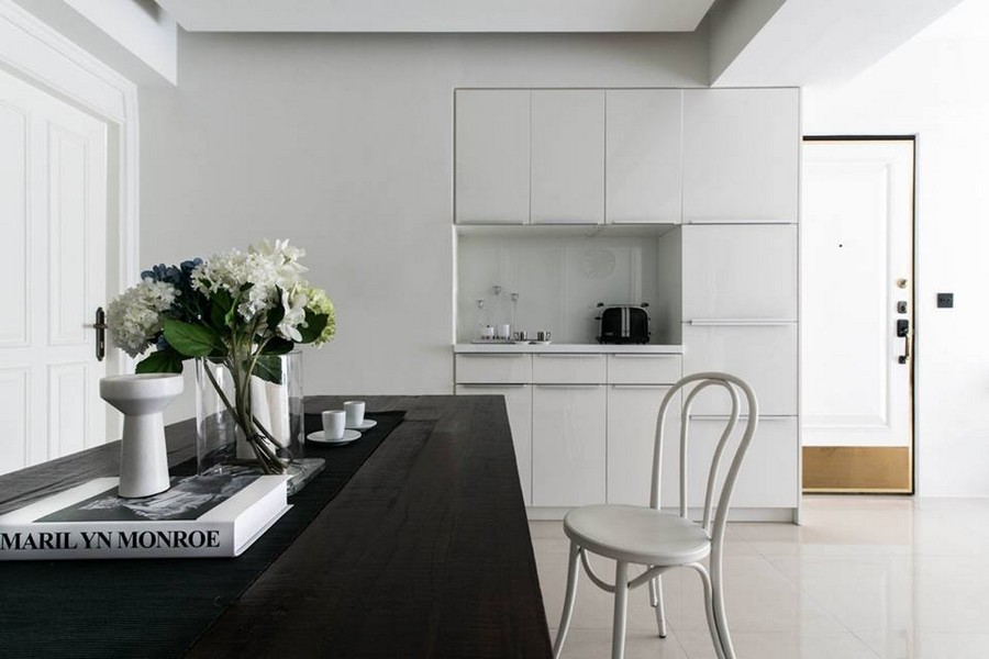
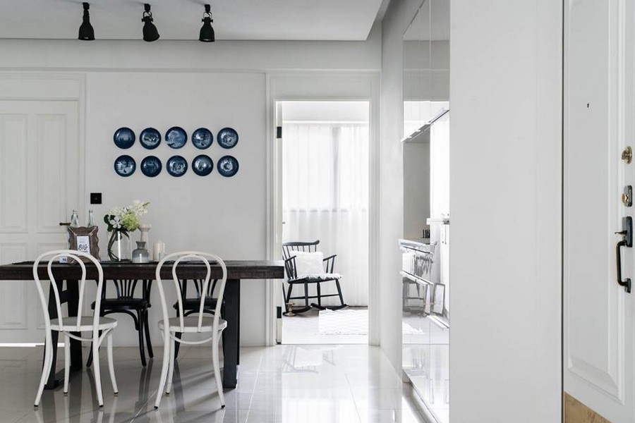
The kitchen zone is pretty minimalistic and compact, with white glossy cabinets. The white scheme is diluted with a dark solid wood table, a couple of dark mismatched chairs and brown door handles. And the role of a bright splash is played by a collection of decorative Copenhagen plates displayed on the wall.
Master bedroom
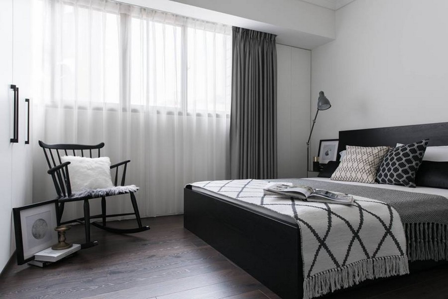
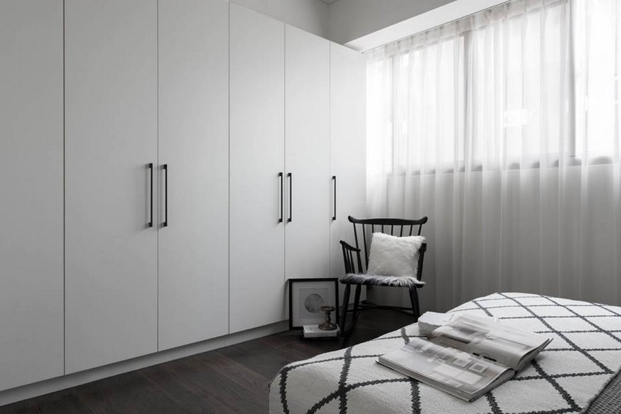
Right from the dining room one can get to the master bedroom. Just like the living room, it’s designed in a black-and-white color scheme, but with a dark wood floor and gray used as the third predominant color. Here contemporary-style elements, such as a bed, a sleek nightstand, geometrical patterns on home textile and a modern floor lamp are found next to objects that embody tradition and respect for history: a rocking chair, a cozy bedspread, and a make-up mirror frame with a touch of retro.
Younger sister’s bedroom
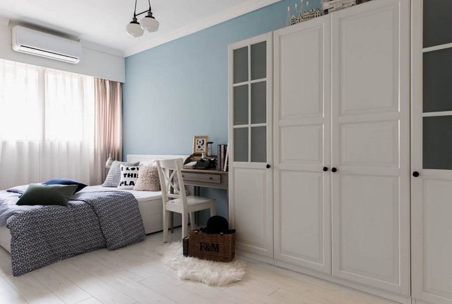
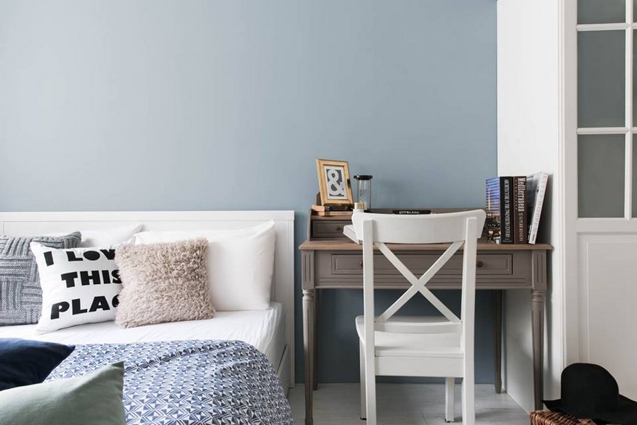
The masters have two grown-up daughters, and each of them has a separate bedroom designed individually. The younger sister’s room looks very pure: the walls, ceiling, floor and even furniture are total-white. This looks like a hint on motifs of French Provence style. This background is refreshed by light blue painted wall behind the headboard, a blue bedspread, powder pink curtains and a grayish beige console desk. Despite the elongated and narrow shape of the room, thanks to such a light color palette it looks very airy and non-cluttered.
Elder sister’s bedroom
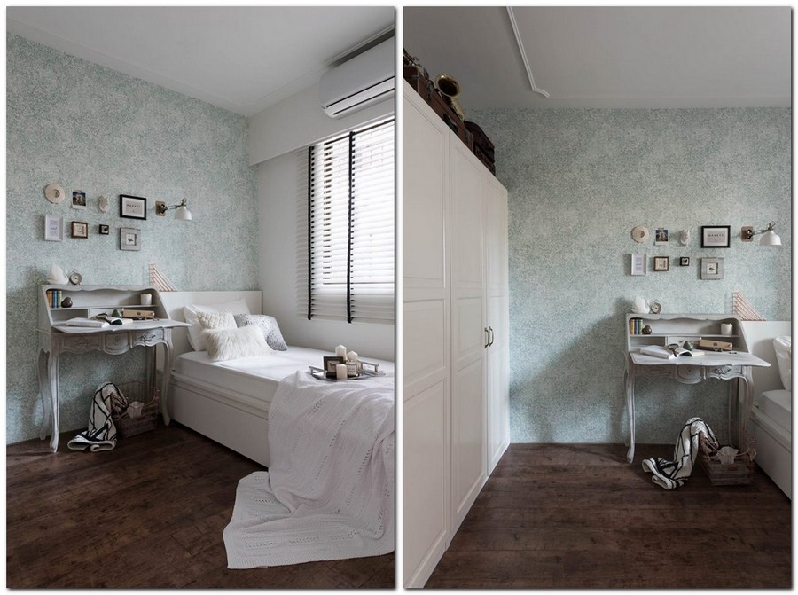
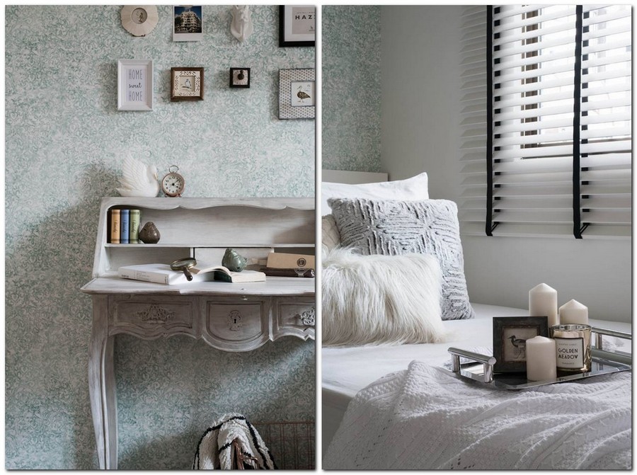
The elder sister’s room is arranged in pastel colors as well, but here the accents are put in a different way. The eye-catchy details of this interior are beautiful light green wallpaper with floral pattern, beautiful wood grain of the dark floor and a gorgeous console desk in retro style. The latter is, by the way, very special for the family as it’s actually old and brings sweet memories to the inhabitants of the flat. Especially for this project it was restored by the designer and given a hand touch of paint brush imitating the old paint. Just like all the other bedrooms, this one features a roomy full-fledged wardrobe for storing personal stuff.
Bathroom
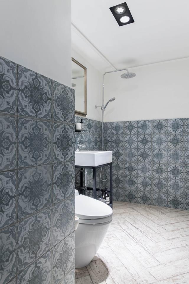
Finally we came to the last, but not least beautiful room of the apartment – the bathroom. Now it looks so fresh and stylish that it’s hard to believe that before renovation it was absolutely infected with wall cancer. With this problem in mind, the bottom part of the walls was finished with elegant greenish gray tiles, and the upper part was coated with special waterproof paint resistant to moisture and any fungi. And a finishing touch of “tradition” was added by faux wood tiles laid in a herringbone pattern on the floor.
