House Beautiful magazine recently posted an article on their website called The Ugly Side of Beautiful Rooms: Design in the Age of Internet Comments. The article, written by Annmarie Dooling, talks about the invective spewed online in comments sections and why people feel that it’s okay to say things online that they wouldn’t say in person. As the article says:
You’d never walk into someone’s home and say “Vomit.” So why is this happening so often online?
Of course, anyone who has been hanging out in the blogosphere as long as I have (since 2005!) knows that online comments are the worst. That the magazines are just getting around to noticing this is probably because they are pushing so much content out on places like their Facebook feeds that they are clearly inviting comments, which includes all the rude ones too.
Reading this, I was reminded of all the negative comments I received when my condo kitchen makeover was published on various websites and was a featured in The Boston Globe and Country Woman magazine.
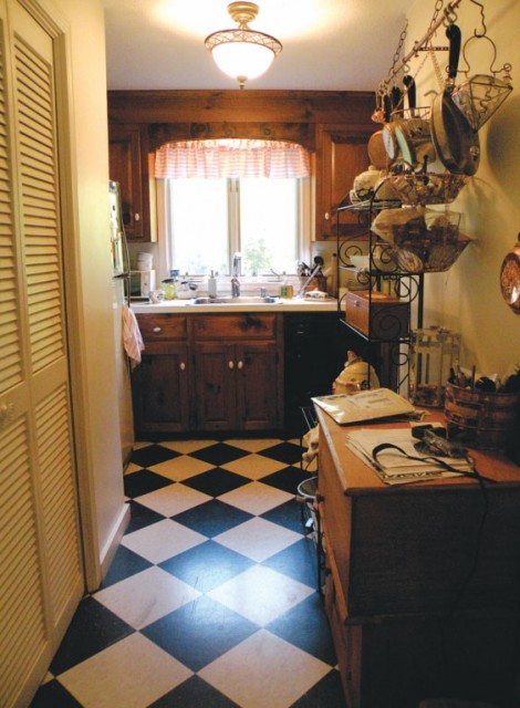
This was the before. Clearly. A tiny little space with dark knotty pine cabinets and no storage space.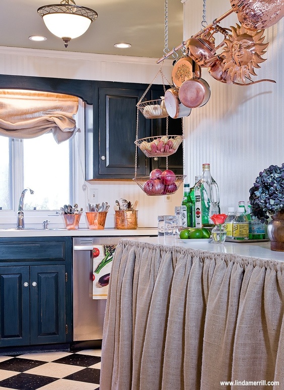
Here is the after (photo by Michael J. Lee) that is on my website and was featured on Apartment Therapy and Shelterpop.
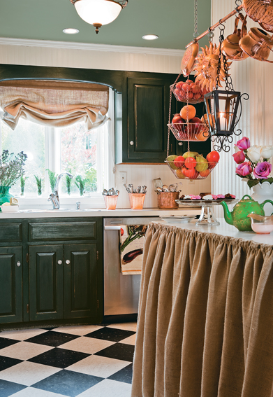
And this the version reshot by Michael for Country Woman magazine.
 And this was the pic shot by The Boston Globe. (sadly, I didn’t think to stage the space with flowers or pretty pots and pans – I had no idea what they would be shooting and this ended up pretty bare bones).
The “hook” on all these articles was that I’d done most of the work myself (with a dear friend) and spent less than \$500, excluding appliances which were given to me in trade. If you’ve been reading for a while, you’ll undoubtedly remember this project which I detailed extensively.
Now, the thing is, design is subjective. Tastes vary and what I like isn’t what you will like. But just because I don’t love orange doesn’t mean it’s wrong, or “vomitous”. I’d happily use it in a client project if that’s what they wanted. My little kitchen makeover was not for everyone – of course. Decisions were made based on space available, my skills at remaking things, and a very strict budget. This, of course, is true of any design project. Budget, the functional needs and tastes of the client, the space and more all play a part in the final outcome. And a single photo doesn’t usually capture all this “back story”. Yet the comments can be overwhelmingly negative. When the now defunct Shelterpop ran the story of my kitchen, it resulted in many, many comments and most were negative. A large majority thought the before was better (seriously?). Several hated the window treatment, someone suggested it looked like a garbage bag, many hated the counter skirt. I was even taken to task for adding storage under the new counter because it meant I had too much stuff. Several people we offended that I received the appliances in trade and refused to believe this was possible – therefor it wasn’t really a \$500 makeover. Of course, “\$500 Makeover!” made for a good headline and certainly, the appliances added a few thousand. But even with the old appliances in place, the change would have been substantial. After Shelterpop ran their article, Apartment Therapy picked it up and posted a few photos. I will say, their comments were generally much better and more constructive.
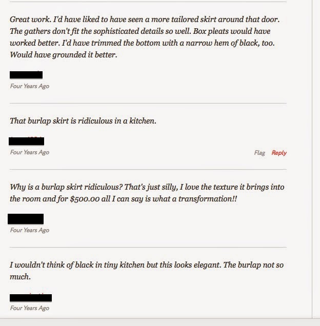
The first comment was what I would consider a total “win” when it comes to constructive criticism. (Maybe I think so because I totally agreed.) I would have loved to do a tailored skirt, but a gathered skirt was so much easier to carry off, a tailored skirt required a lot of math and planning, which at the time I wasn’t that interested in doing. And I loved the banding idea as well.
The second comment is, as they say, ridiculous. Tell us why it was ridiculous! Was it the burlap? That it was a skirt at all? Of course, I would have loved to install a nicer counter with cabinets below. But not for less than \$500. Instead, it was an old door mounted on a frame and attached to the wall with plastic shelving below, and then covered up with the skirt. It was all about function. But, rather than just saying “ridiculous” (I guess it’s better than “vomit”) tell us what would have improved it – like the first commenter did. Obviously, comment three came to my defense. And comment four managed to do both a compliment (always should be first) and then a criticism. And that was fine. They were right – burlap isn’t exactly elegant. But it is cheap and it was trendy a few years ago when I did this.
When negative commenters are criticized – they usually fall back on the tired old notion that all people want are rainbows and sunshine types of comments. Not true! As the examples above show – you can be critical and say you don’t like something without being rude and obnoxious about it. Some people assume it’s jealously on the part of the commenter. I’ve never really believed this is true 100% of the time. I think there are people who just feel better about themselves when they can be critical of things – it makes them feel somehow smarter. And, I think there are people who just aren’t that smart and don’t have the vocabulary to launch a true criticism of what they are seeing.
Sadly, this type of negative commentary isn’t the purview of non-professionals. A few years ago there was a designer who had written a book about things they didn’t like about other people’s houses. This somewhat snarky headline was used to help sell the book which actually had great advice about how to improve one’s home. There was also a Facebook page where they posted groupings of house photos within a theme and invited the “fans” to comment. When it starts with “things I hate…” you can only imagine the direction that the comments will take. Now, I had interviewed this person not once but twice. We had a professional relationship of a sort. I was always uncomfortable with their brand of snarky criticism, but largely ignored it. Until one of my own project photos popped up as an example of a bad rental property.
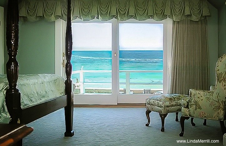
It was grouped with several supposed waterfront rental houses (this was not a rental house) that were considered by this designer and followers to be nasty and worthy of invective. One of the comments really got me – something to the effect that it looked like “grandma’s furniture”. In fact, the client was a Grandma and it was her furniture. Everything was criticized from the color palette, the furniture and the window treatments, that it was too formal for a beach setting. Now, I will admit, the photograph (which I took myself) did not do the room justice. I was just happy to get the outside and inside matched up (two different exposures merged together – a personal photographic victory!). Without knowing any of the context, these supposed design critics just had a field day. For instance, the valance was too wide and empty on the left side – why didn’t the window treatments split in the middle versus being stack right? Well, because the door open
ed left to right and the clients wanted to be able to sleep with the window open at times, yet still be covered. You can’t do that if the drapes are split in the middle. The 10′ wide window required a lot of fabric and the drapery had blackout lining. Needless to say, the stack back on the right was very wide and in order to be able to fully open the drapes off the windows to showcase the view, they had to be hung as wide as they were. All this is to say that there is usually more to the story than meets the eye in a photo. In this case, the client, a realtor, was selling her home and wanted to play up the ocean view. We redid the entire master suite with this in mind. The house sold in a bidding war the first weekend it was on the market for well over the asking price. She loved it, it served its purpose; to me, that’s a successful design.
But how offensive was it that a fellow designer would use (without permission obviously) a photo from someone else’s portfolio as part of their “let’s make fun of this design!” Facebook page?? When I emailed them, demanding that it be taken down, it was. The blame, however, was put on a “fan” who had sent in the photo. (Note, my URL was not on the image at the time this happened).
So, the rude comments don’t just come from those who don’t know better, are “jealous”, are merely trolls, or who are perhaps lacking in sufficient language skills to provide thoughtful commentary. Sometimes, the negativity is fomented by industry insiders and those who just find it fun to make fun. Shame.
If you don’t like something, that’s ok. Most designers and clients can take legitimate criticism. But nastiness for its own sake is, oh, what’s the word?
Ridiculous.

If you’re looking to create the home of your dreams, contact me to discuss the possibilities! ![]()
::Surroundings::


